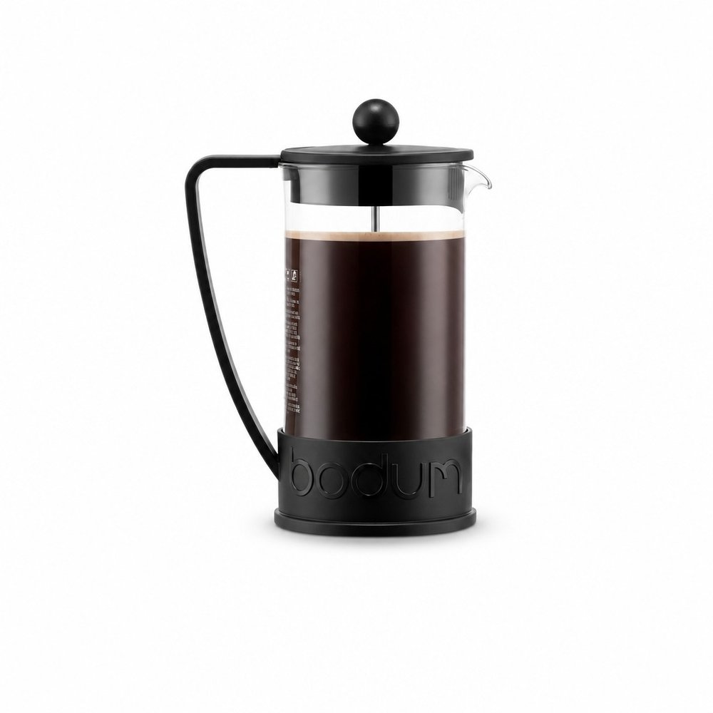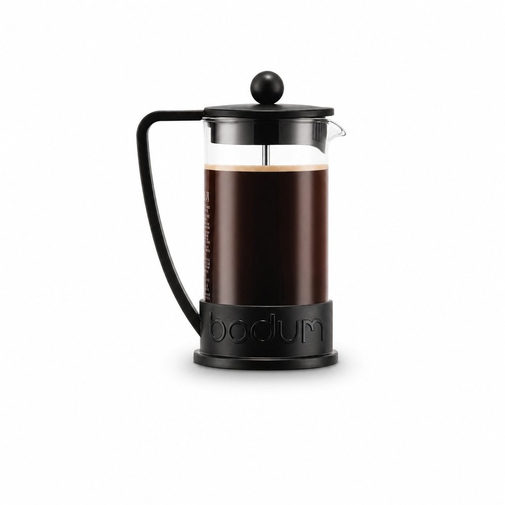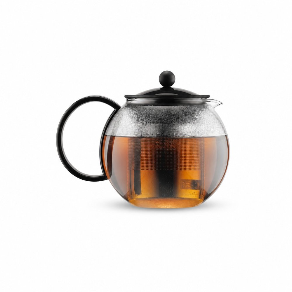



Tassen
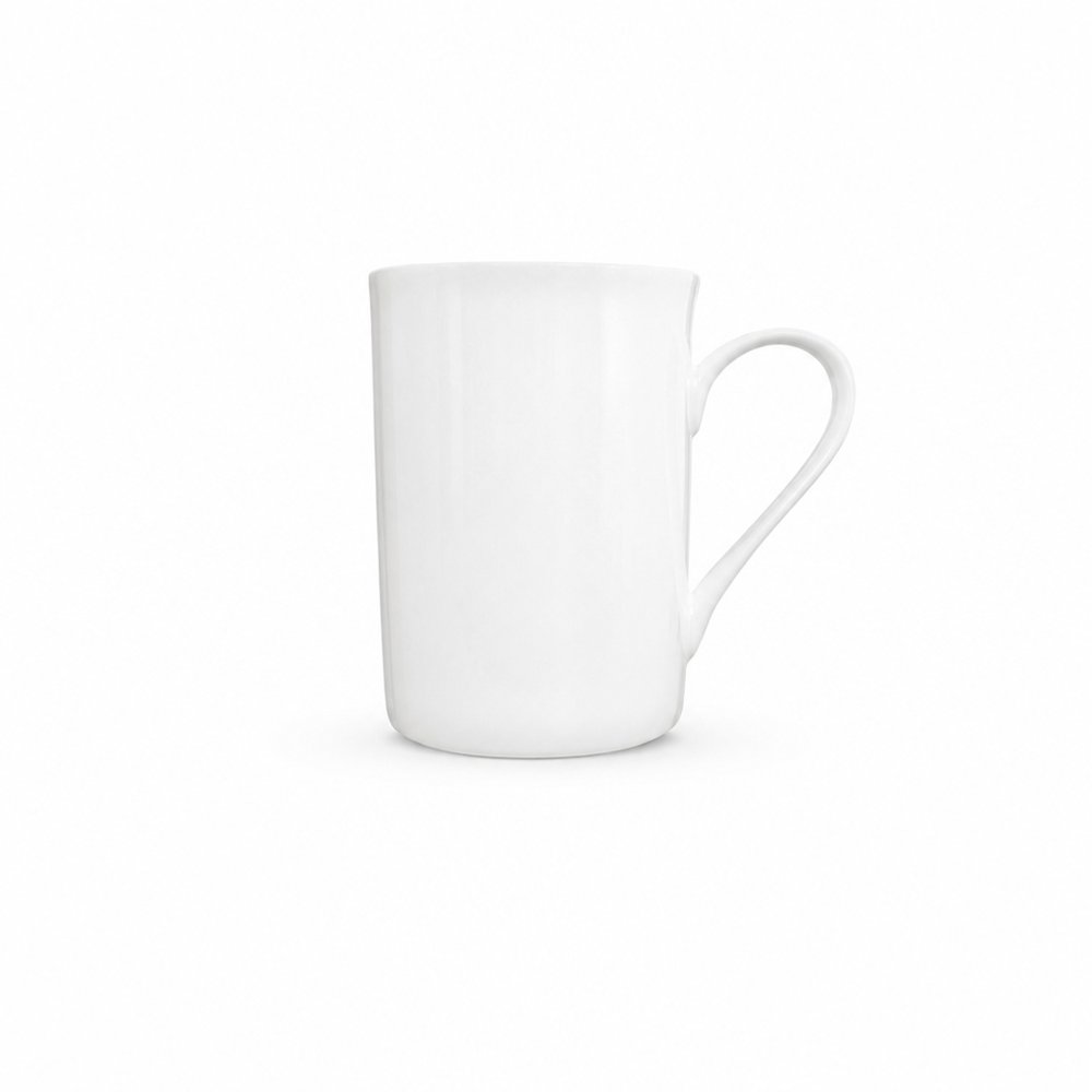
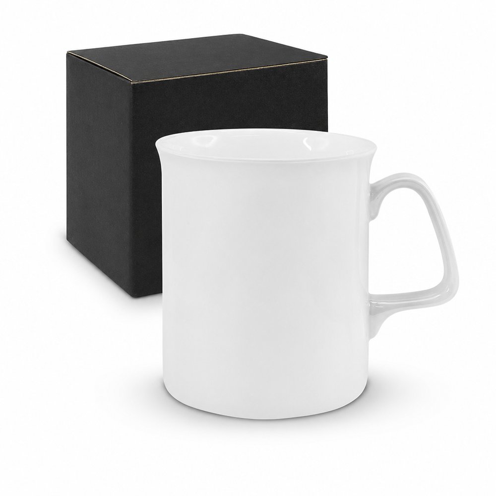
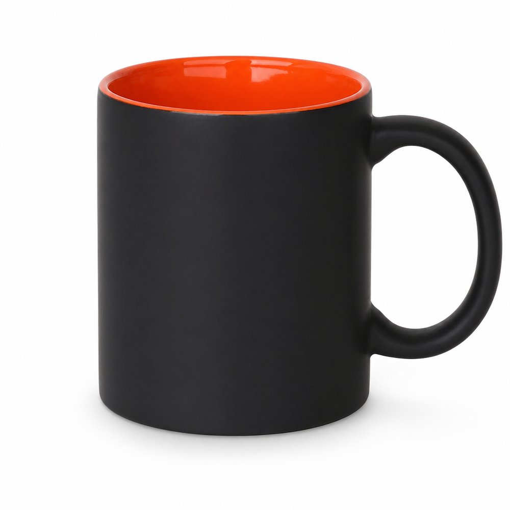
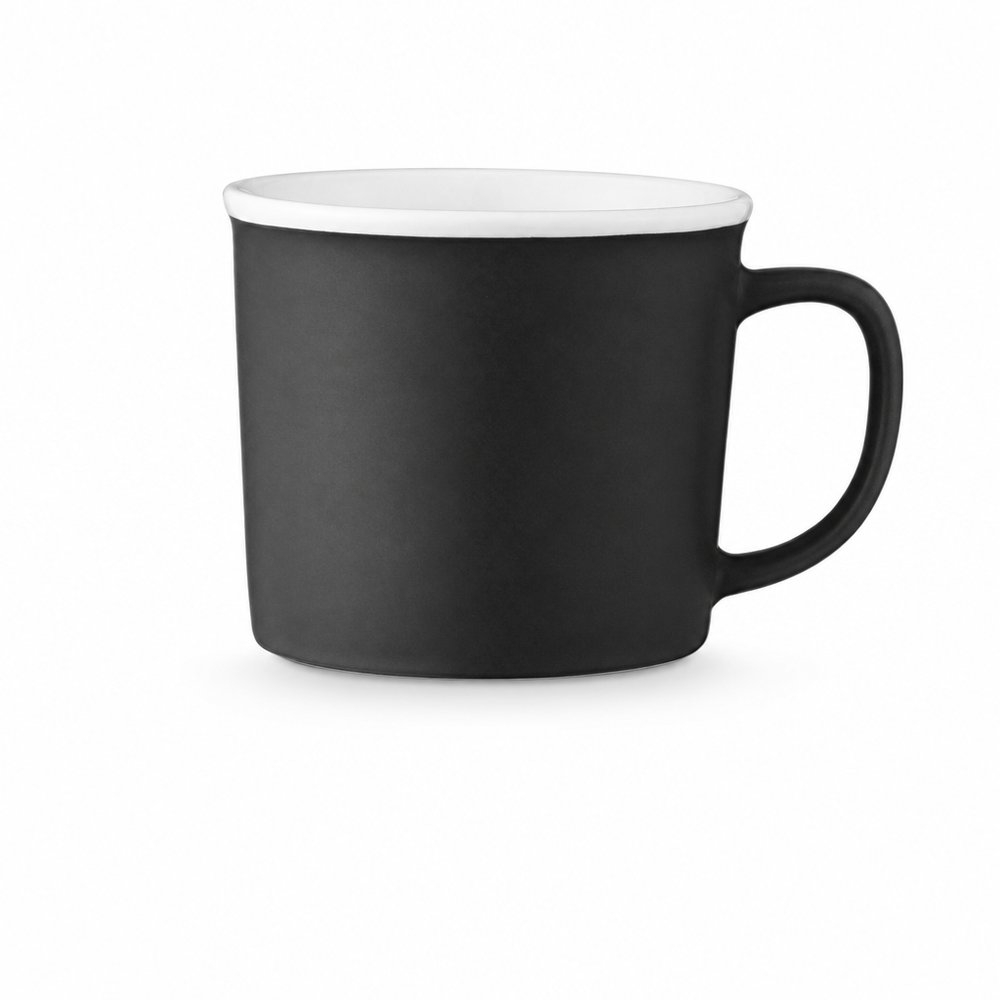
Qualität Bone China Tassen
Ab 6,52 € zzgl. MwStMindestmenge 250
finden es. lieben es. keep es.
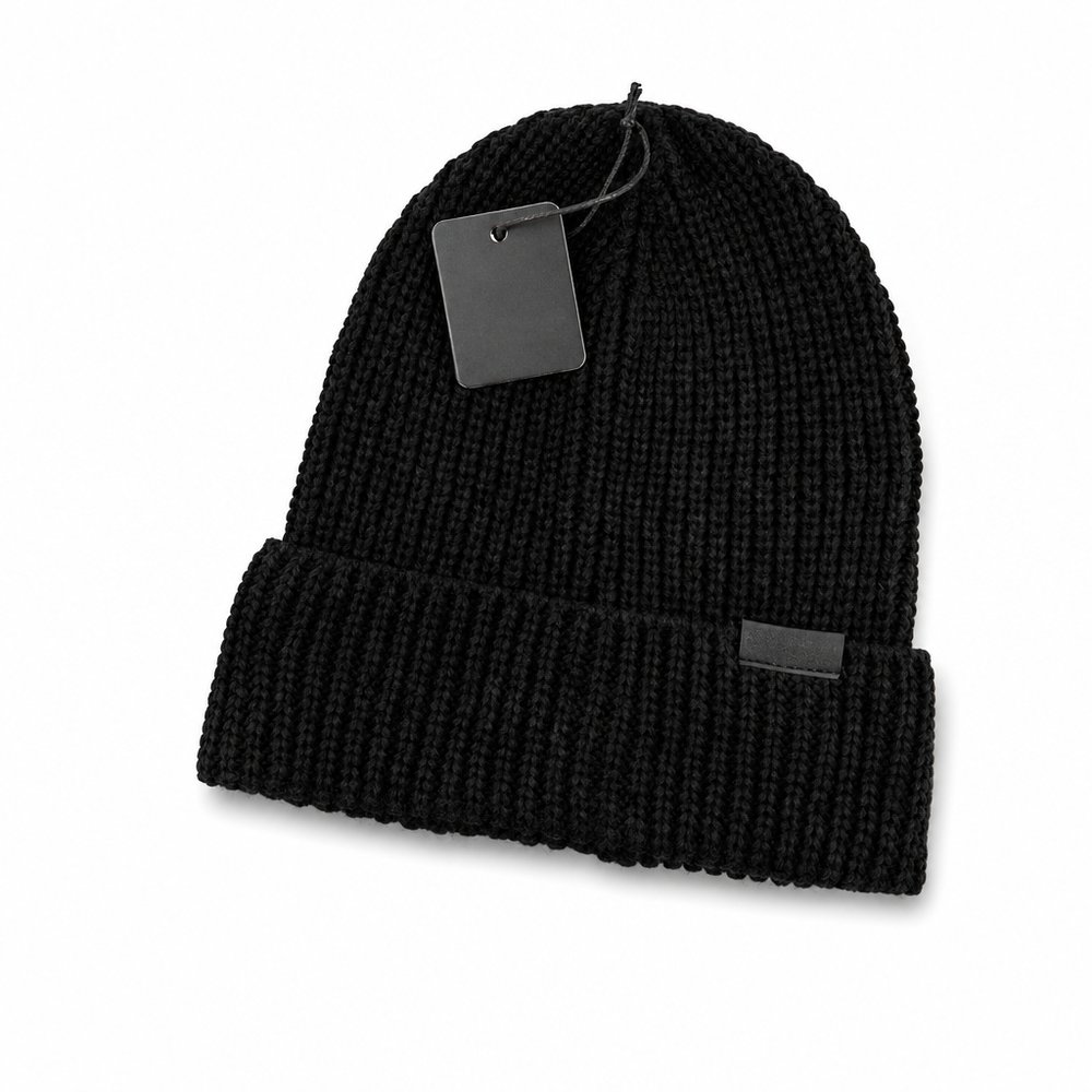
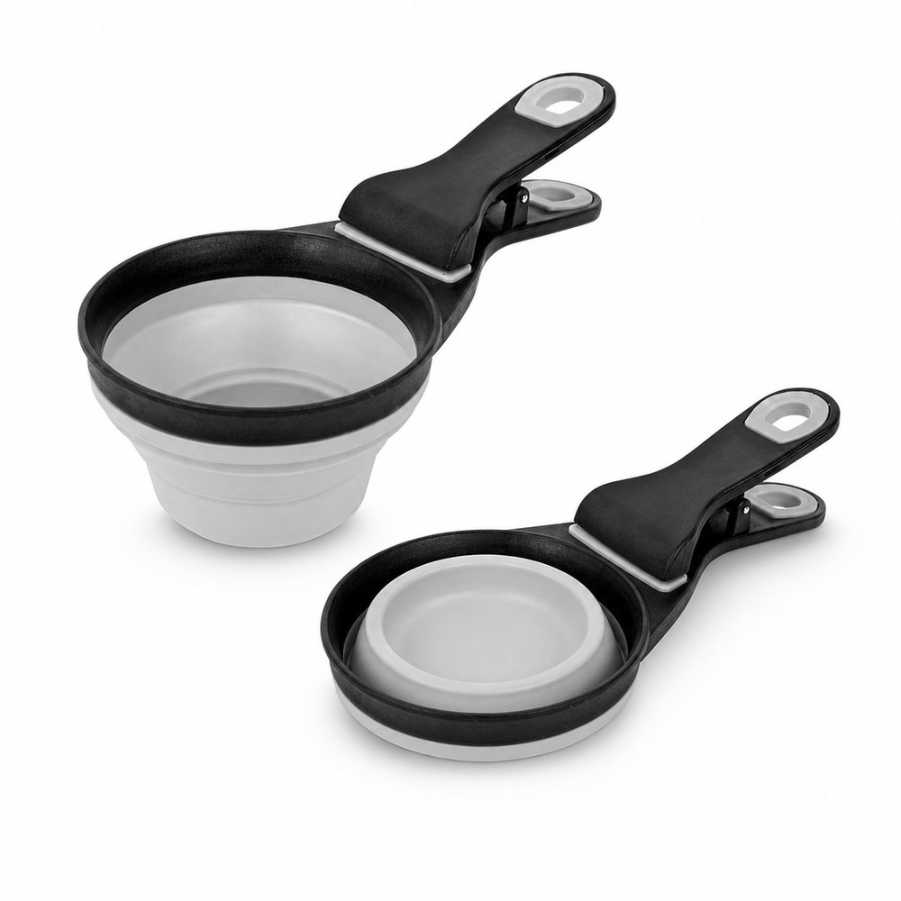
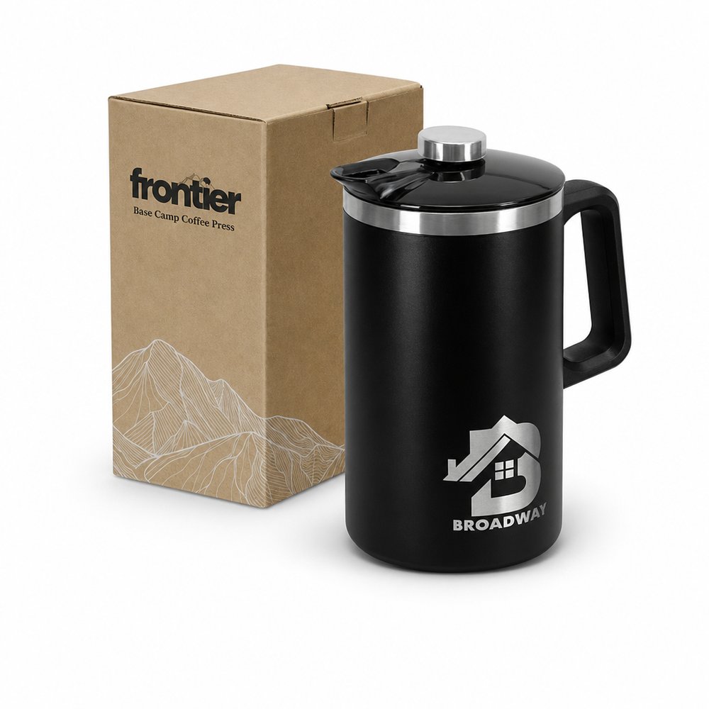
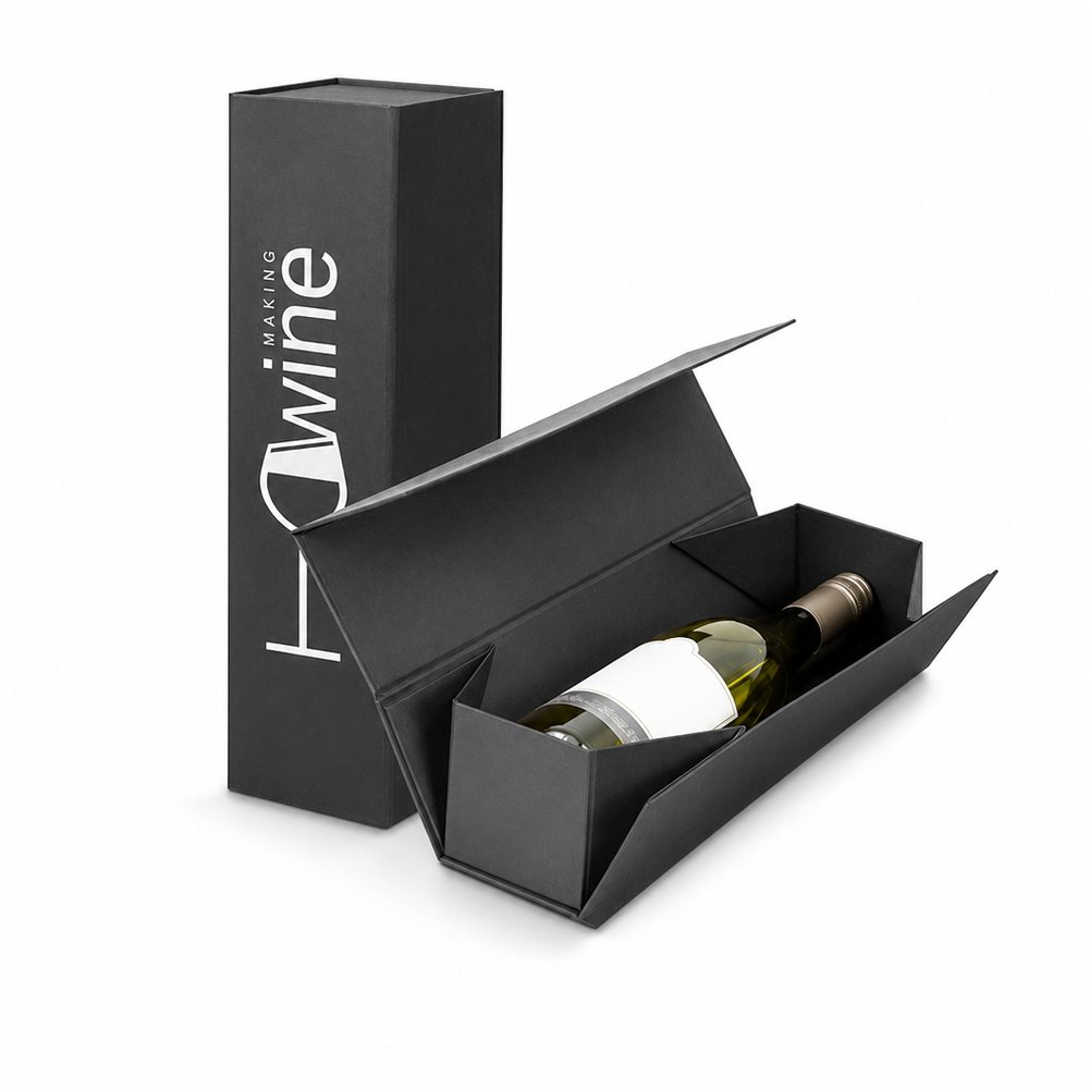
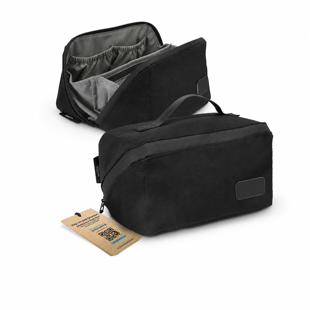
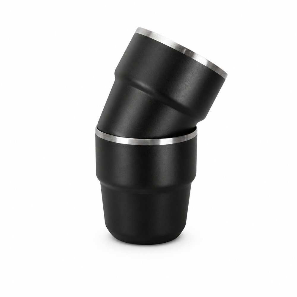
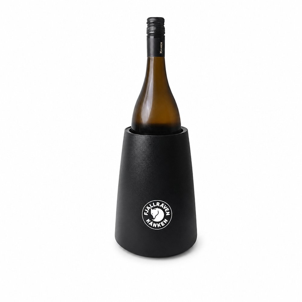
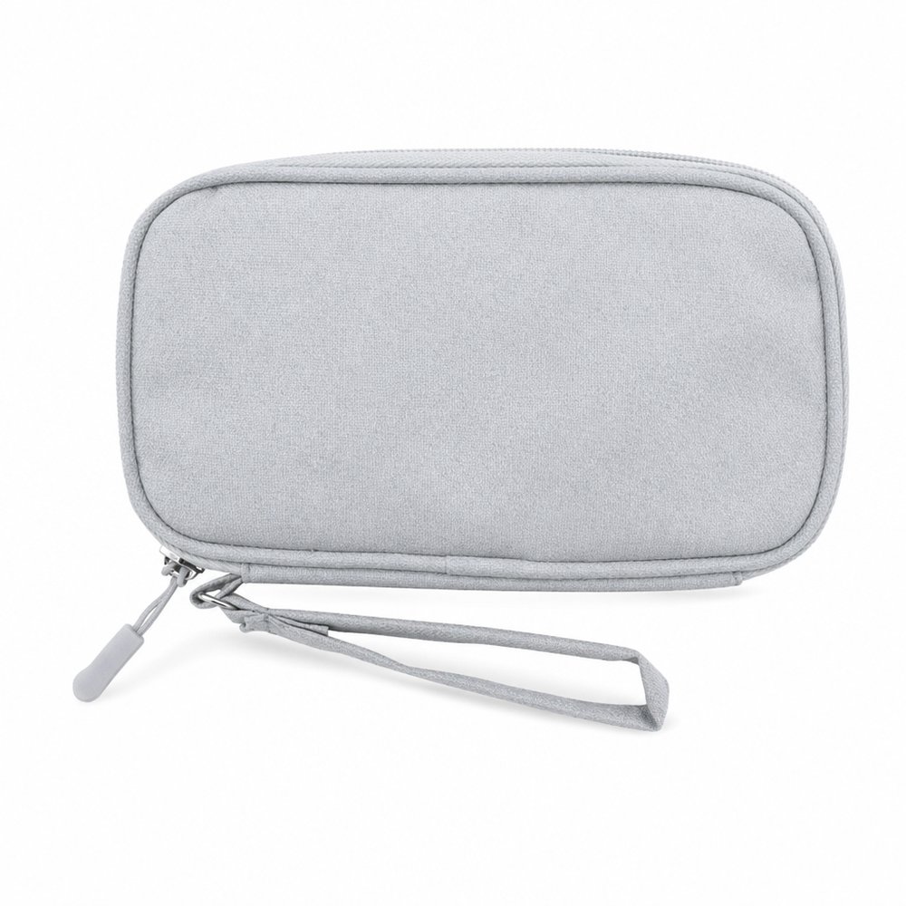
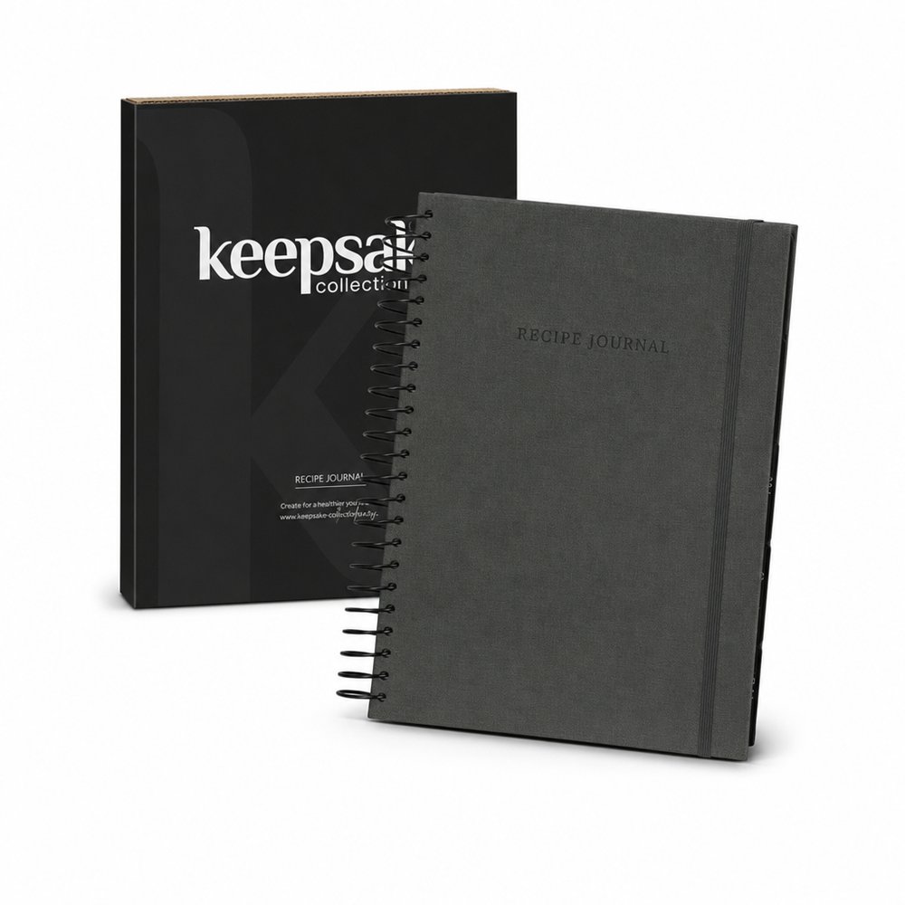
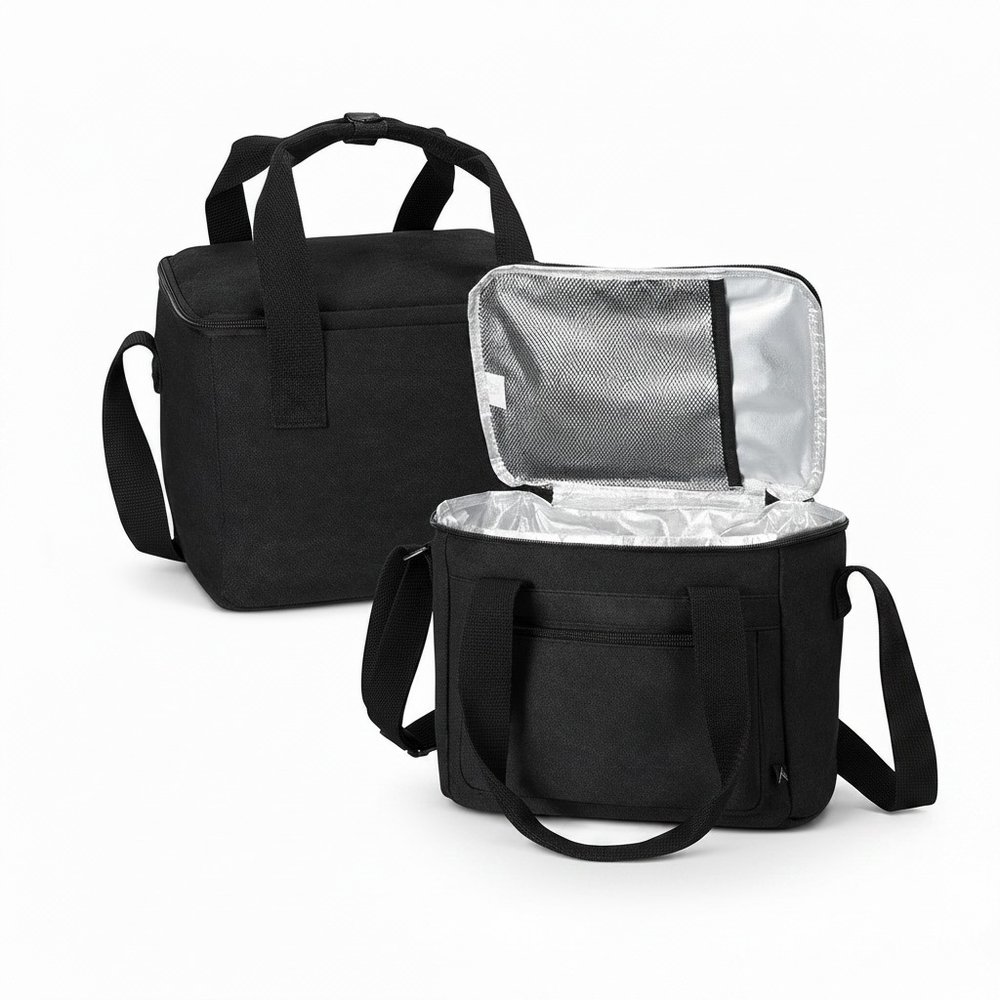
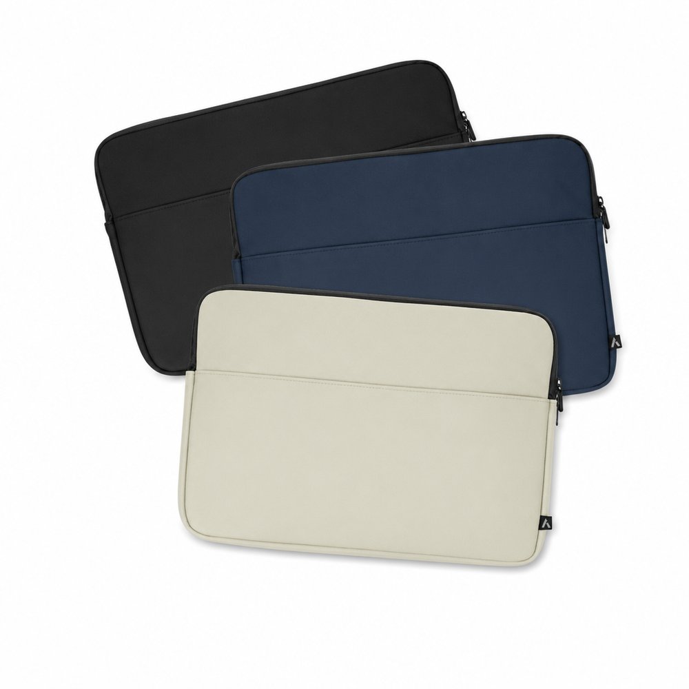
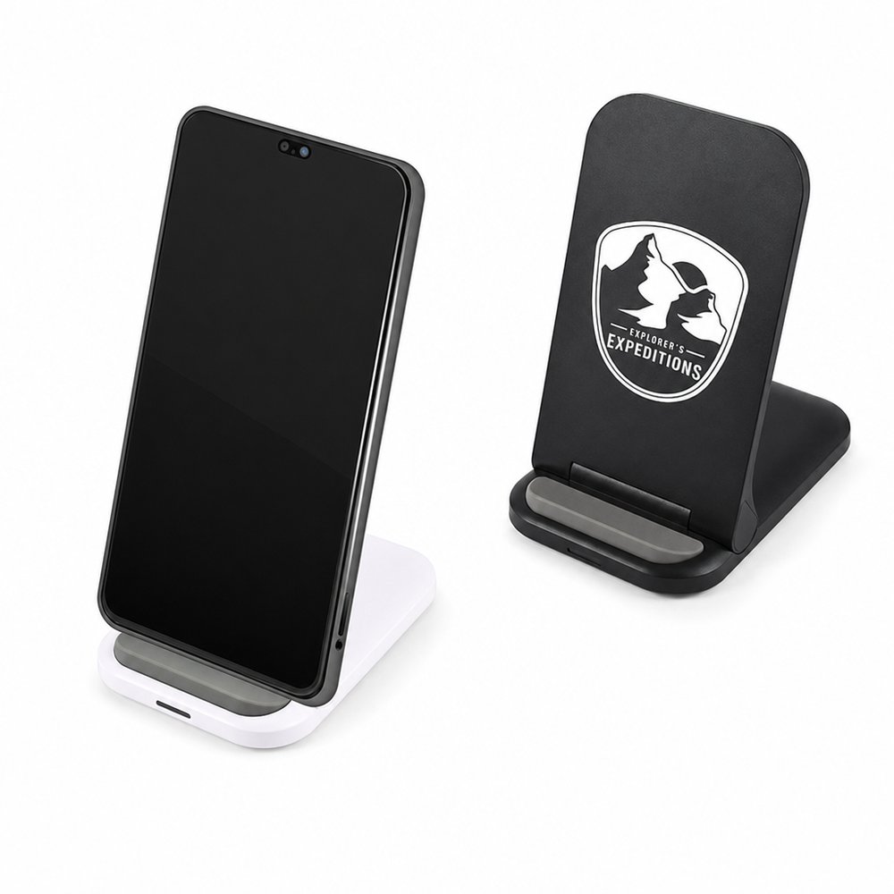
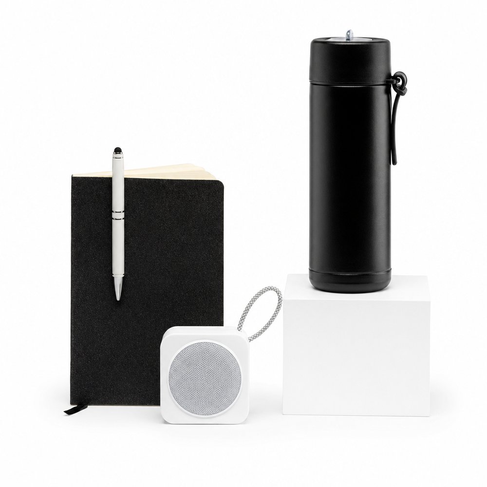
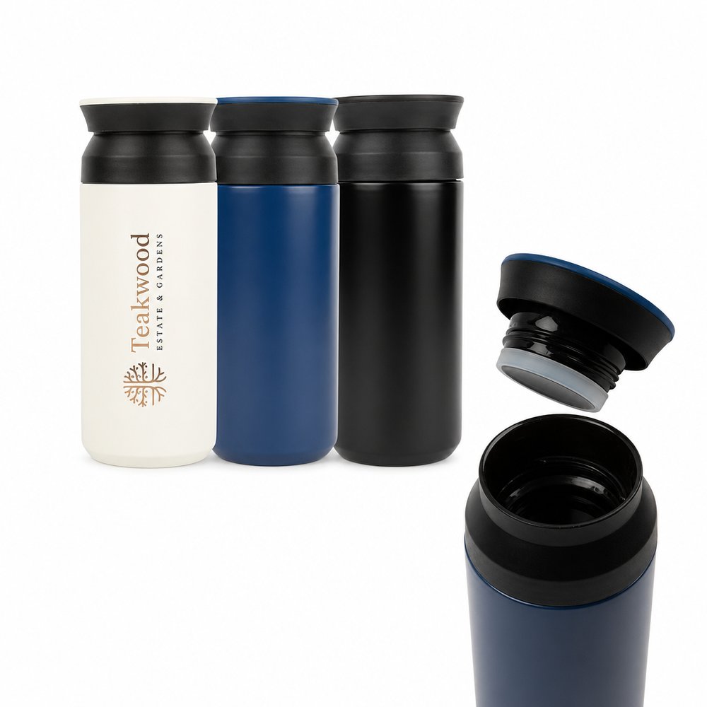
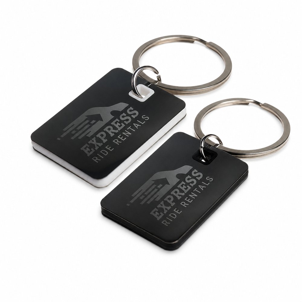
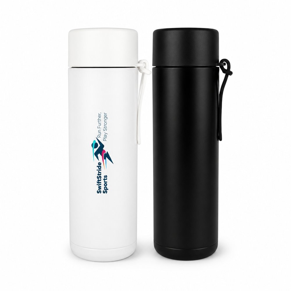
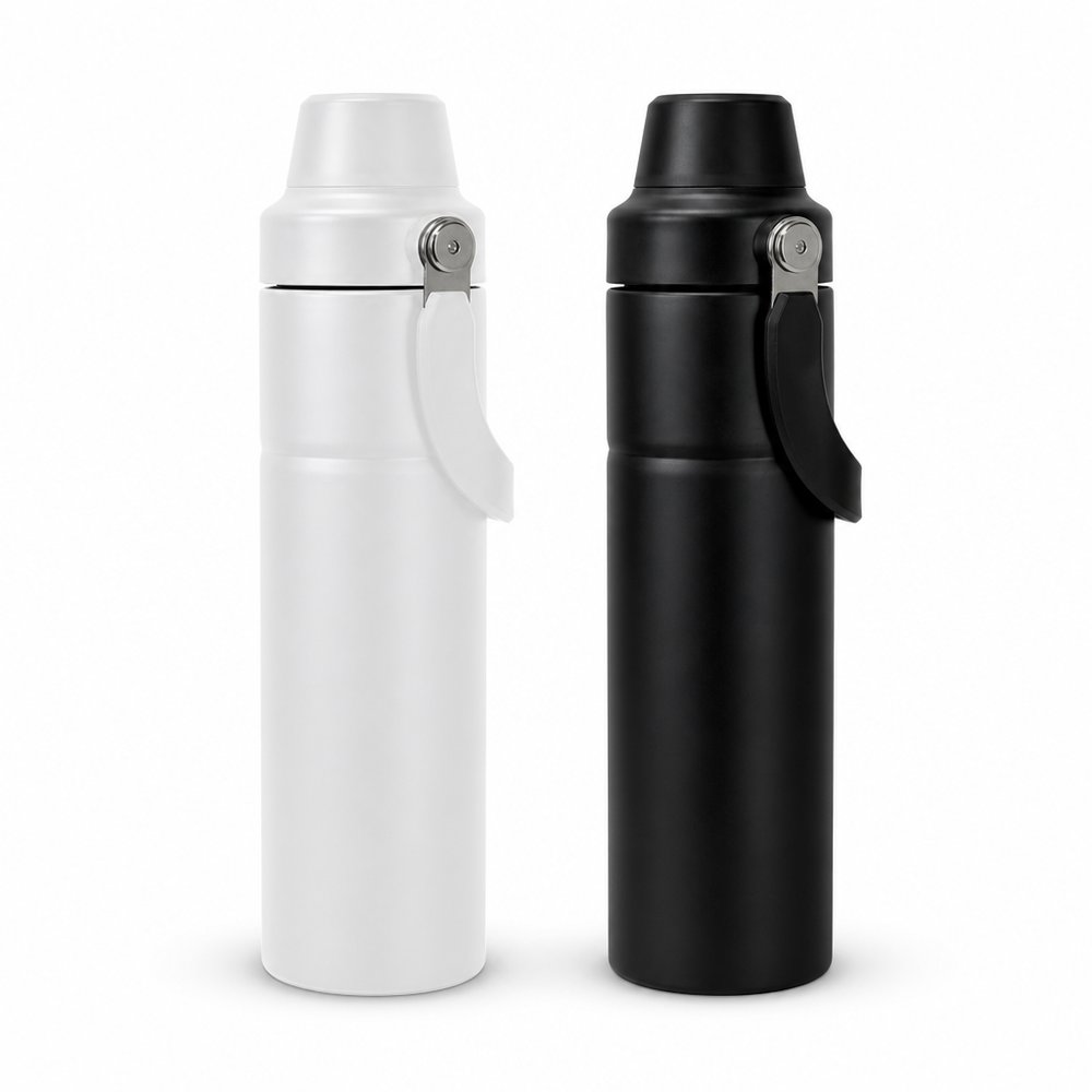
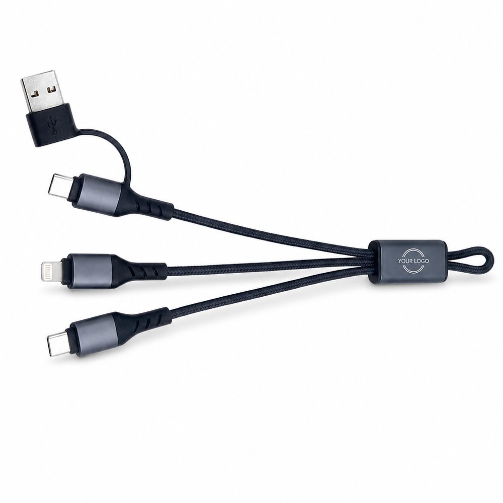
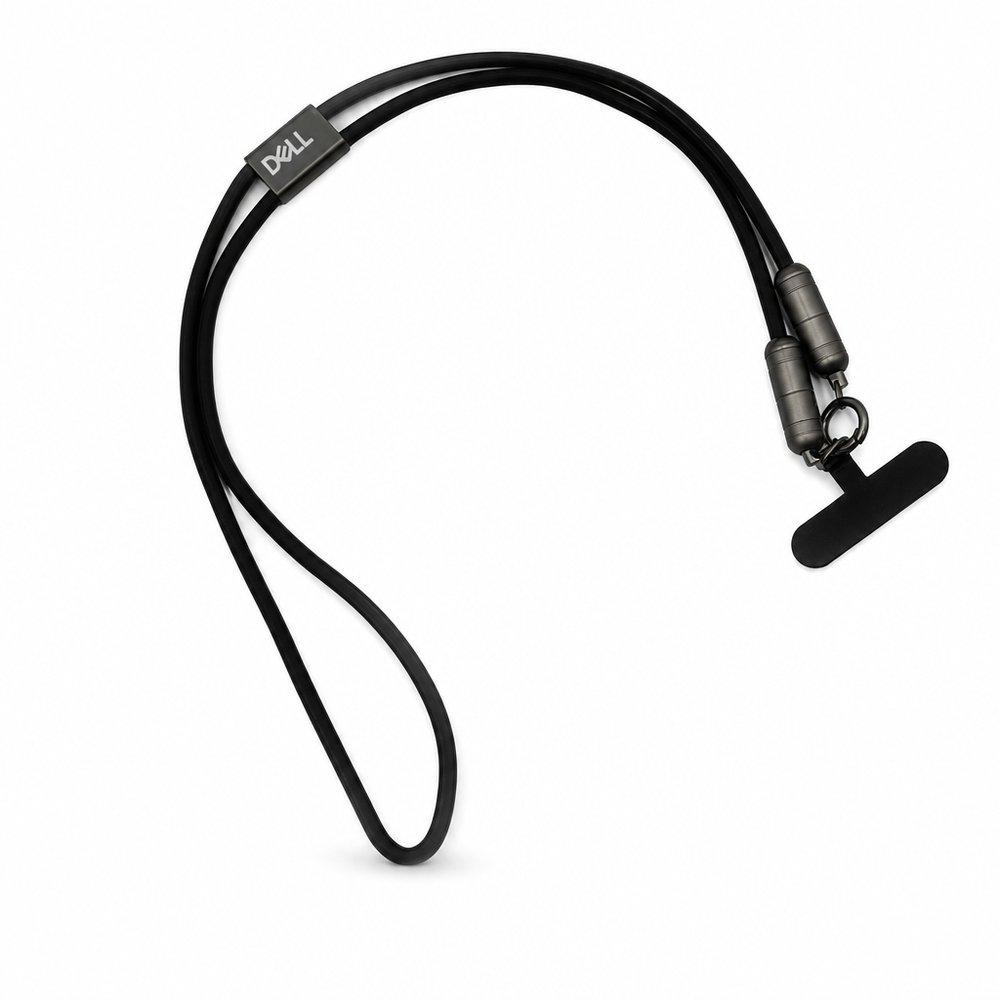
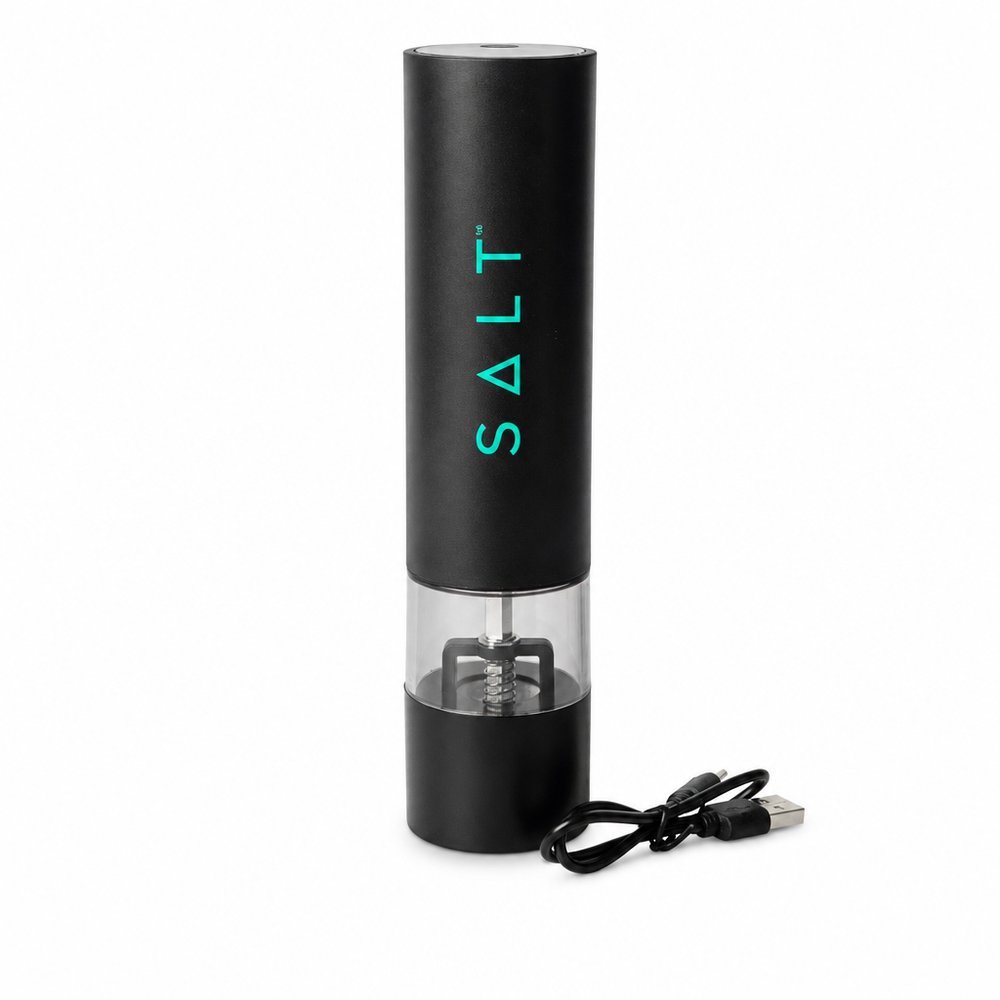
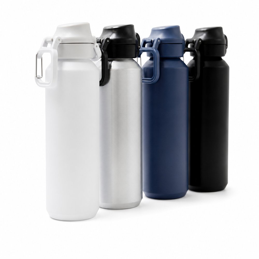
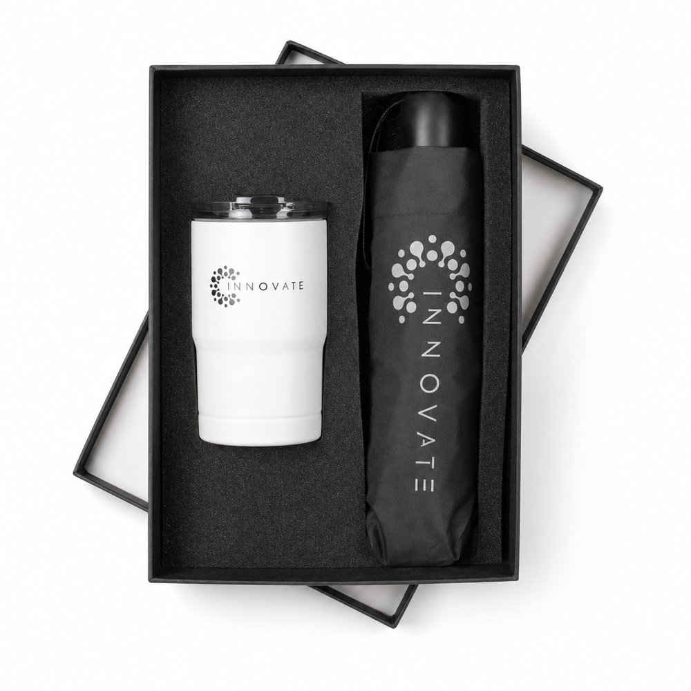
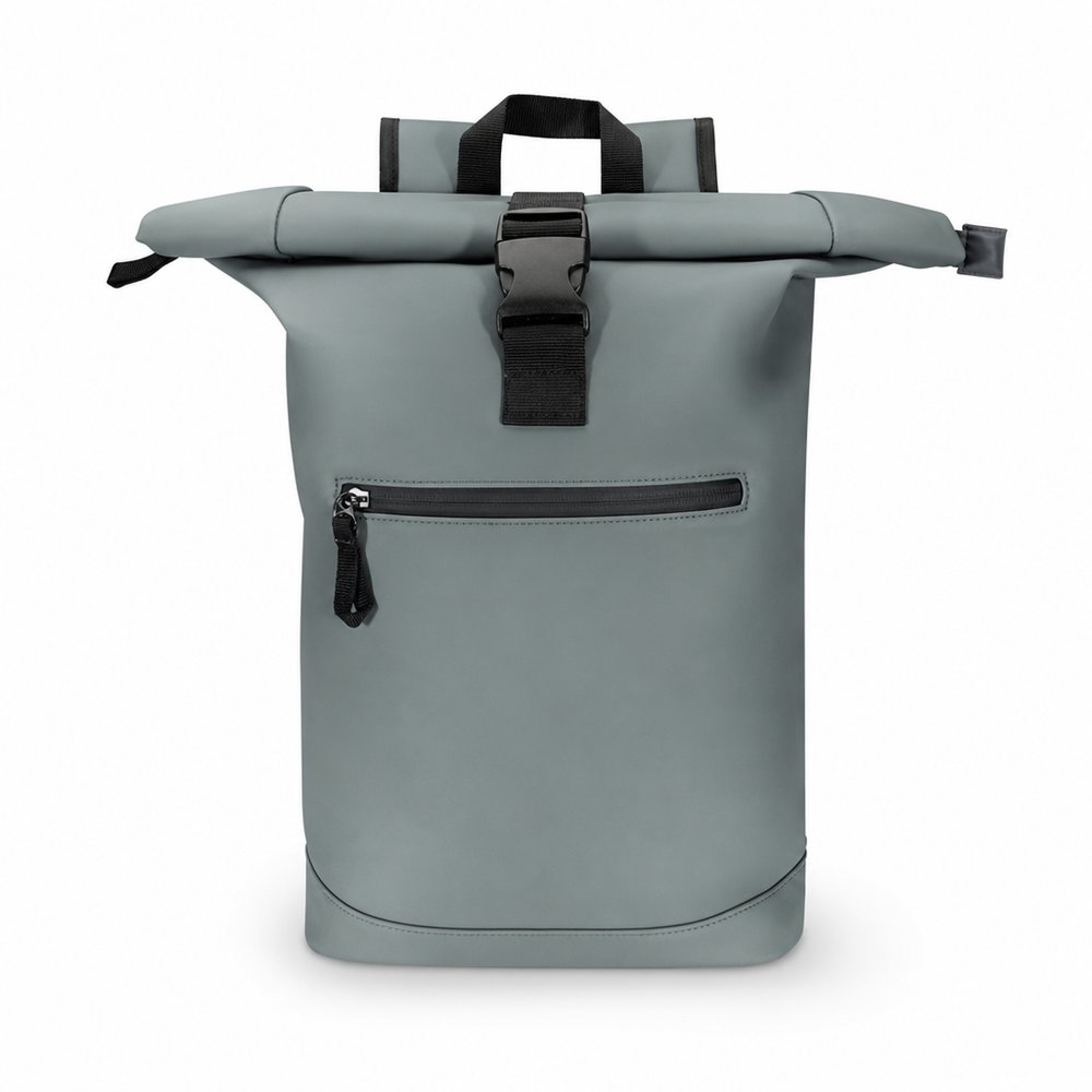
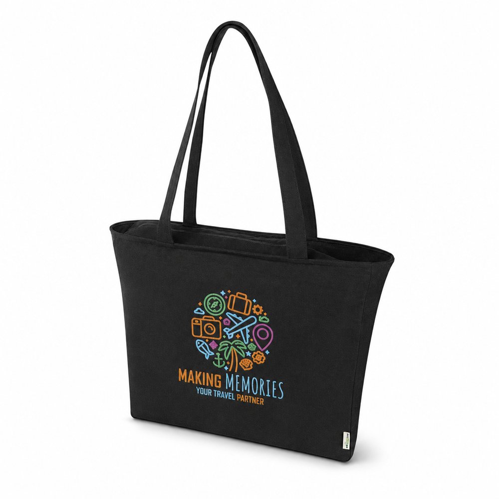
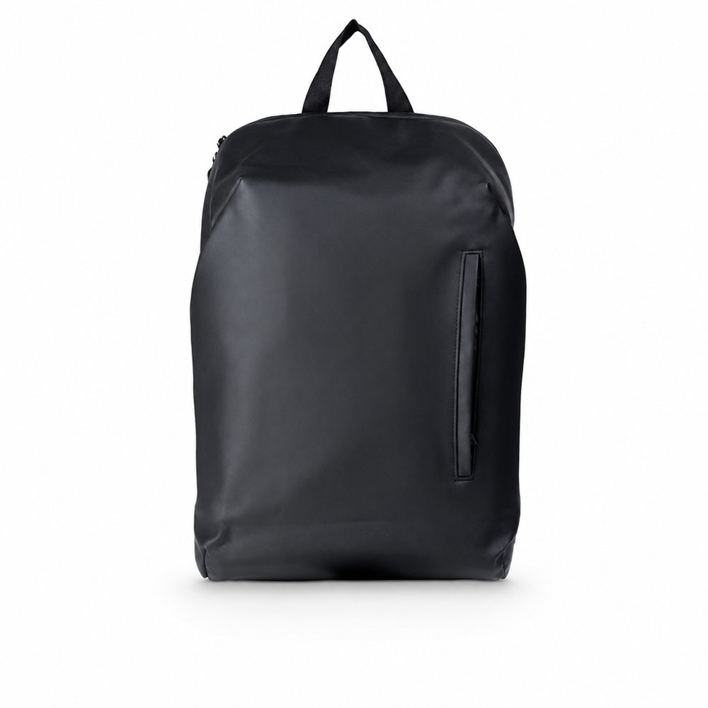
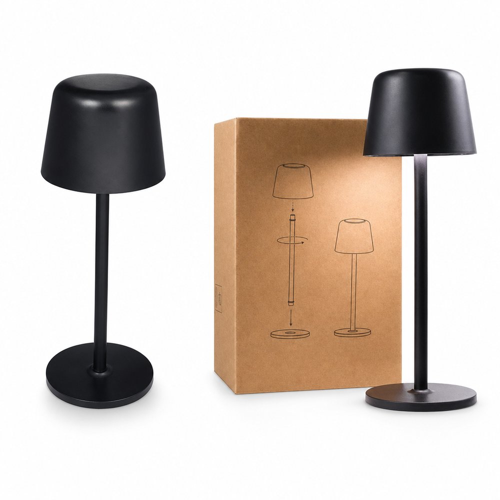
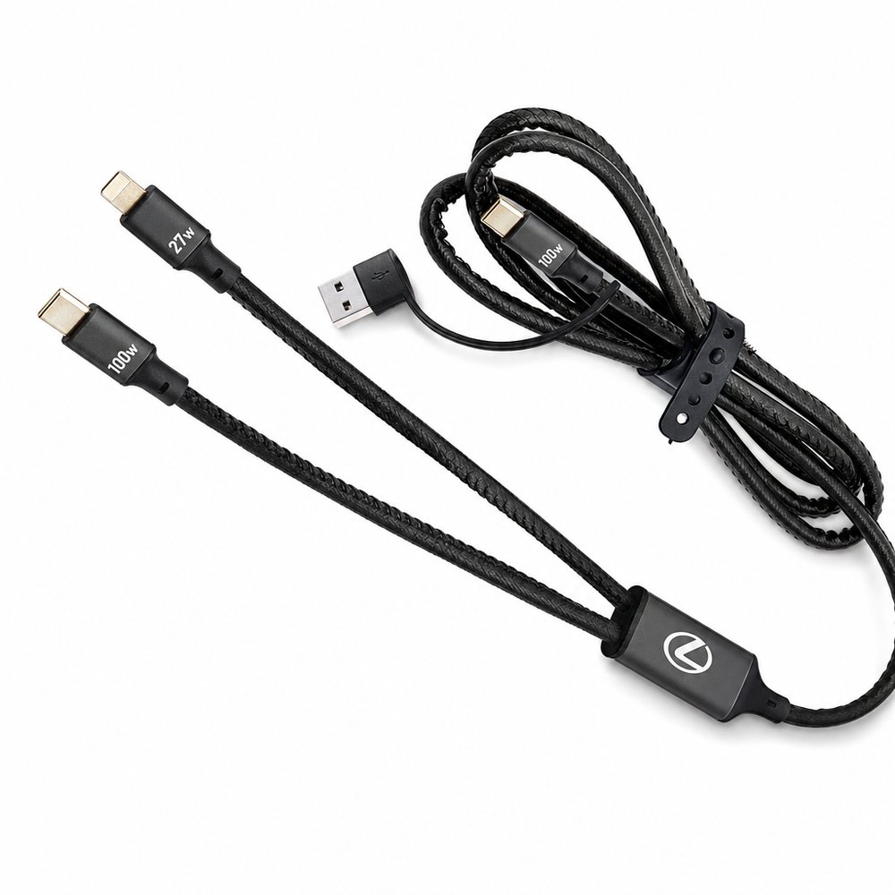
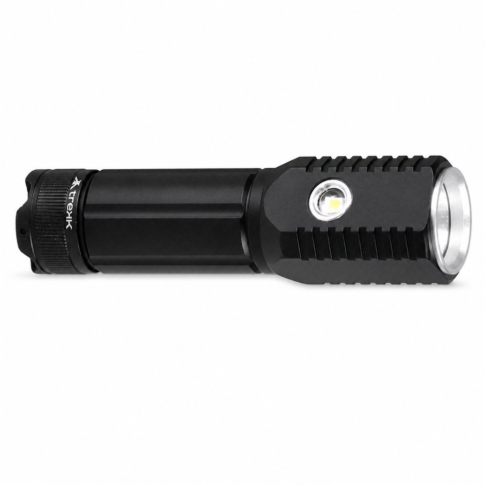
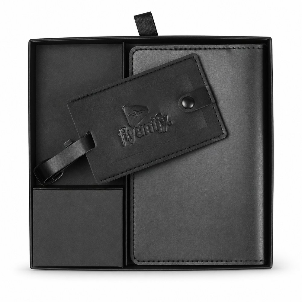
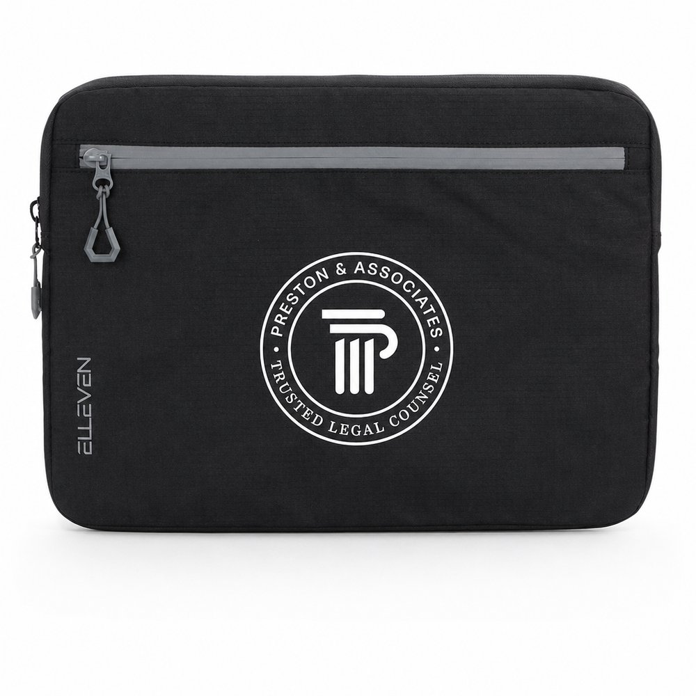
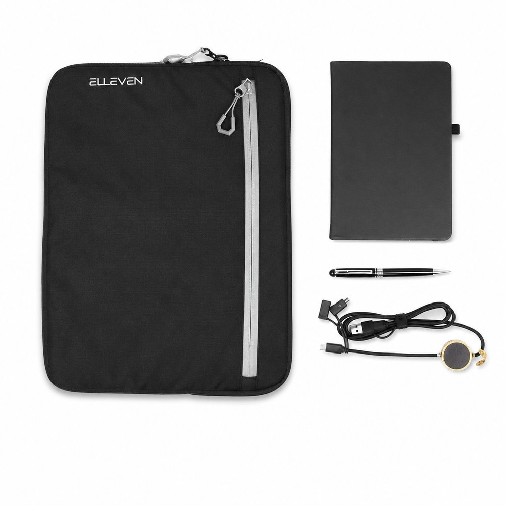
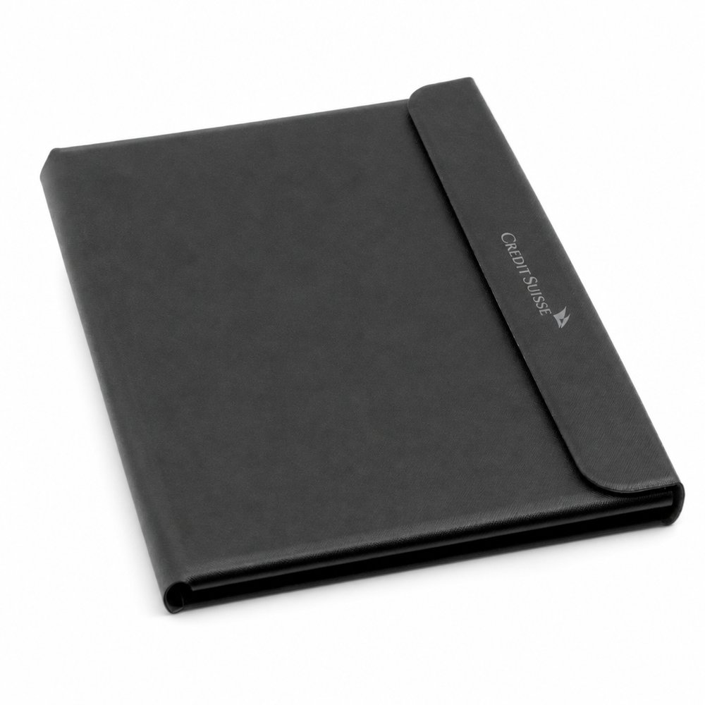
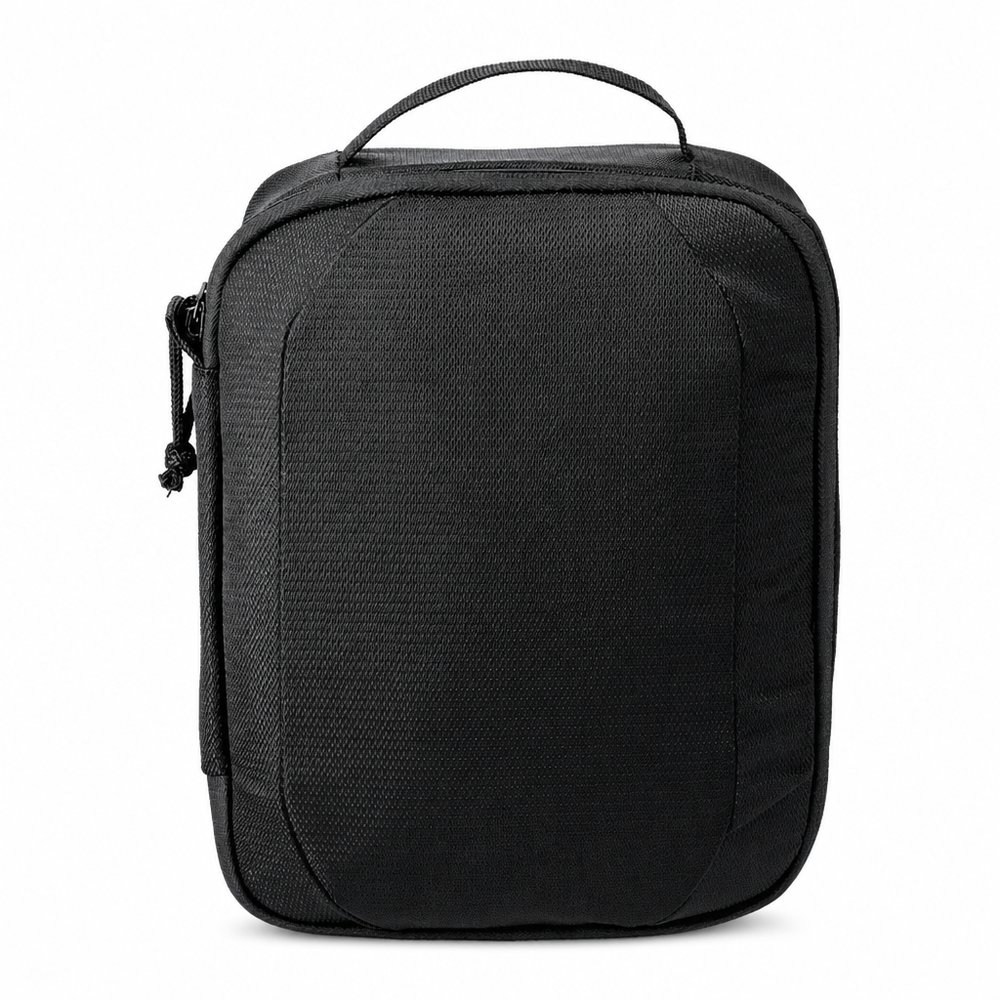
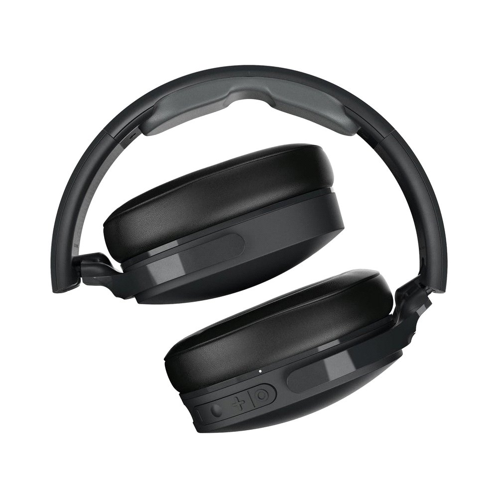
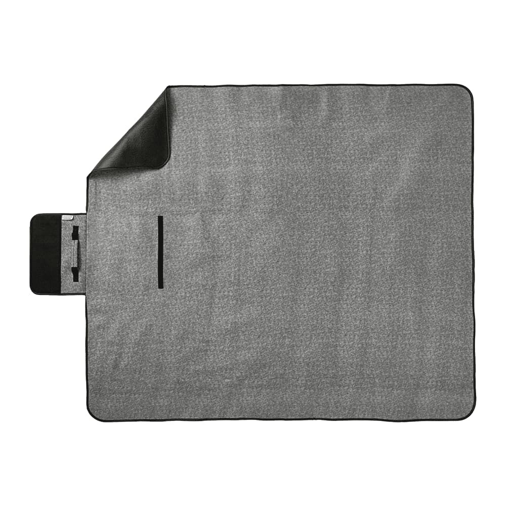
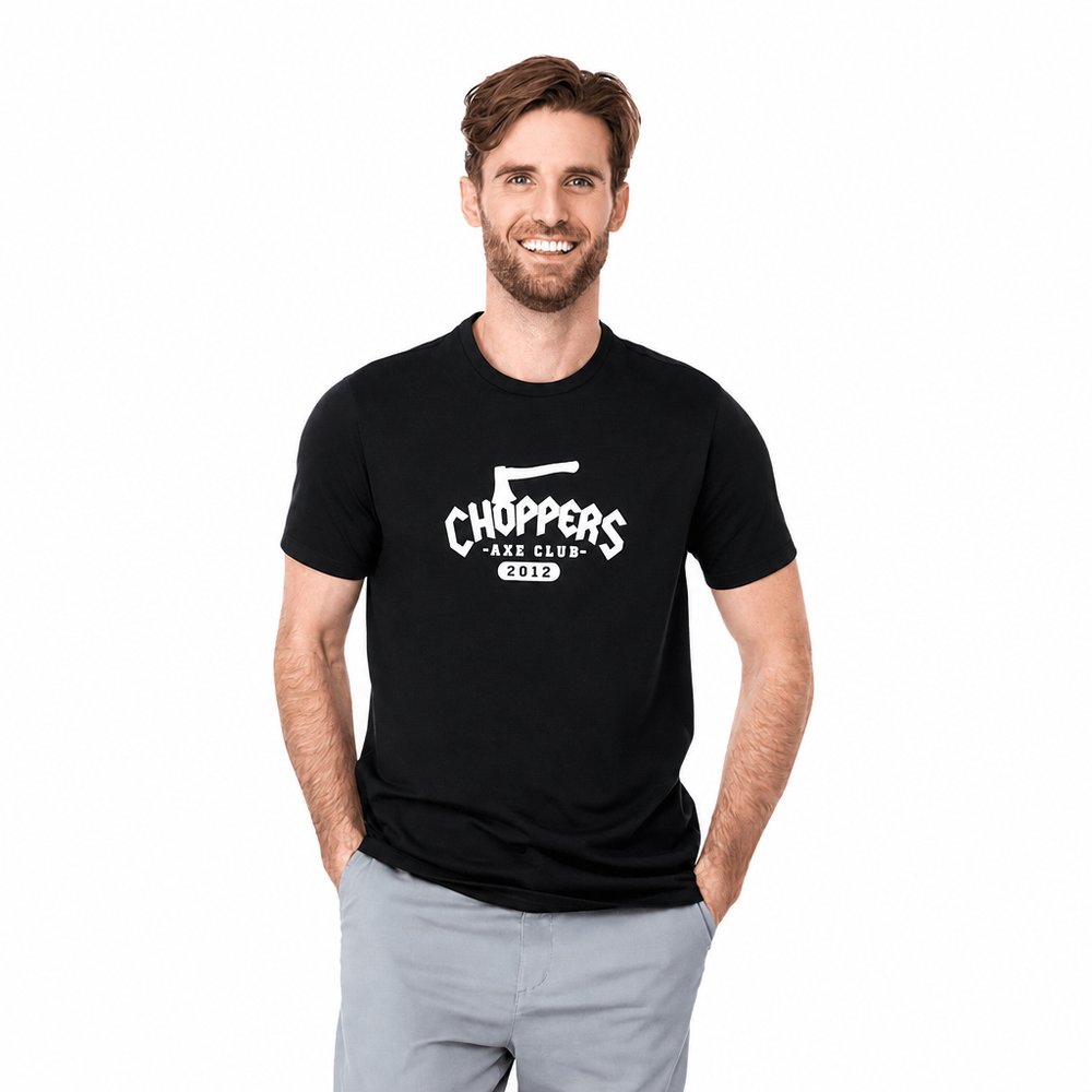
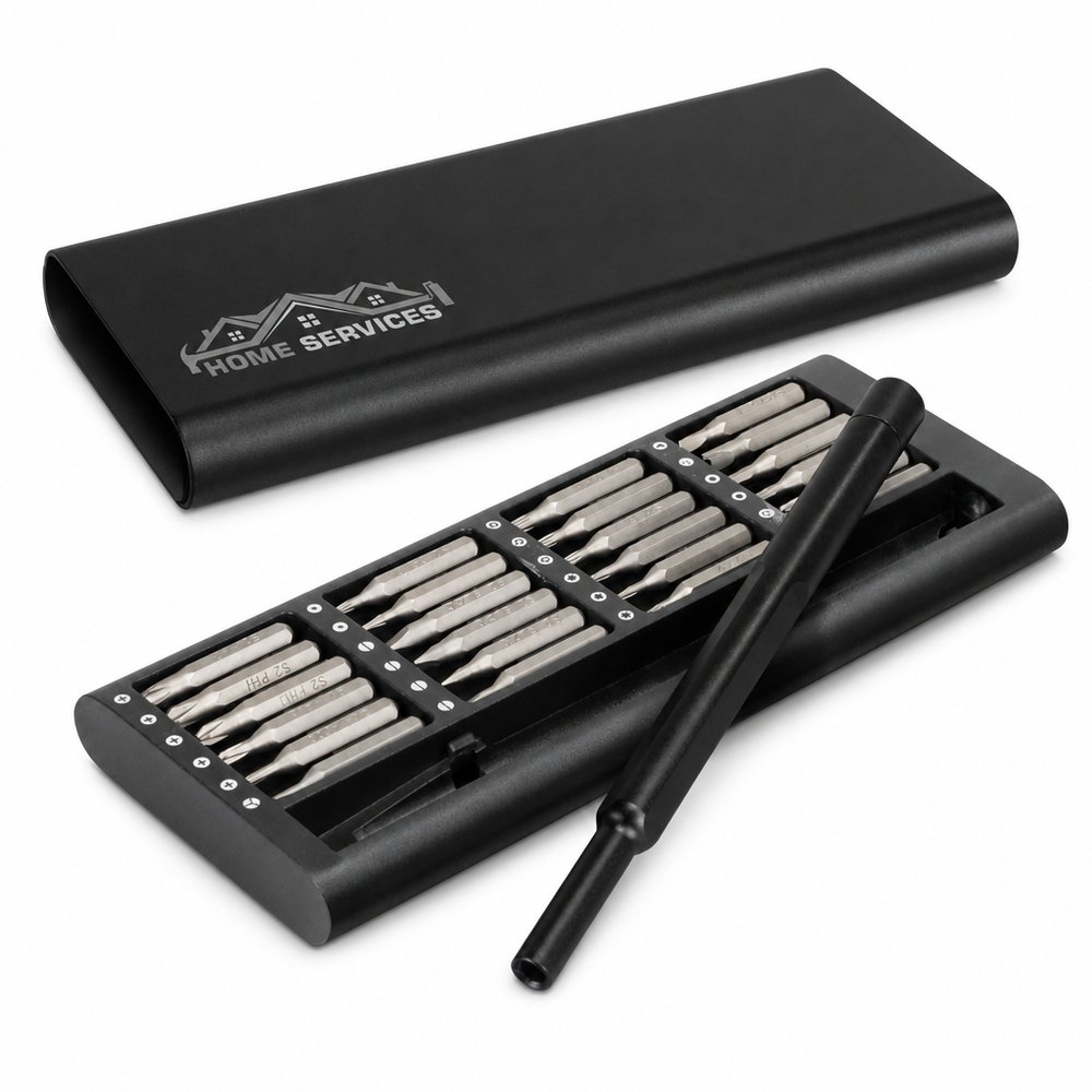
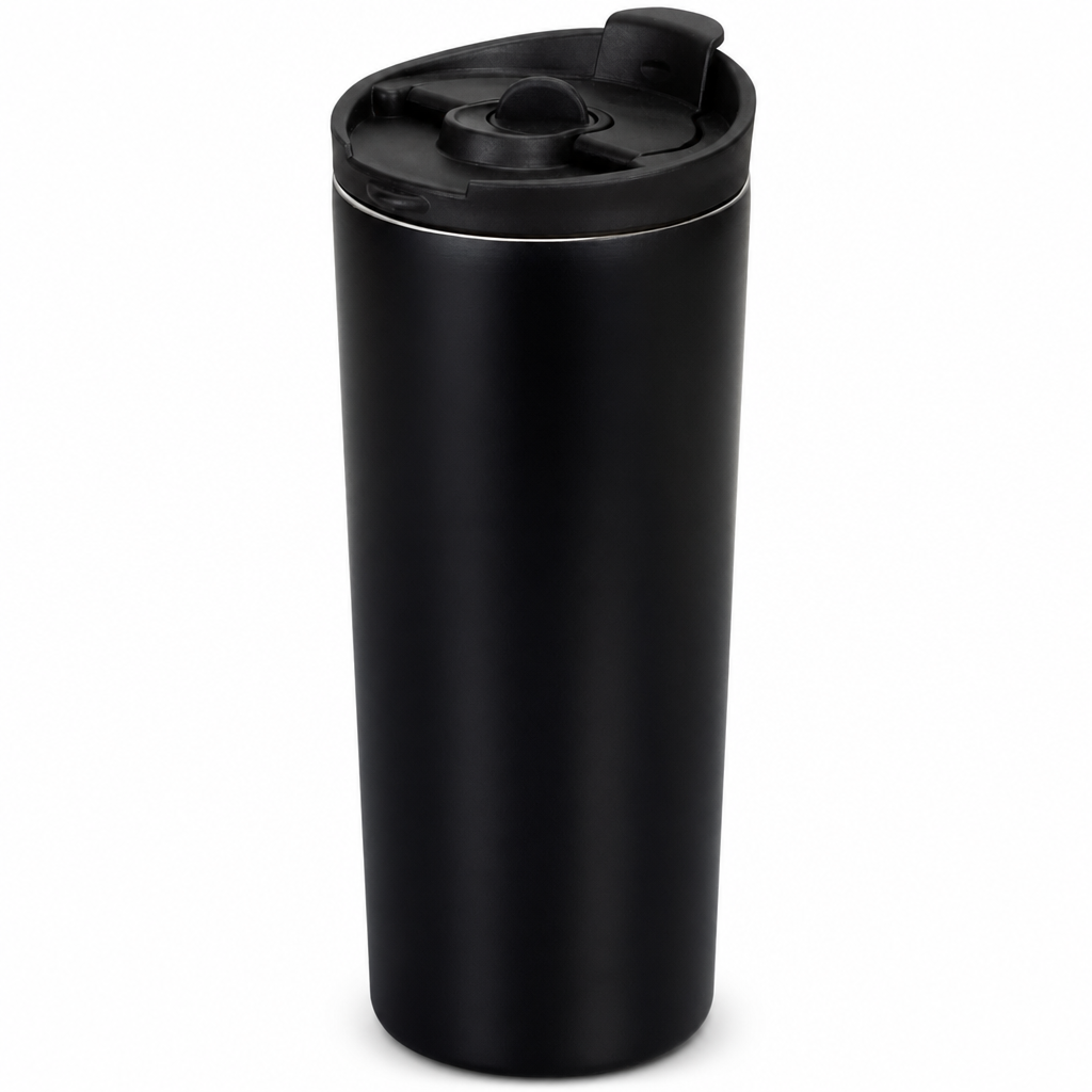
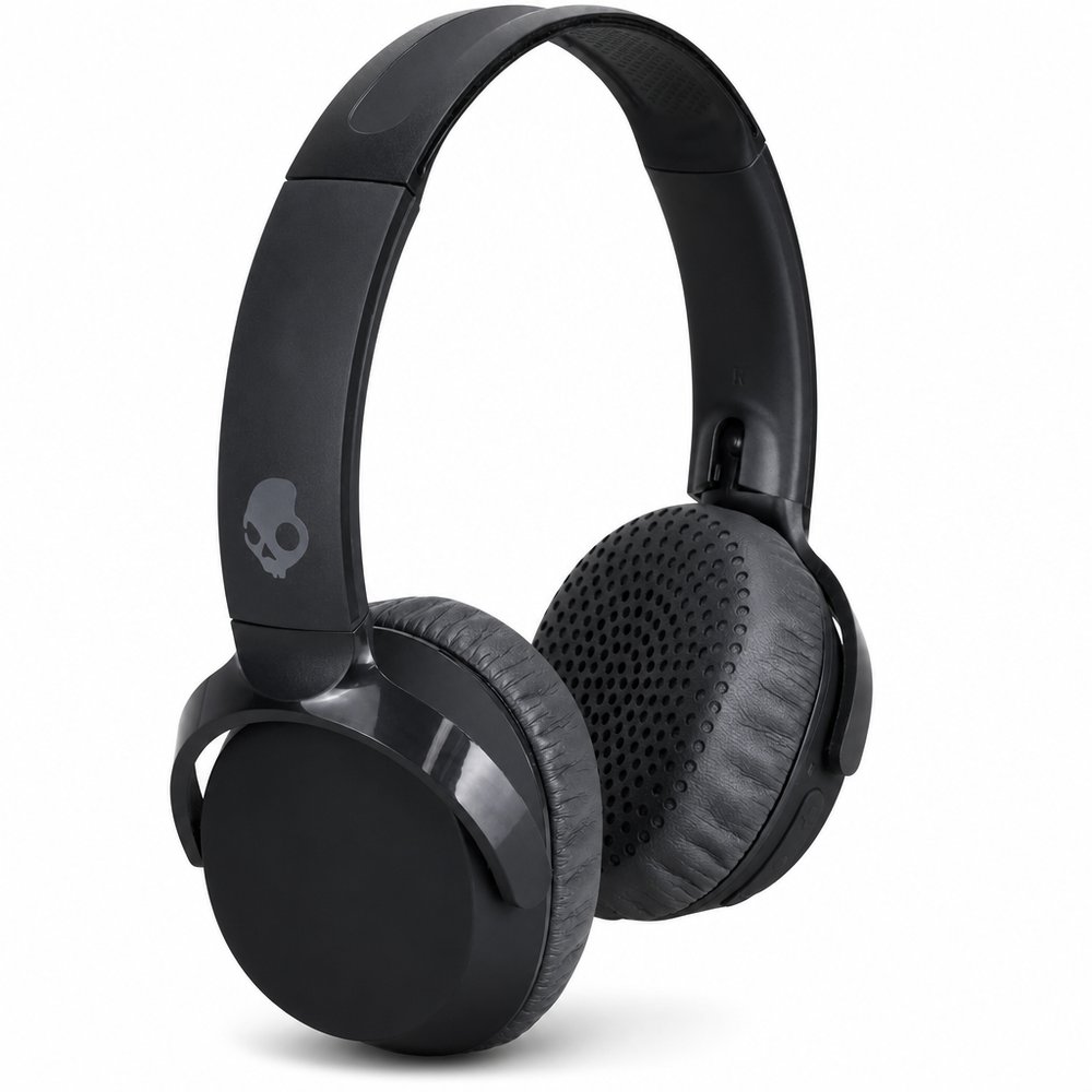
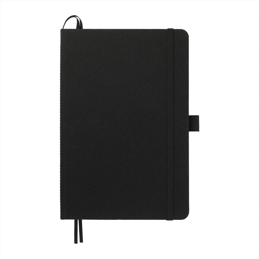
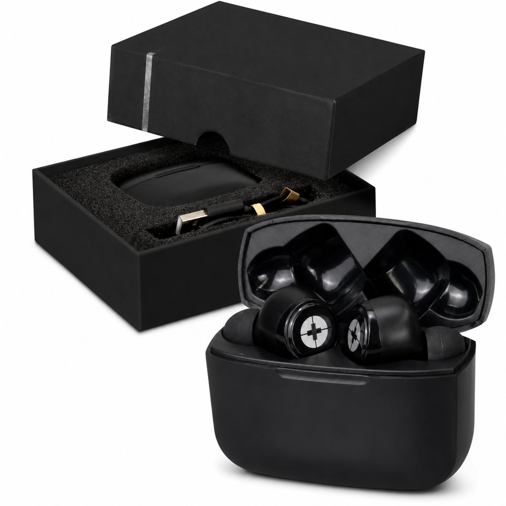
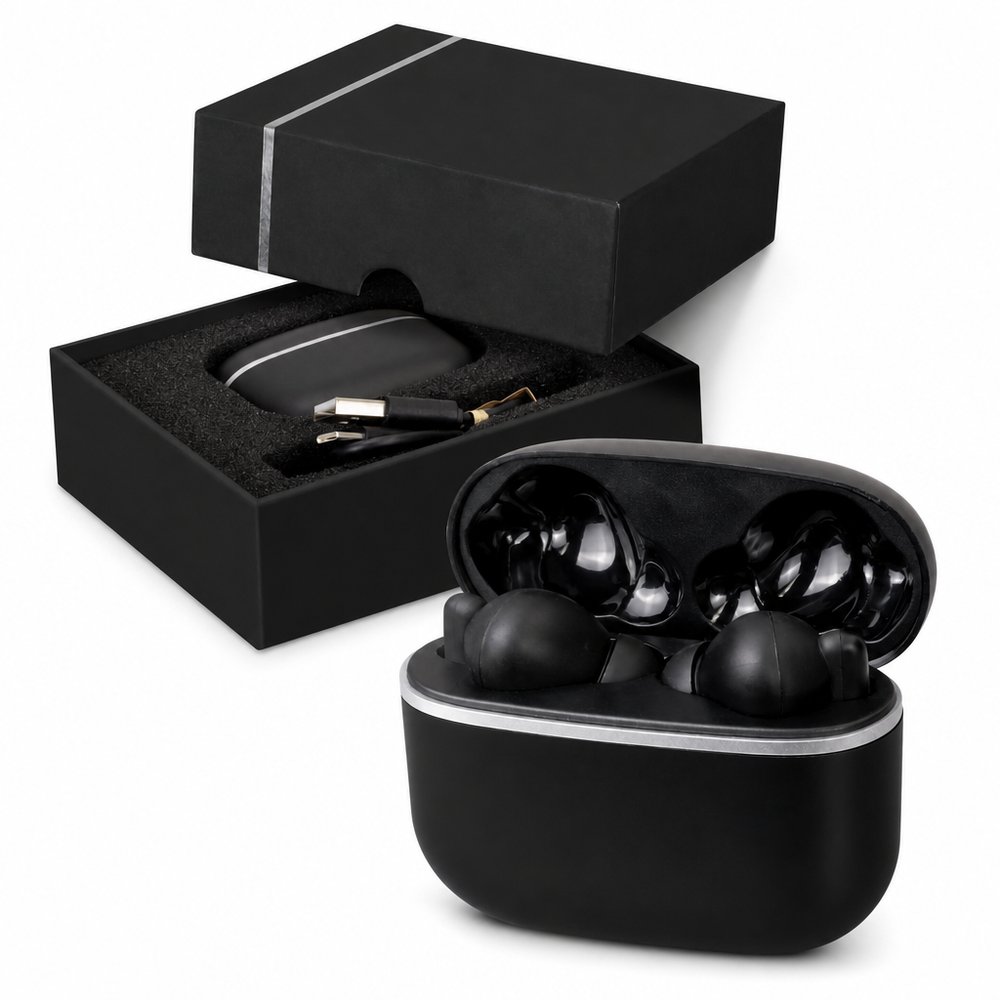
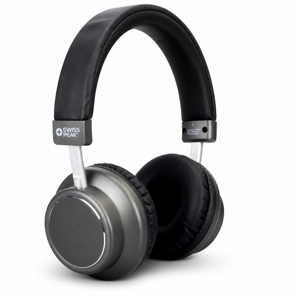
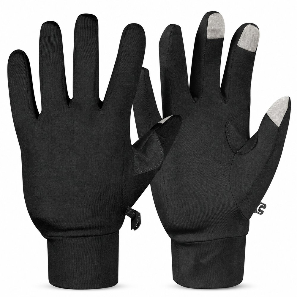
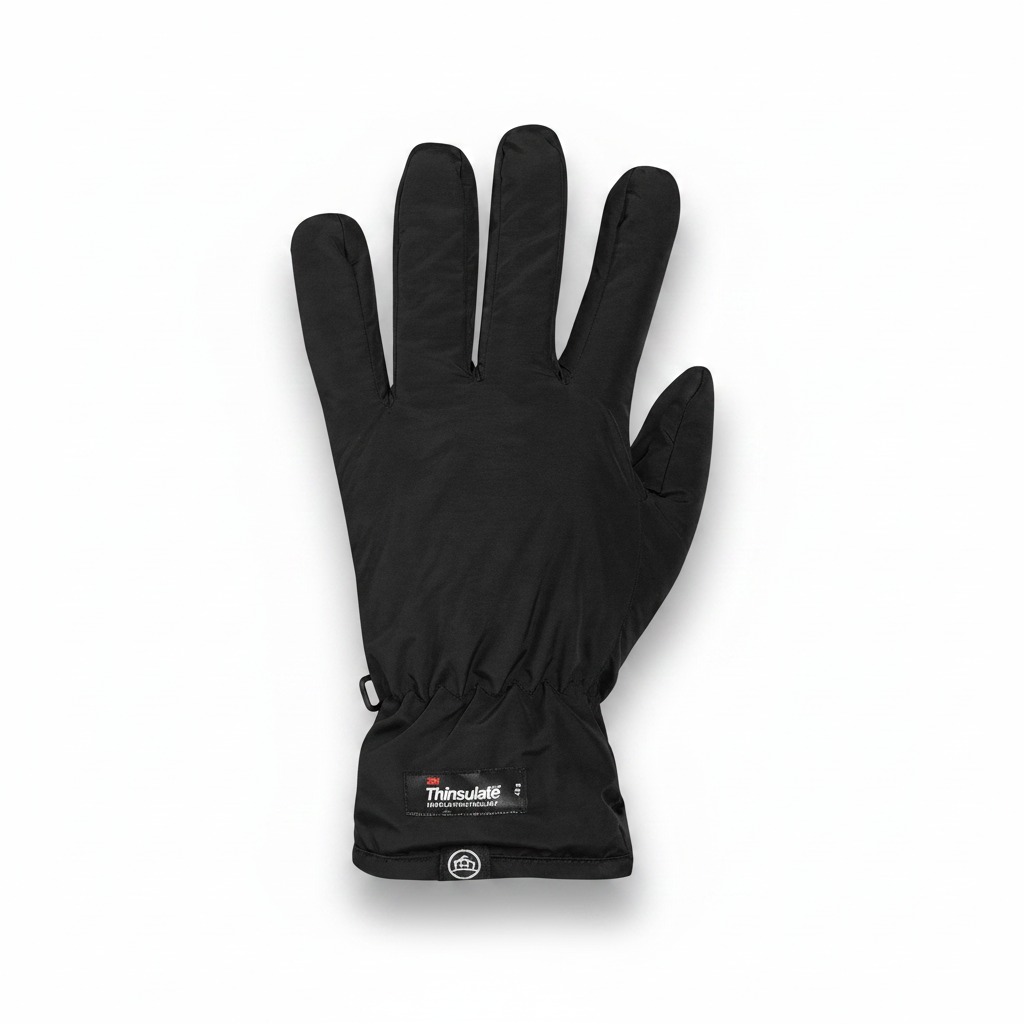
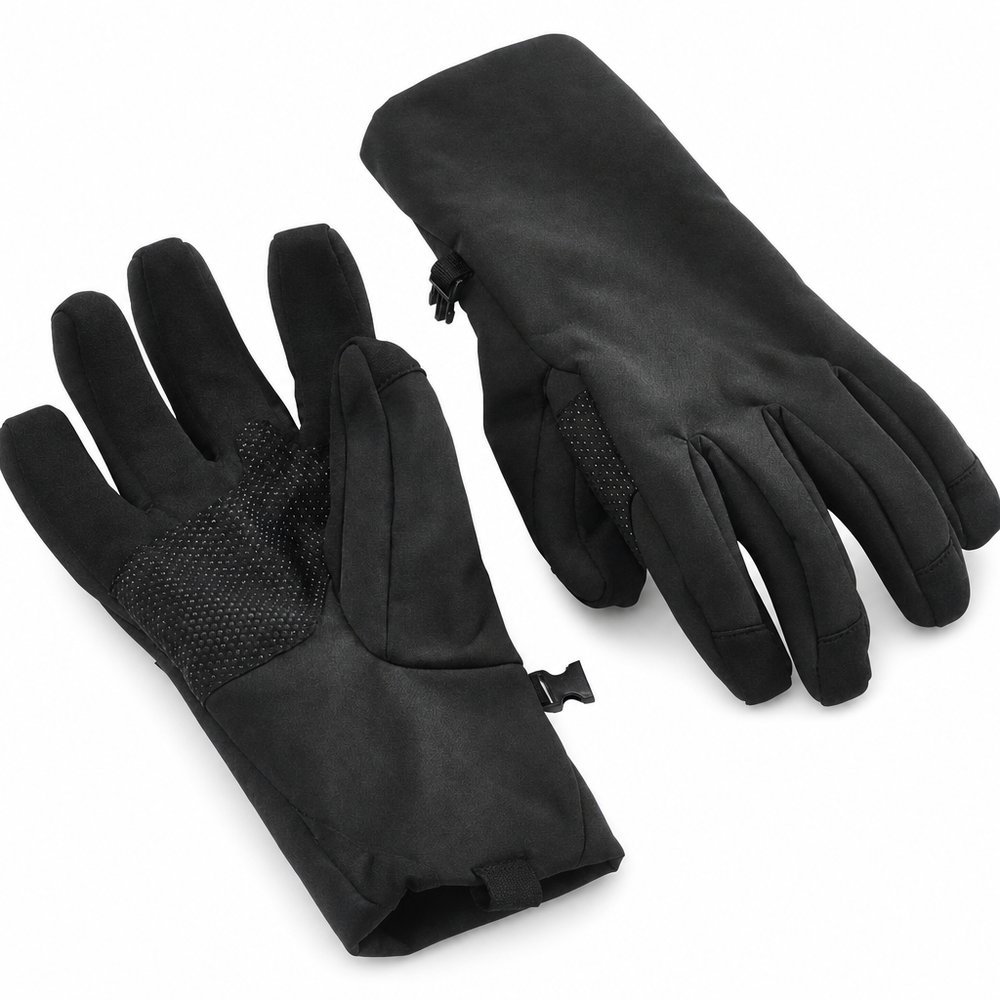
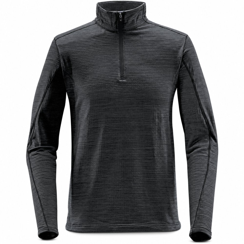
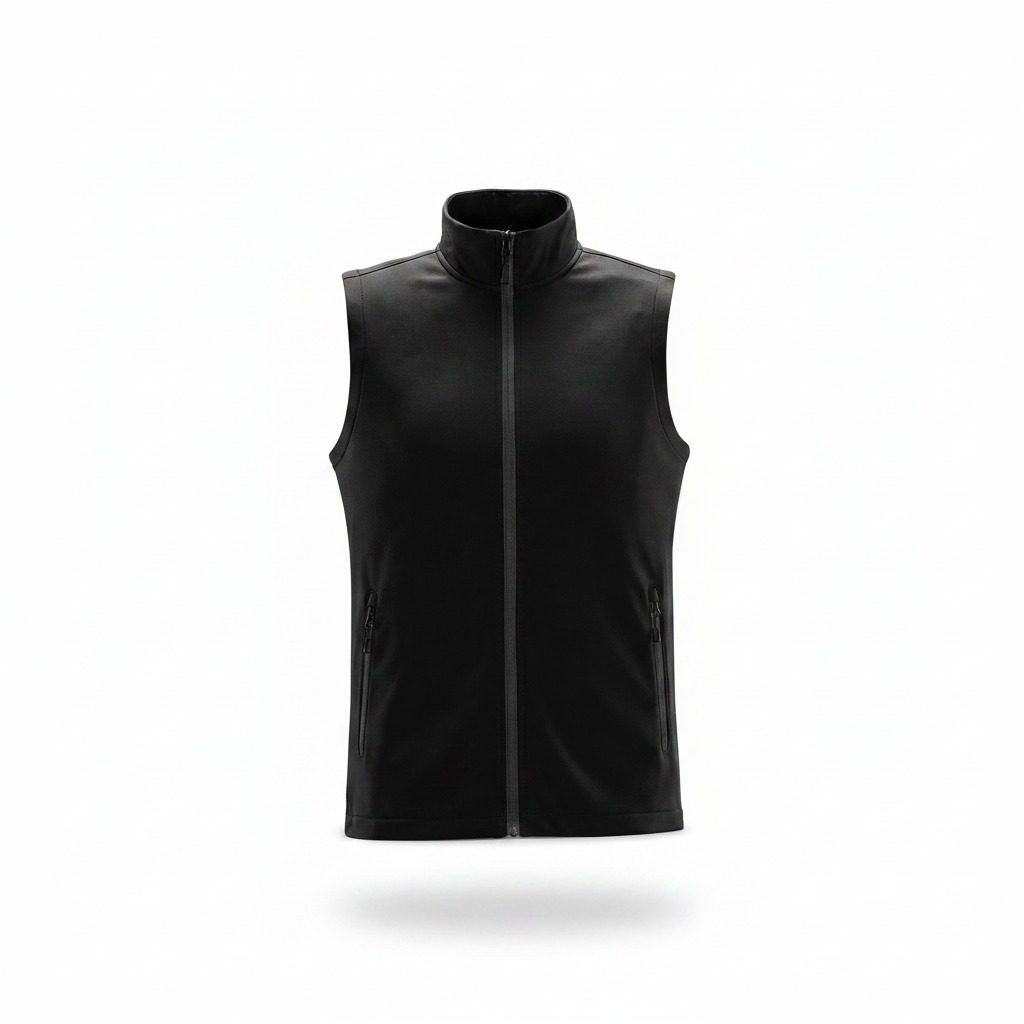
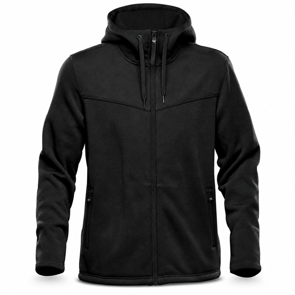
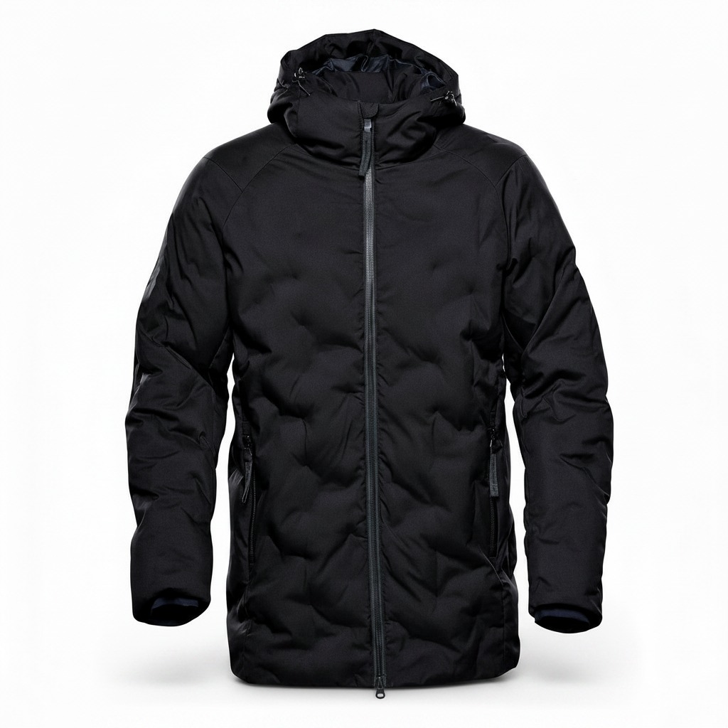
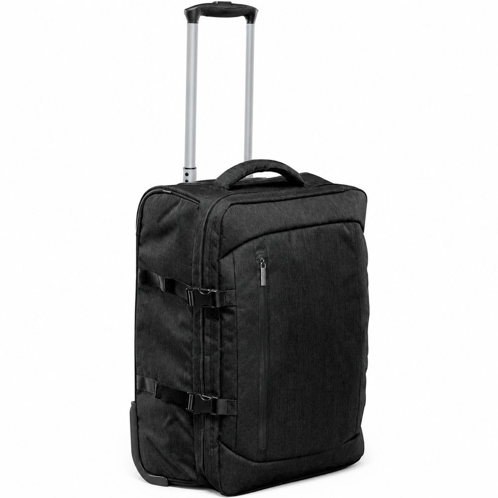
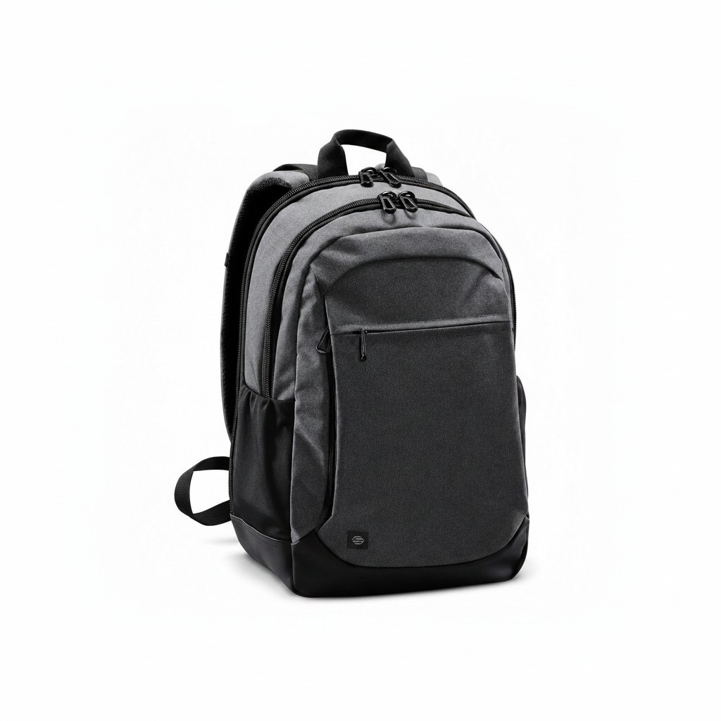
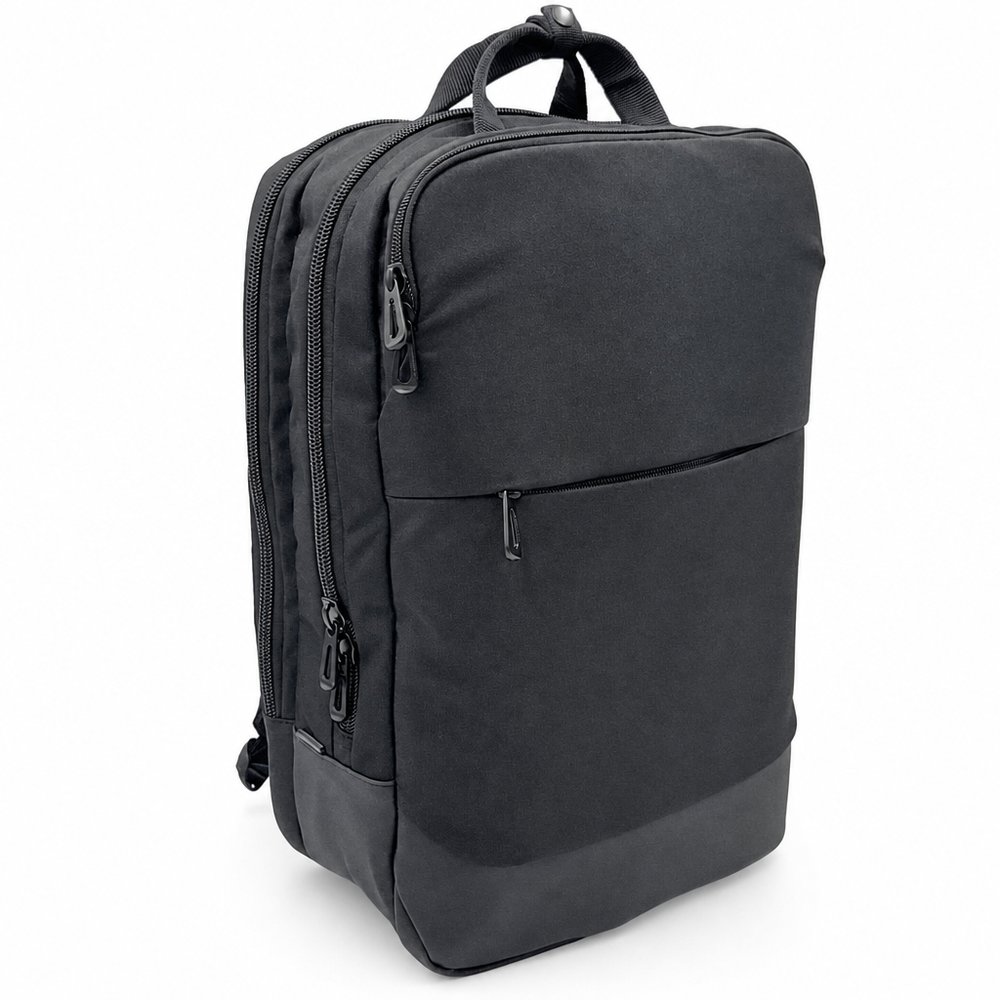
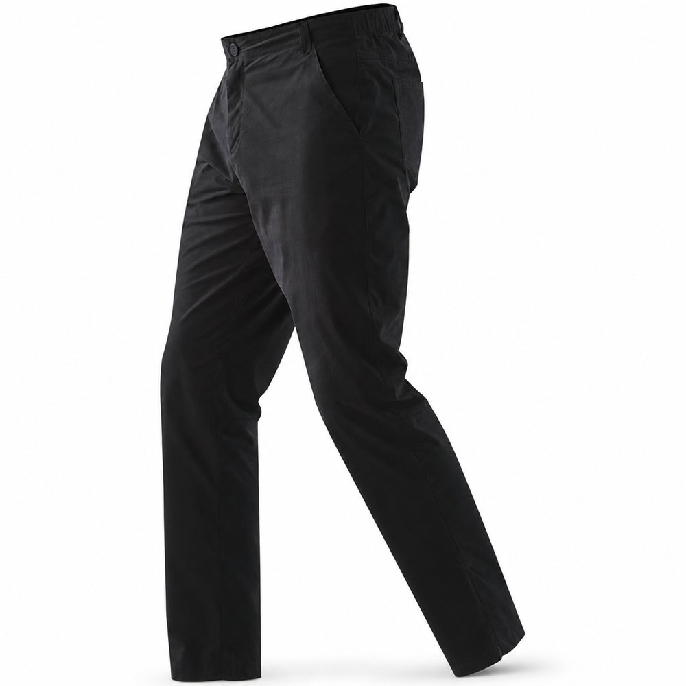
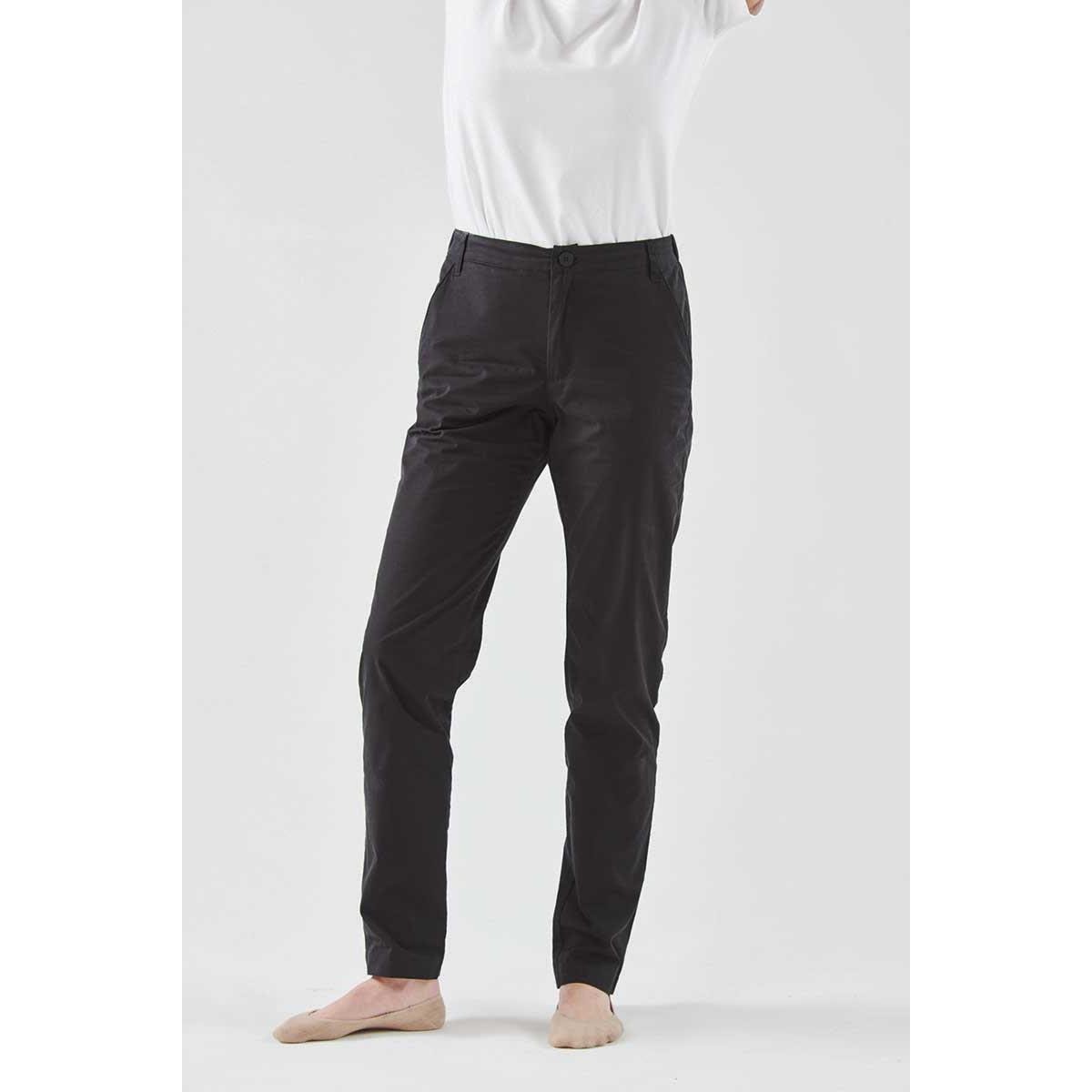
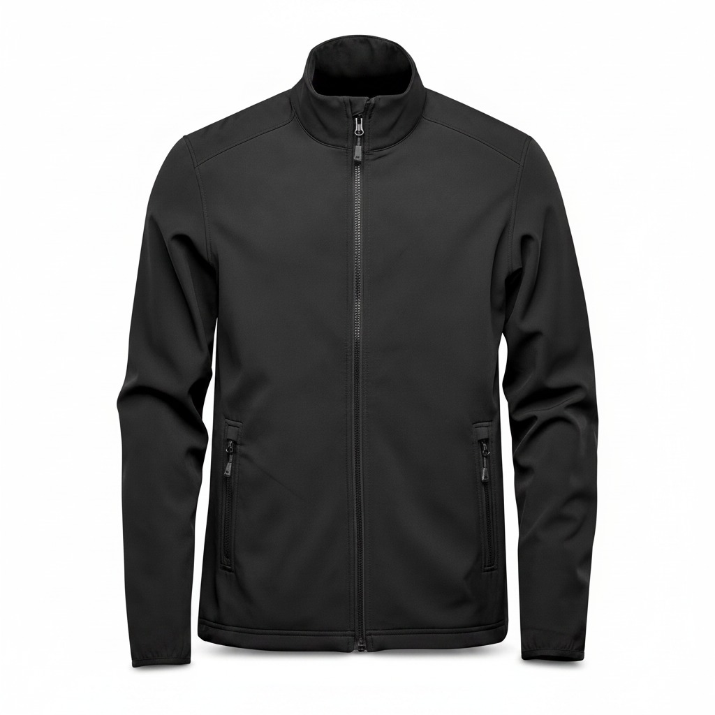
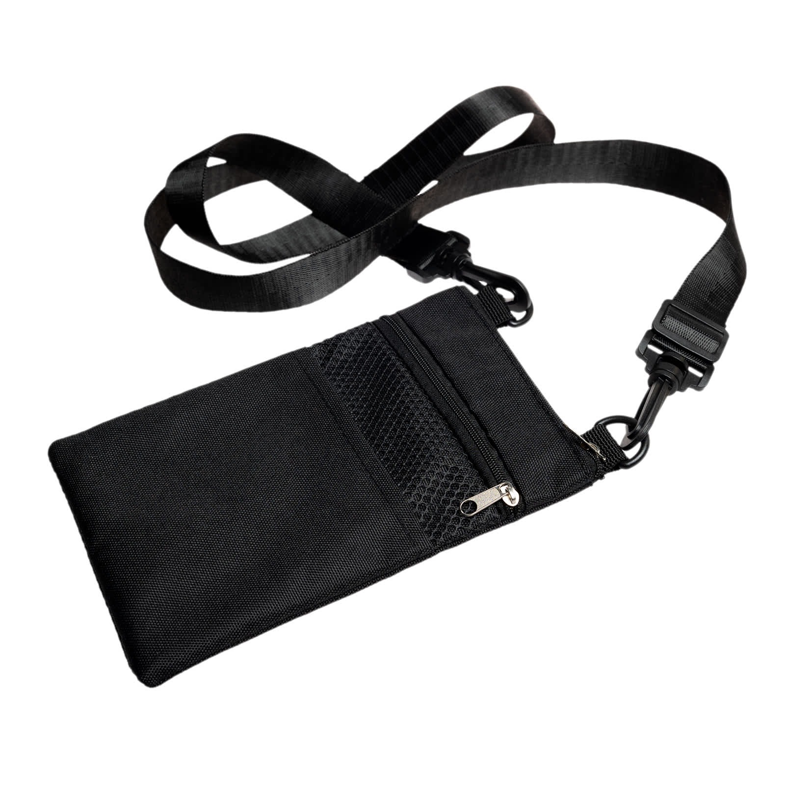
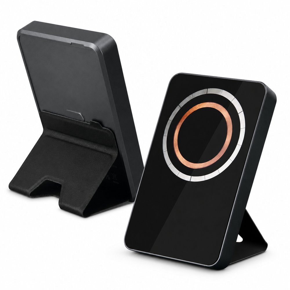
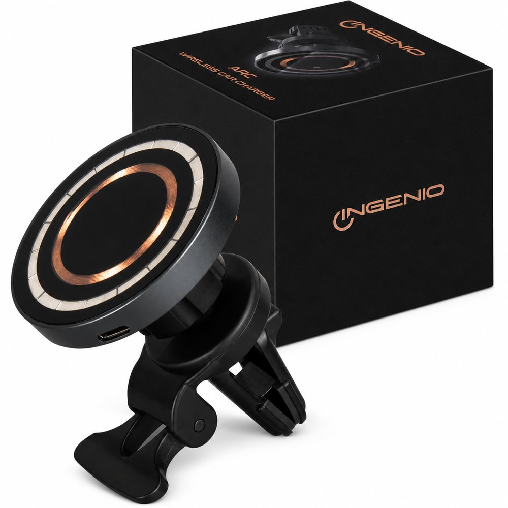
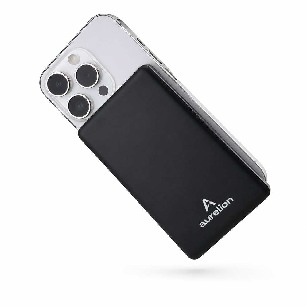
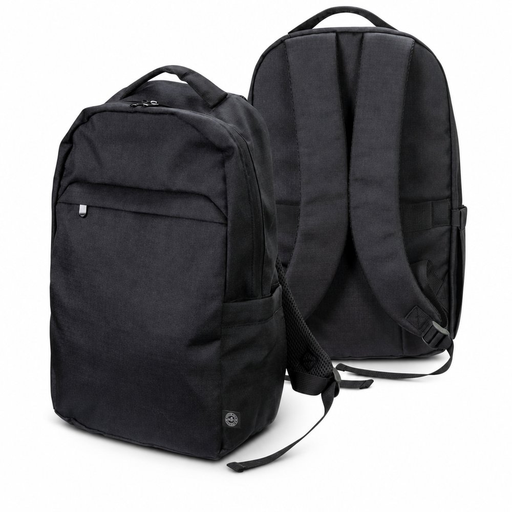
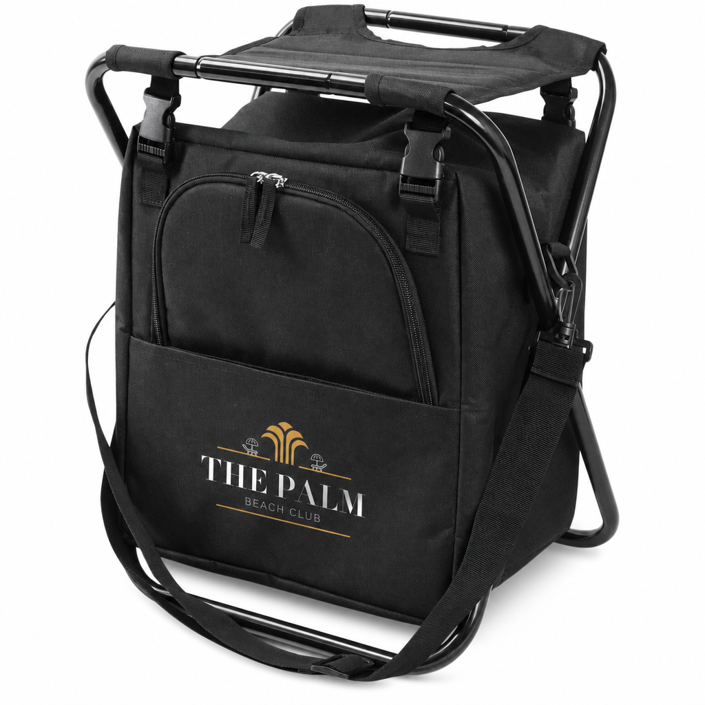
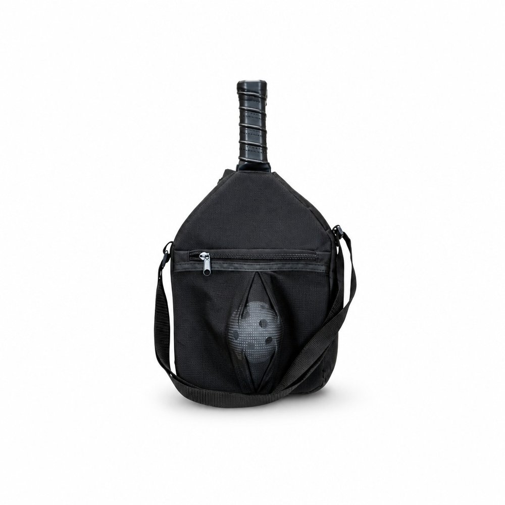
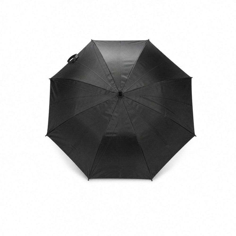
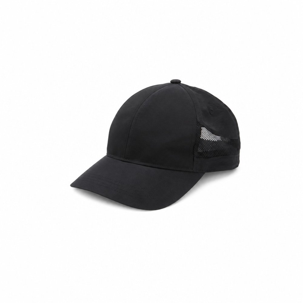
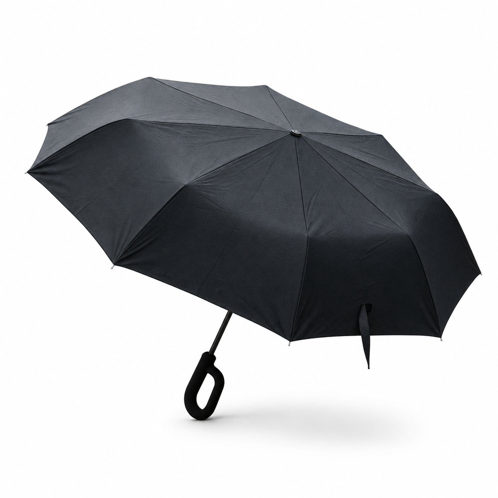
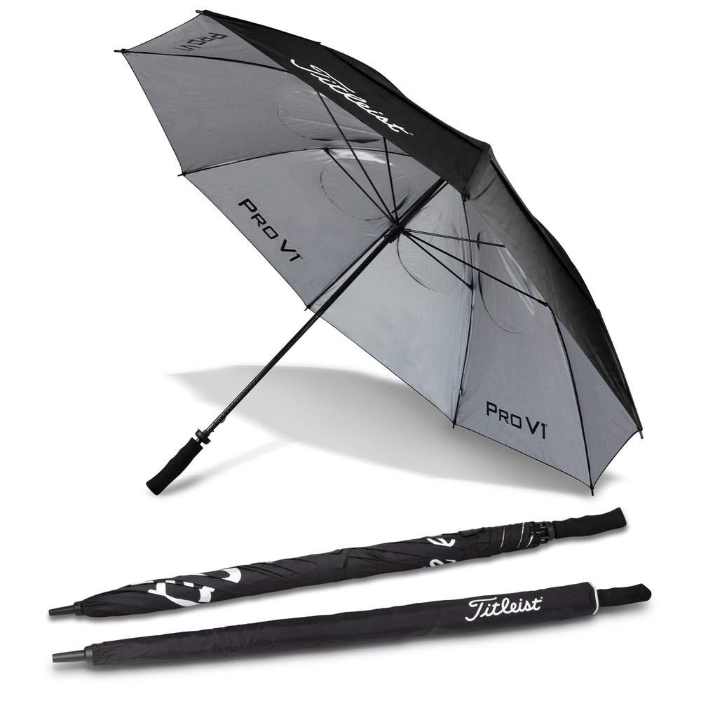
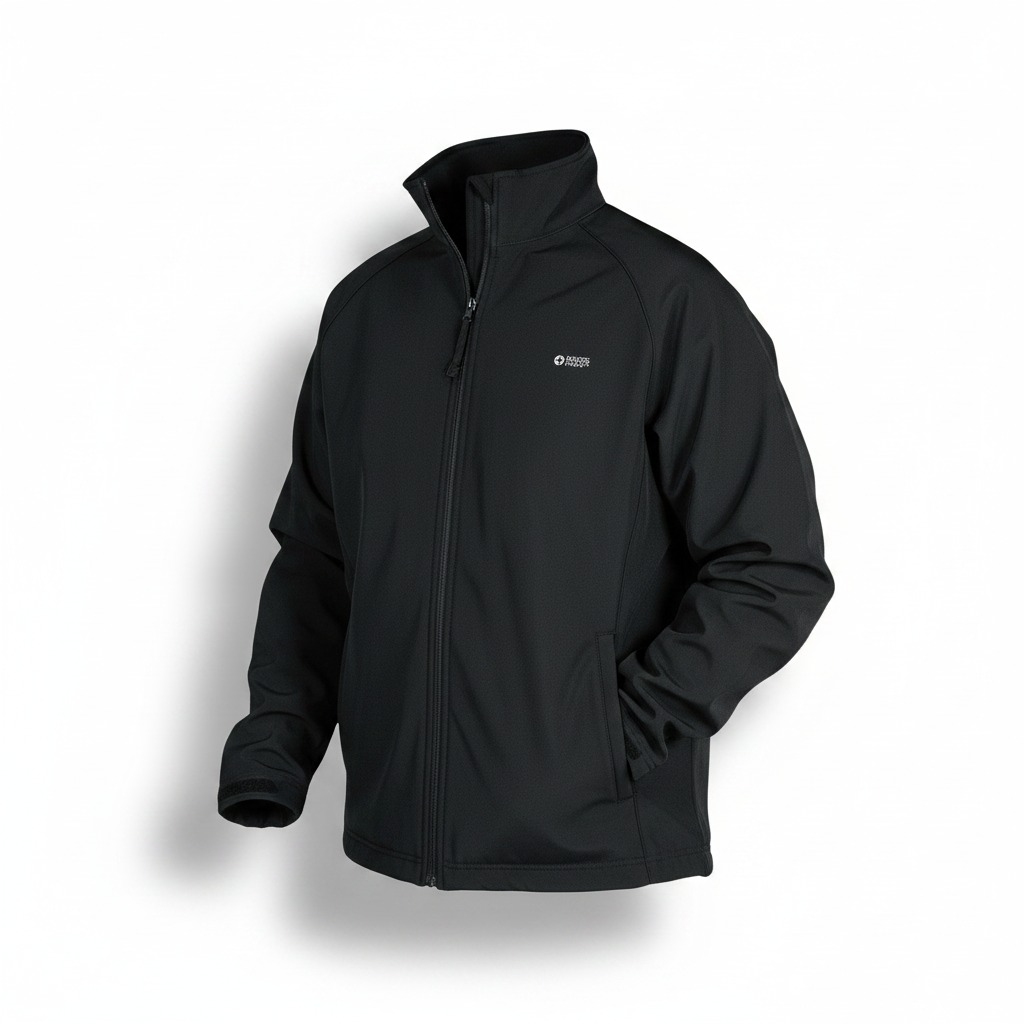
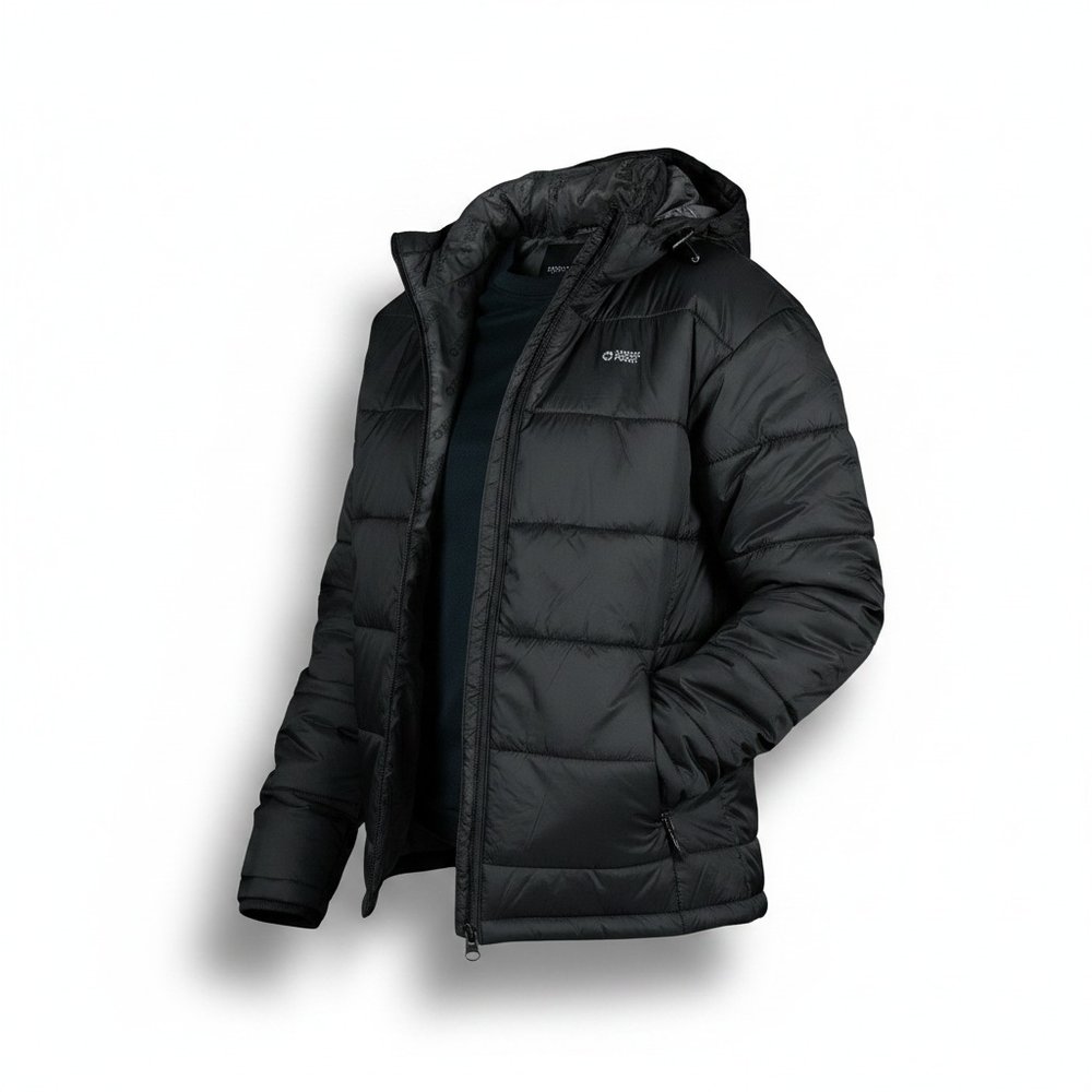
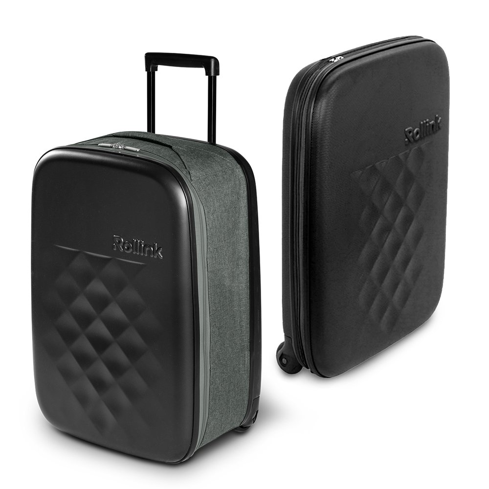
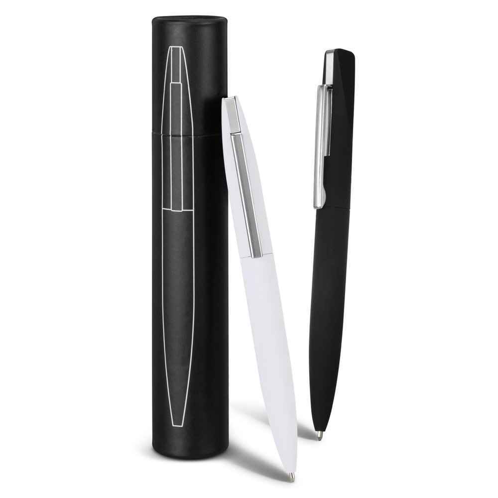
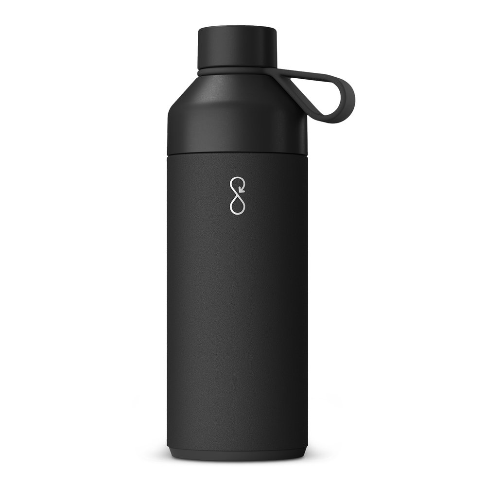
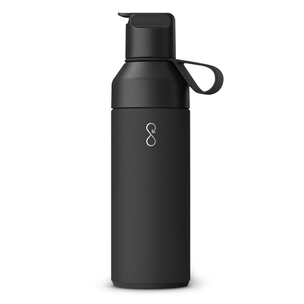
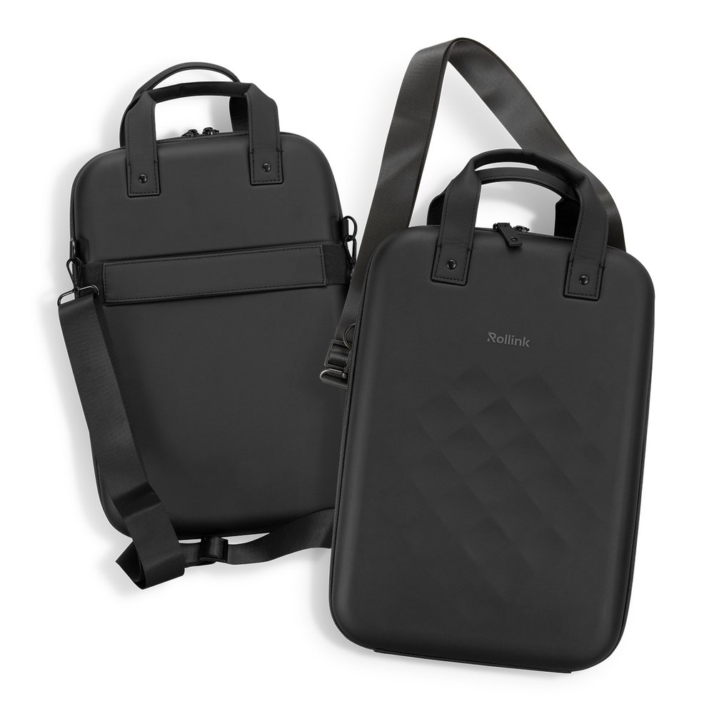
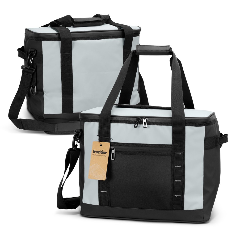
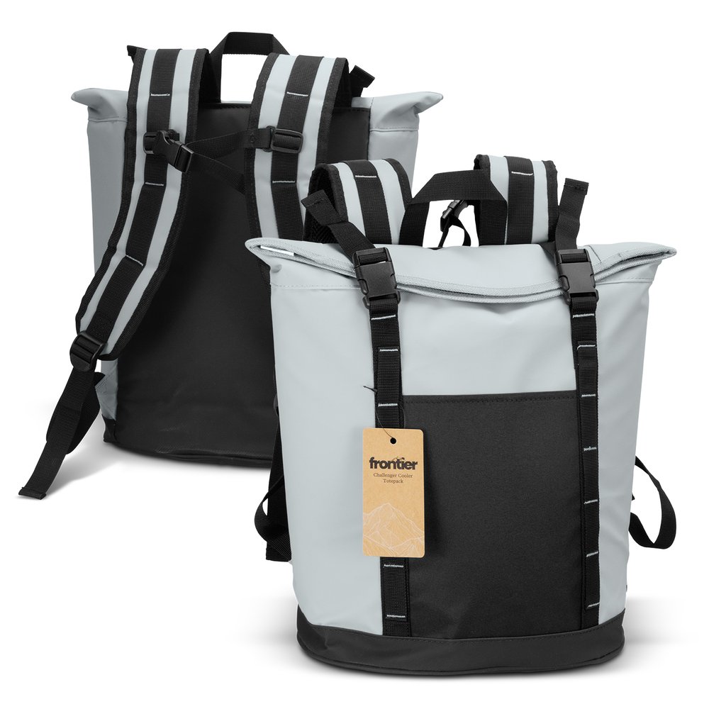
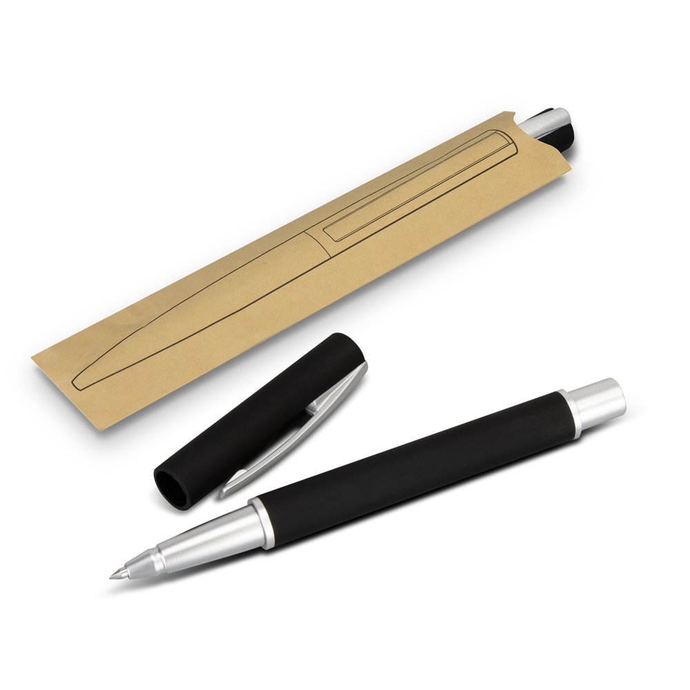
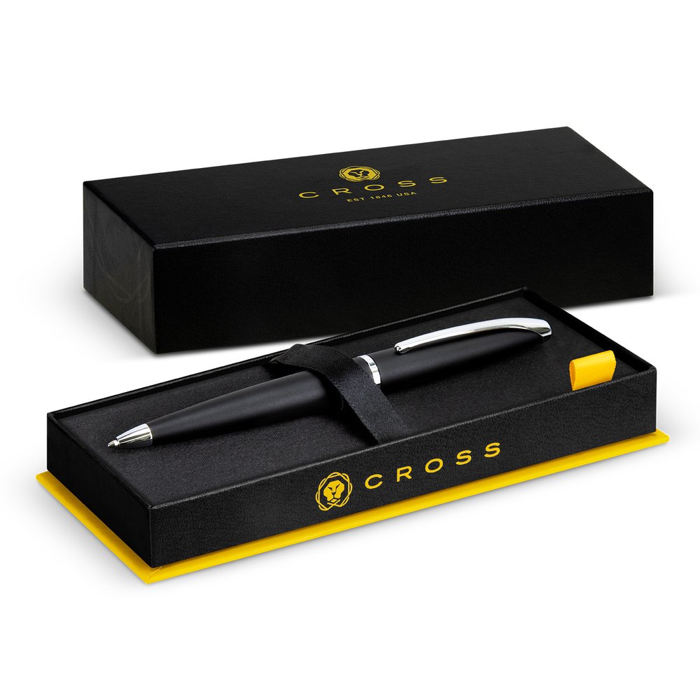
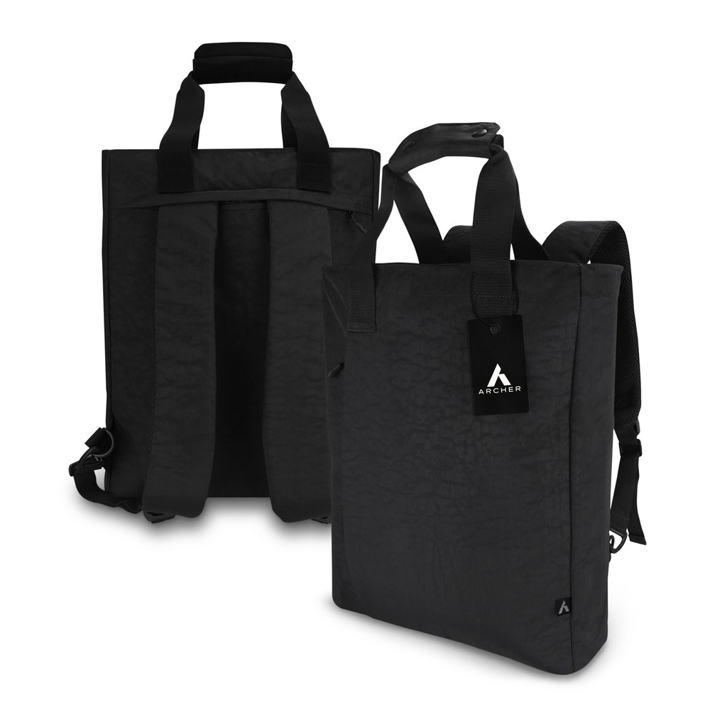
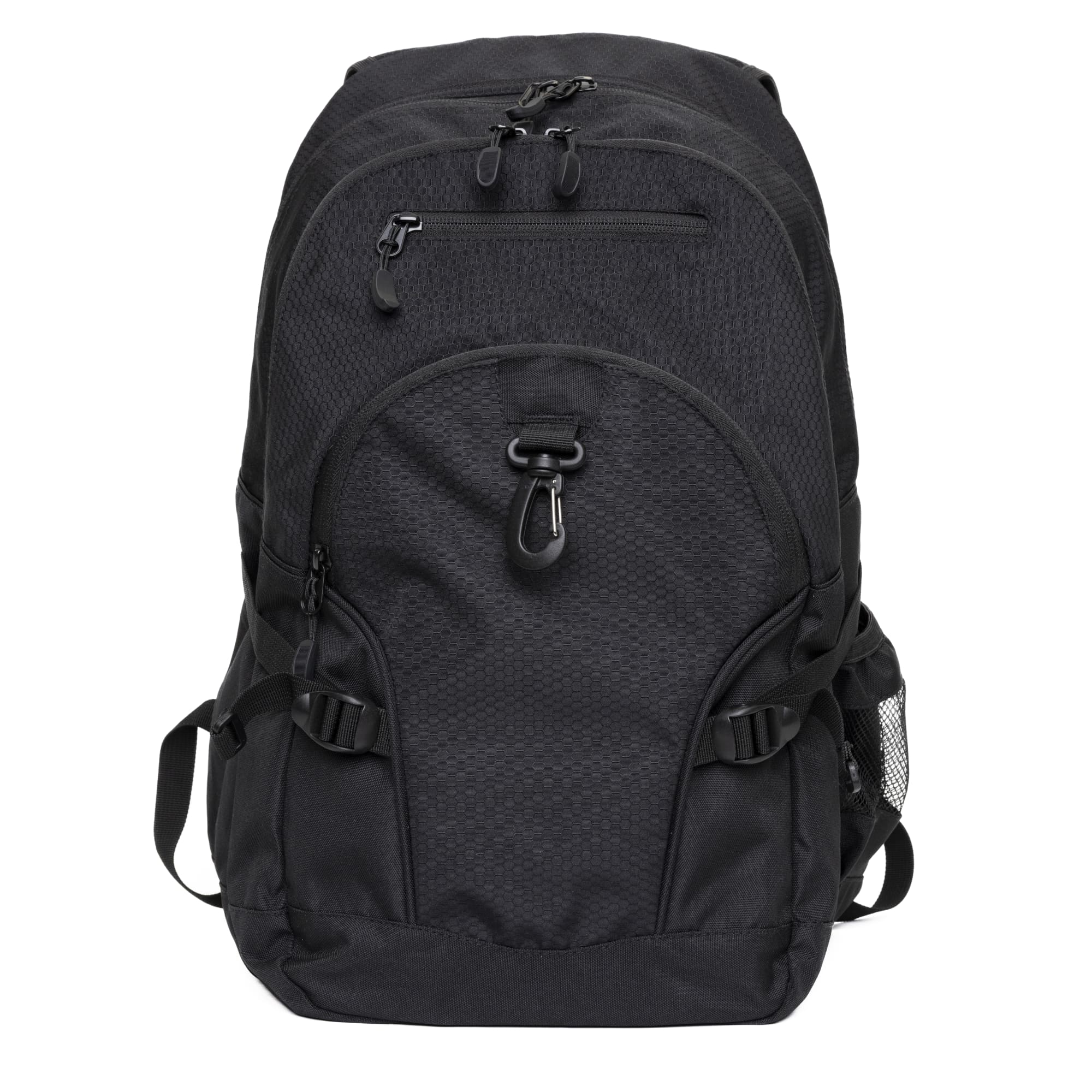
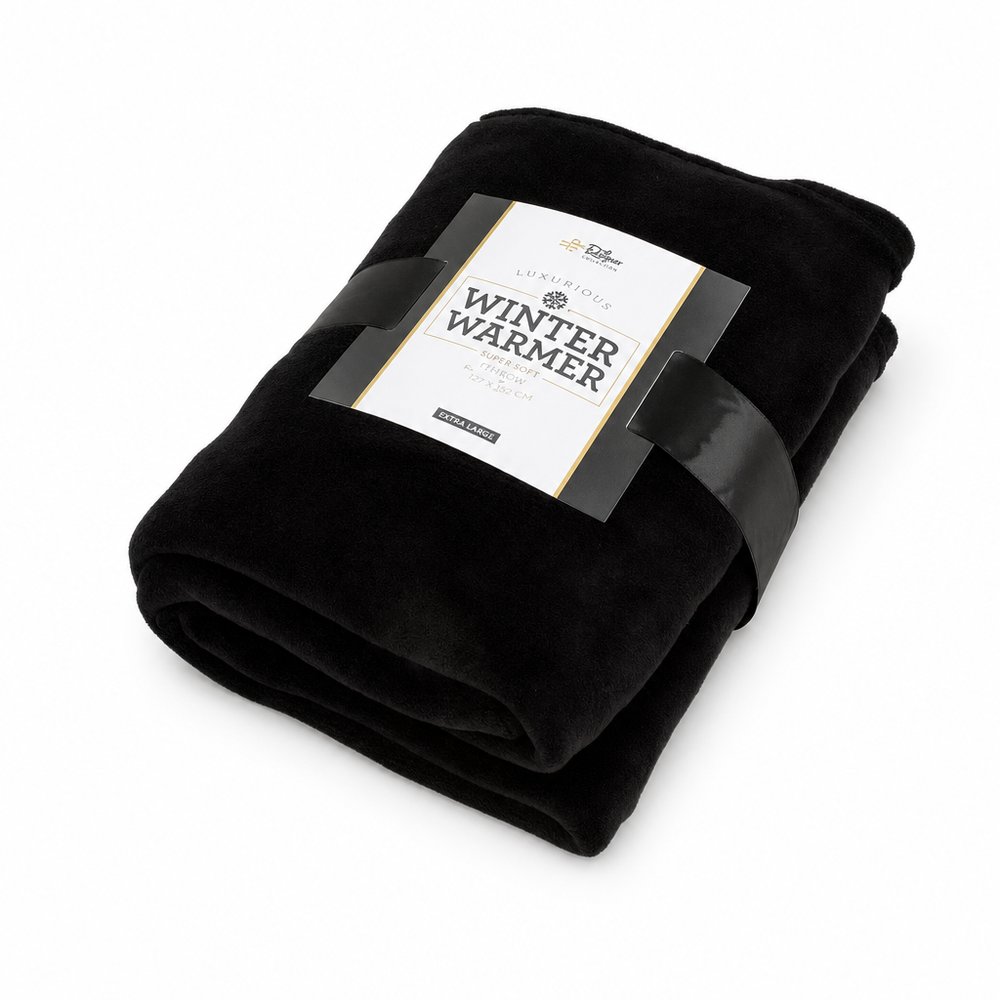
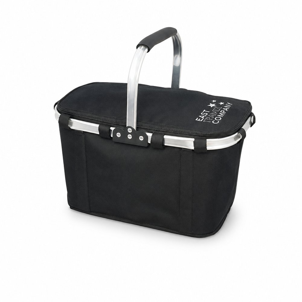
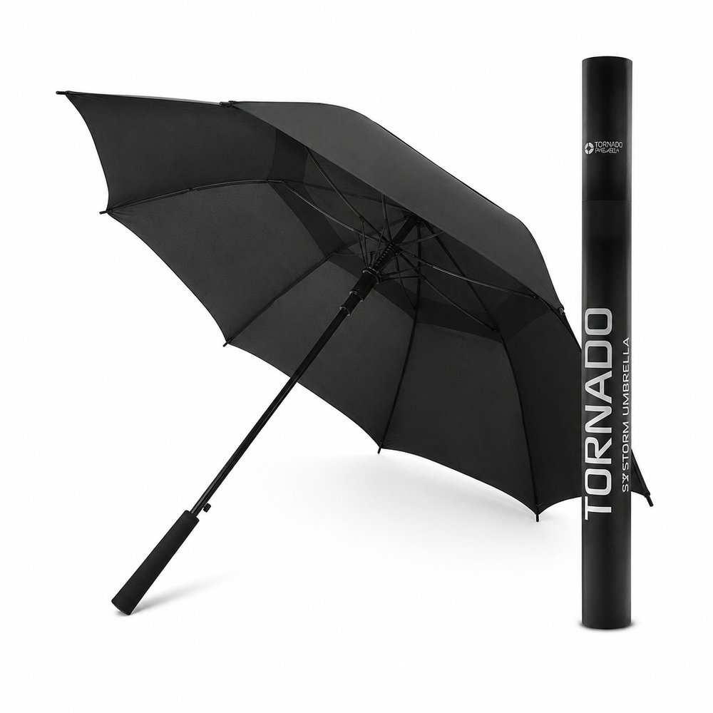
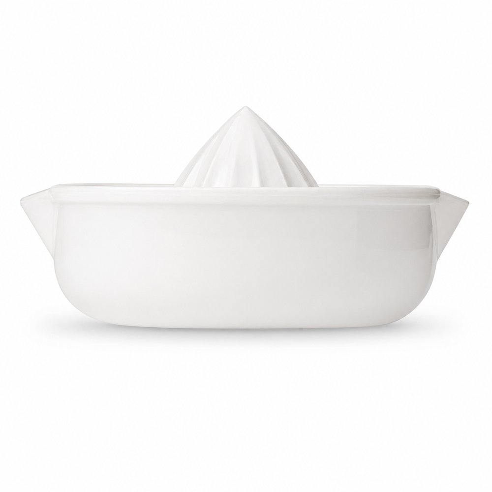
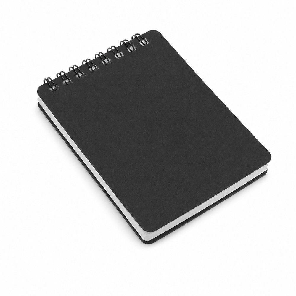
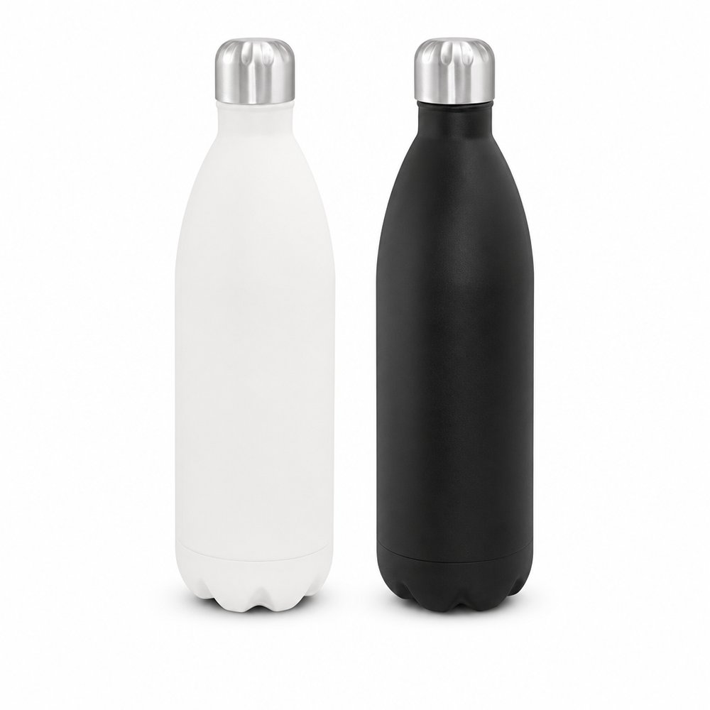
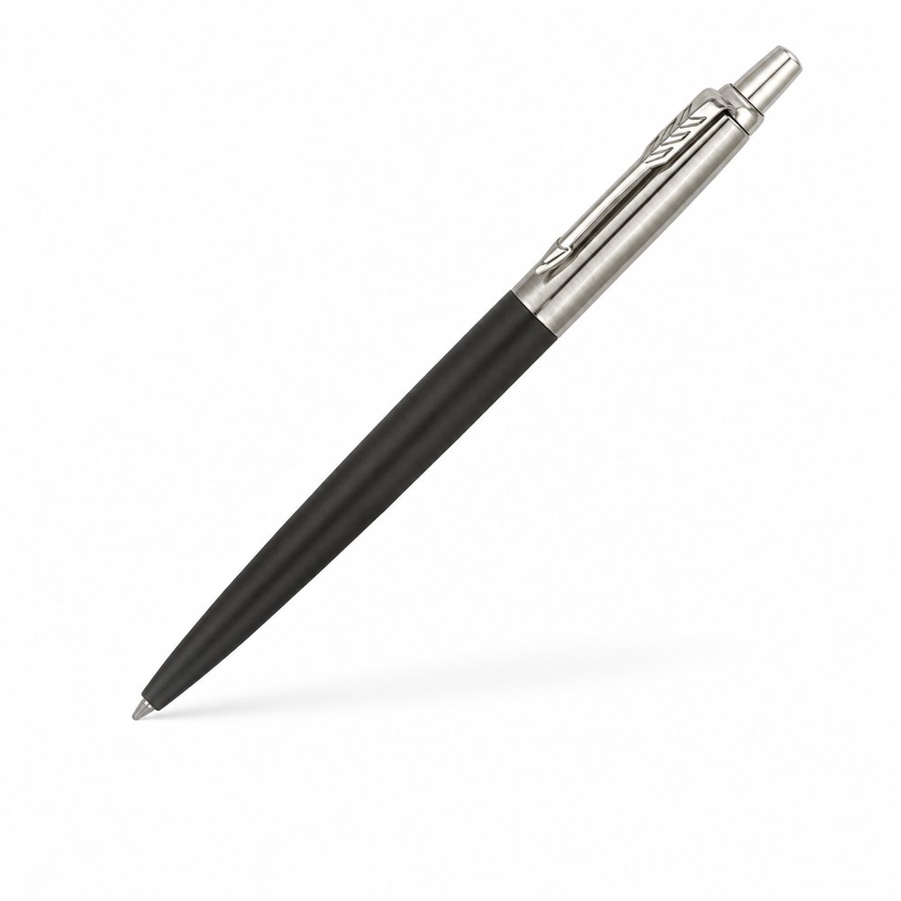
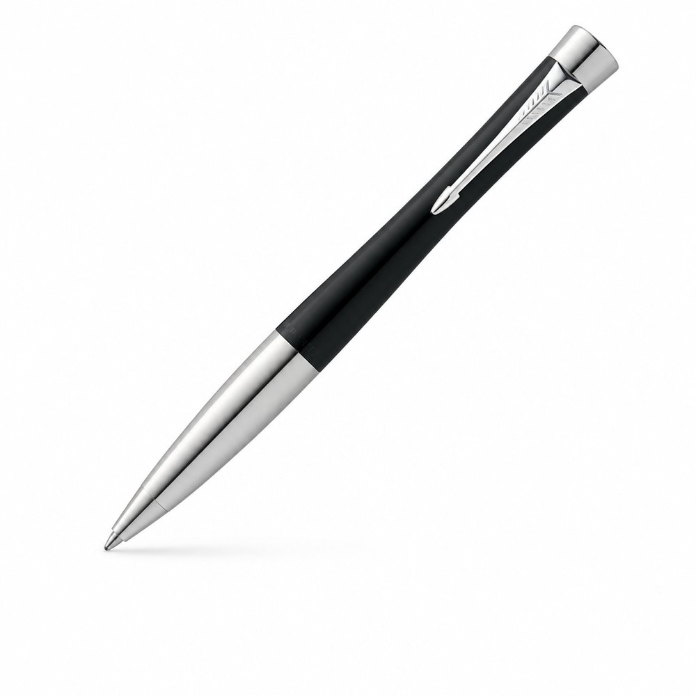
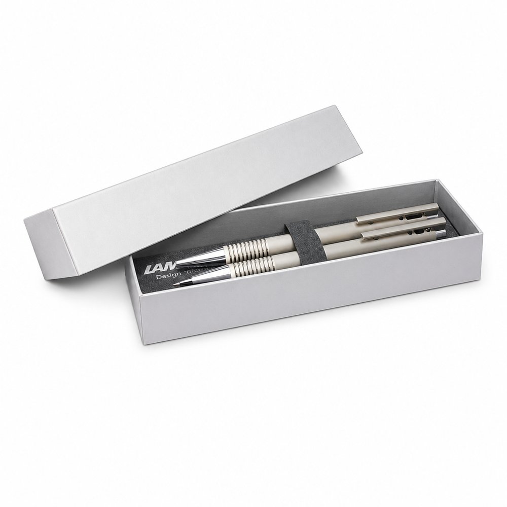
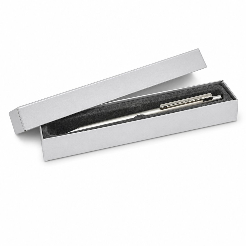
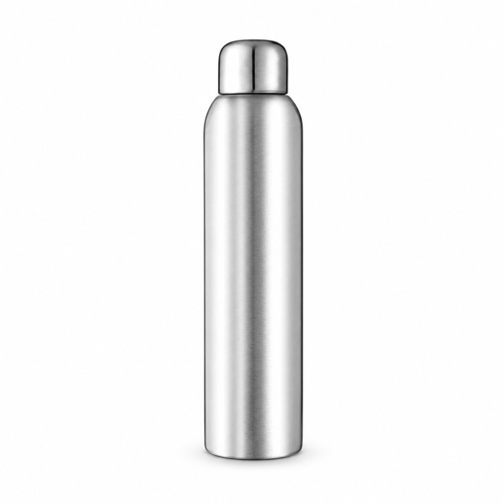
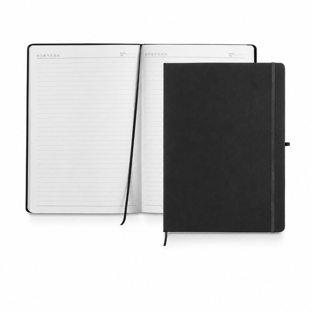
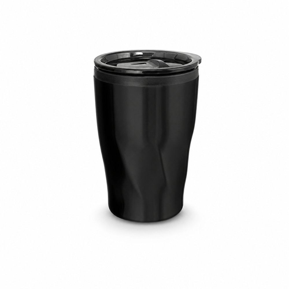
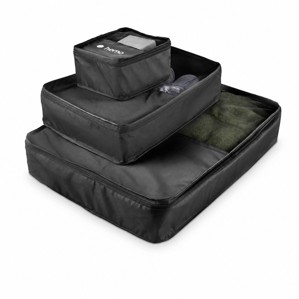
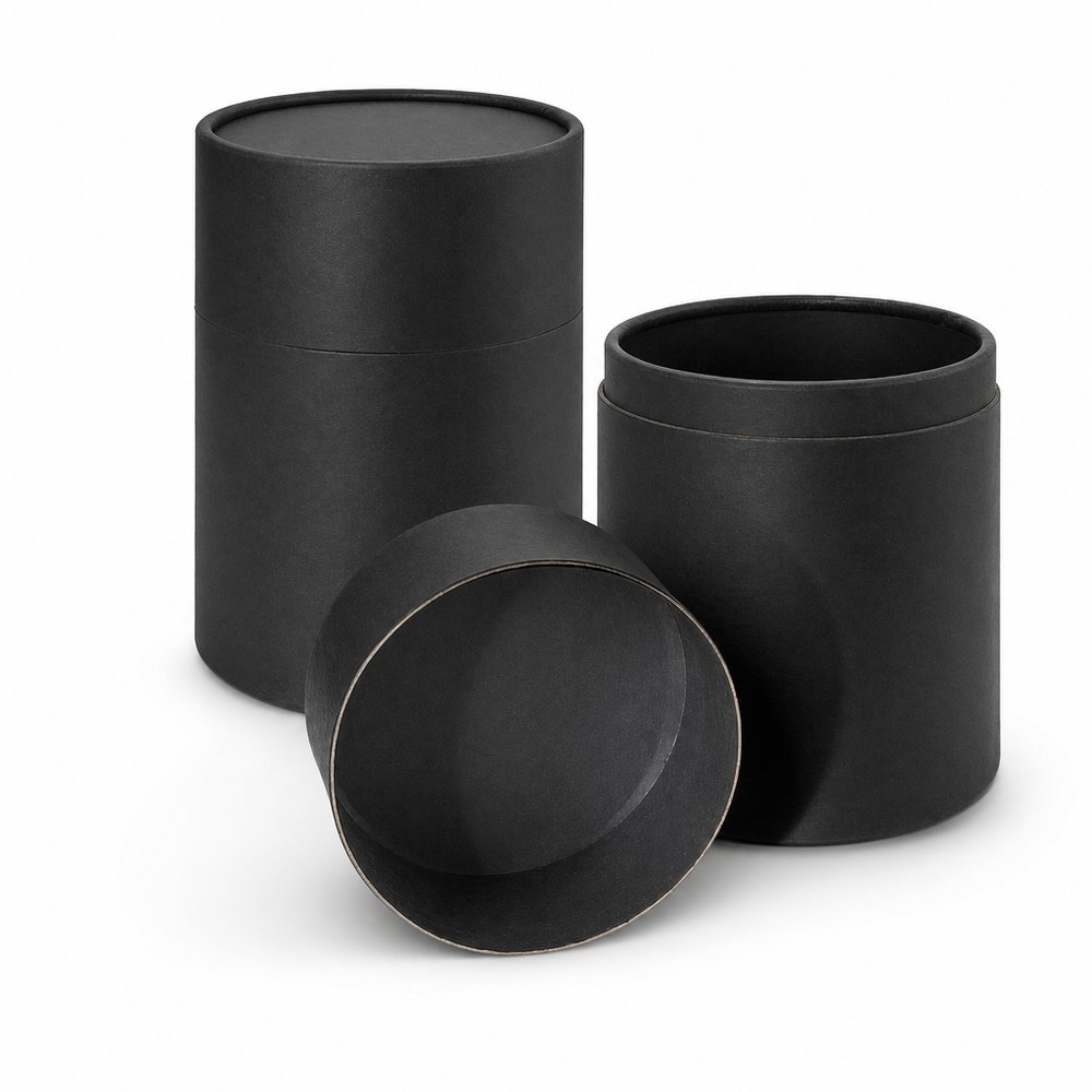
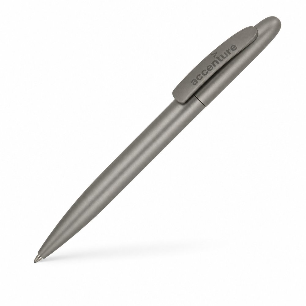
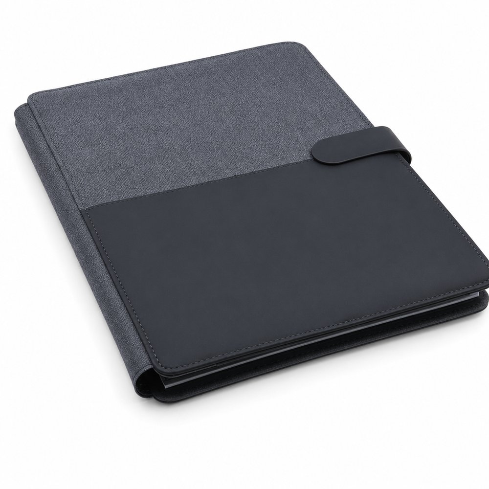
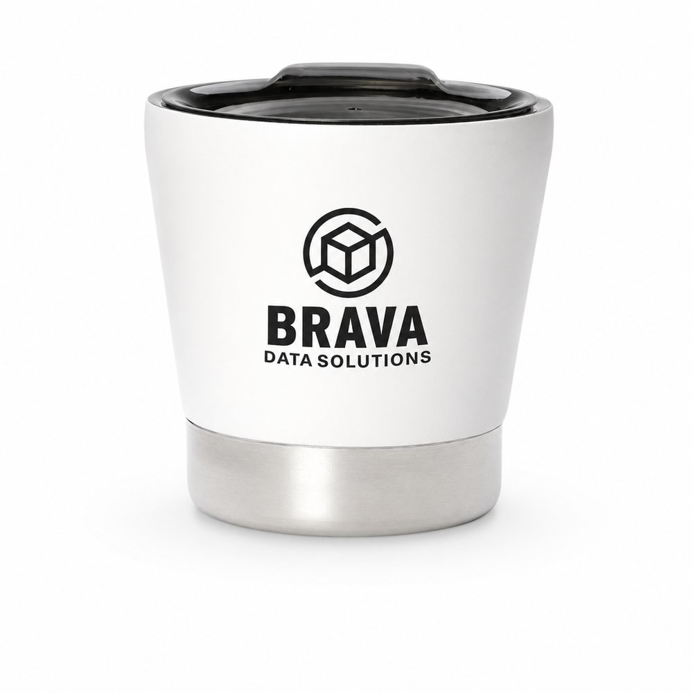
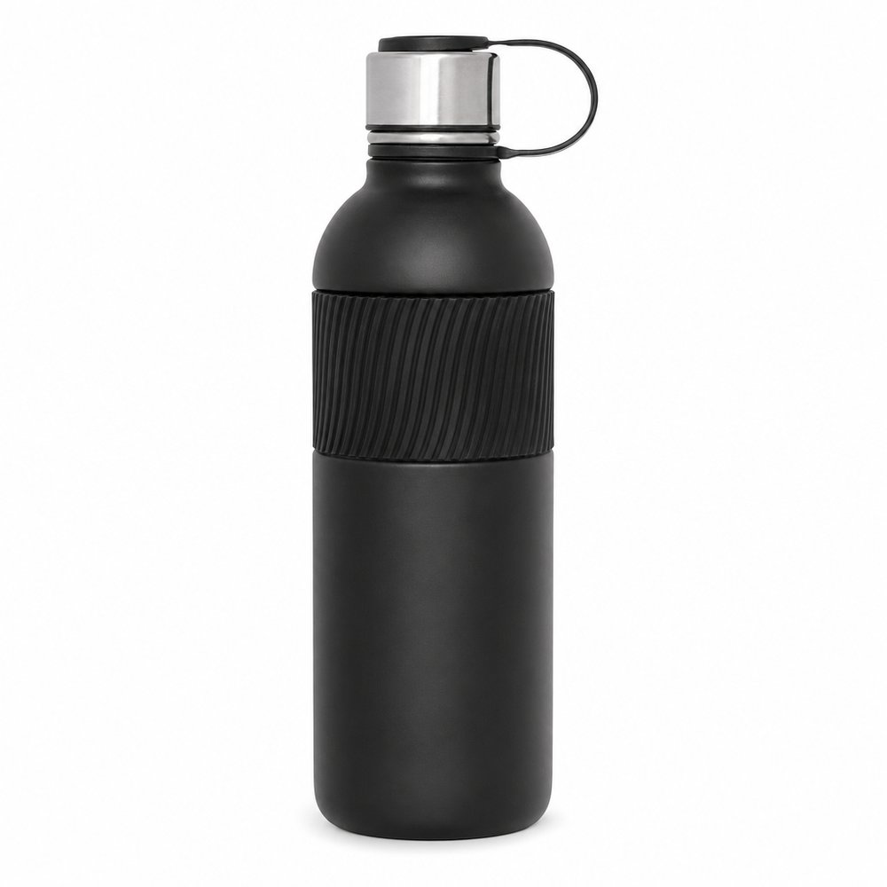
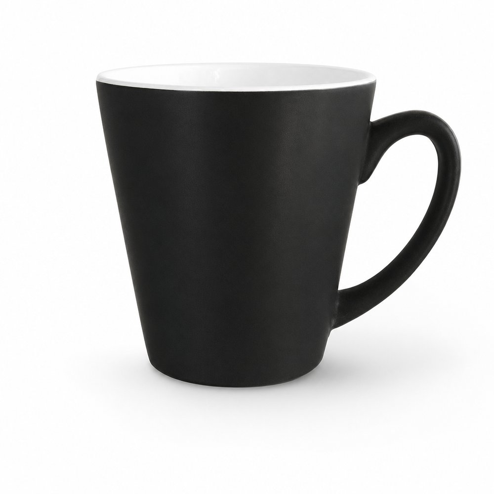
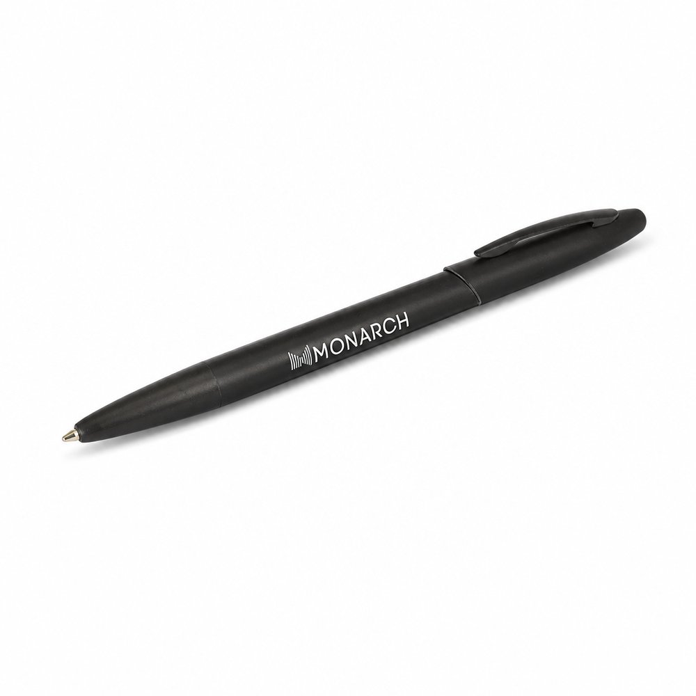
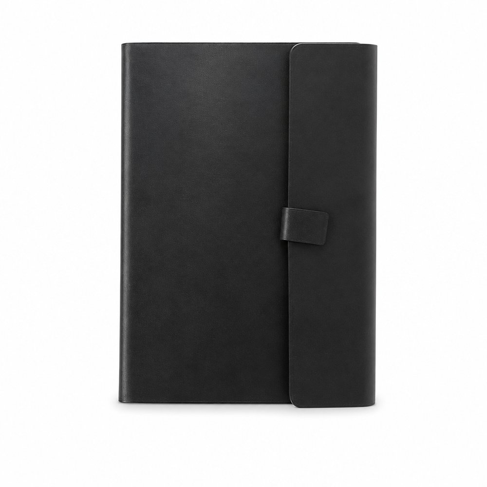
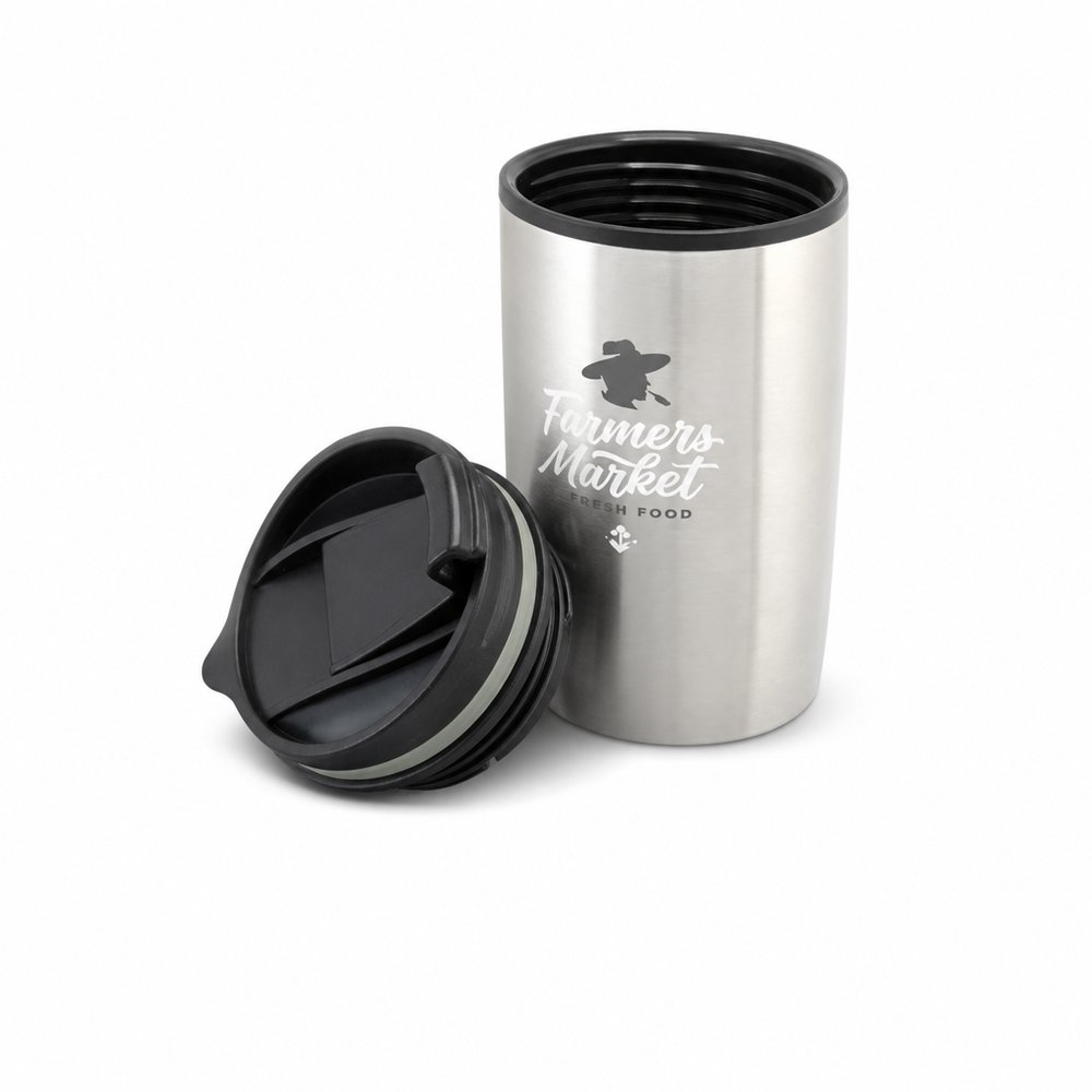
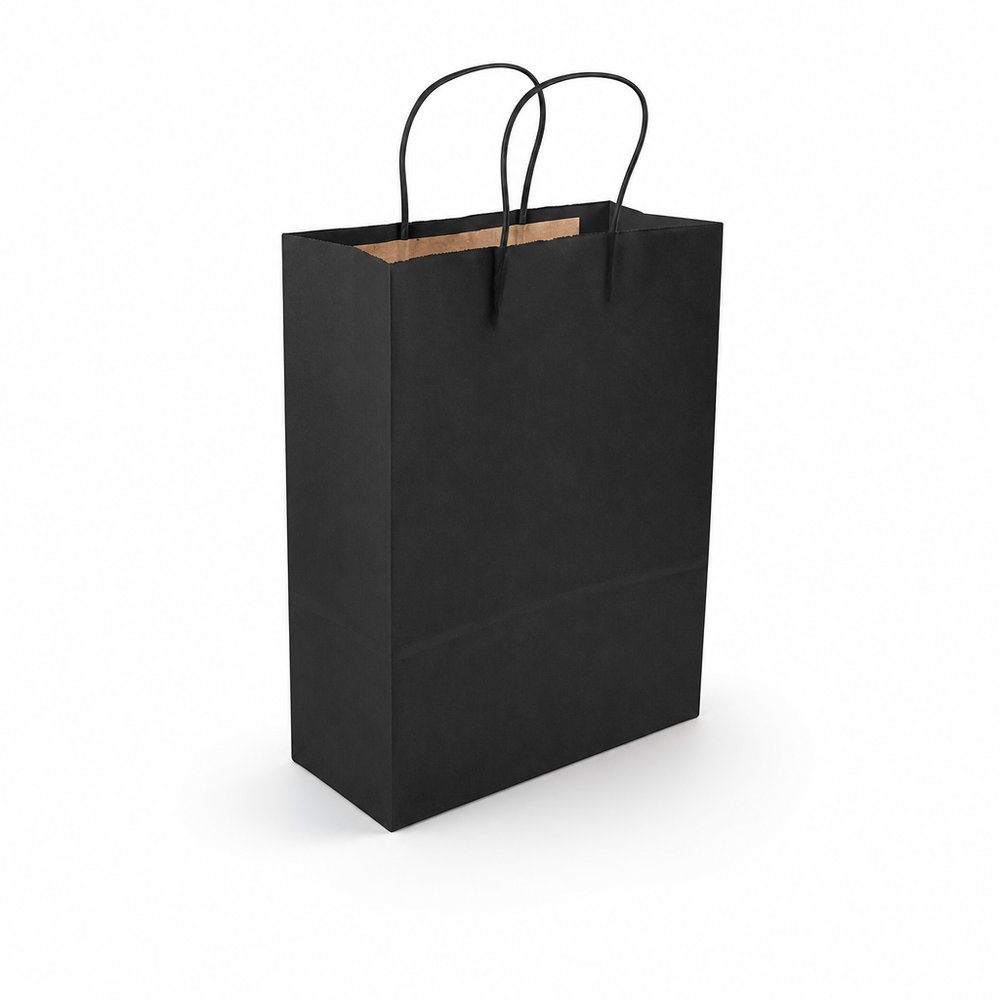
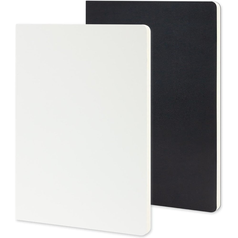
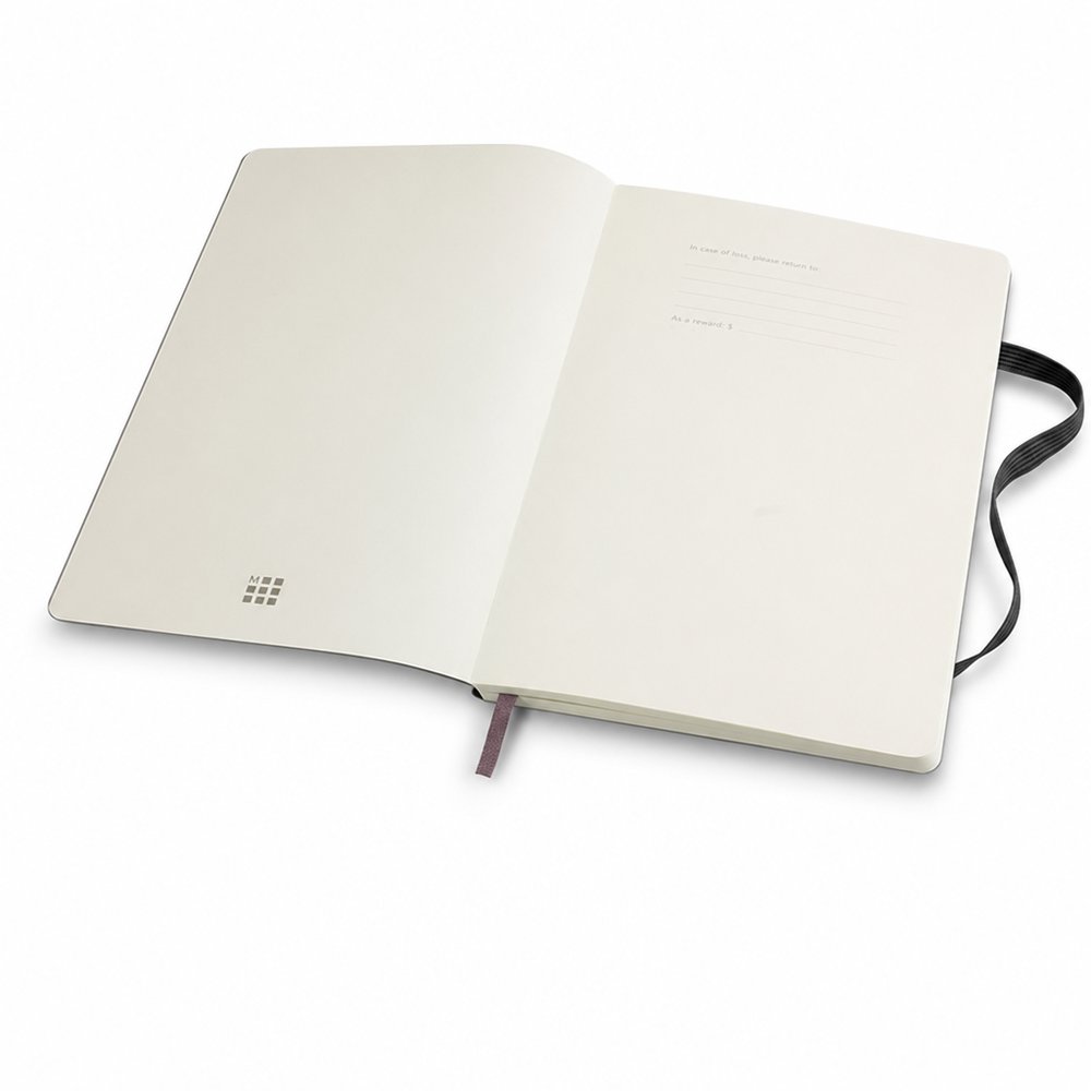
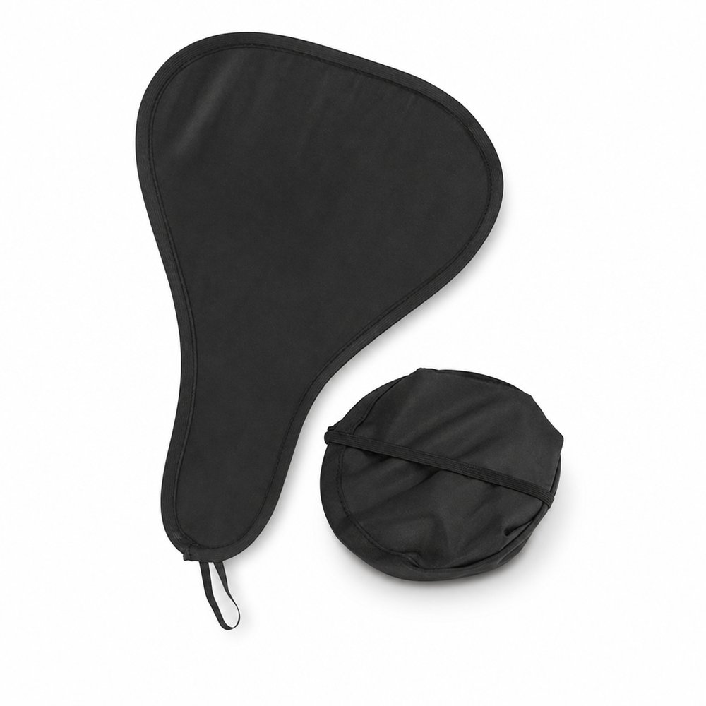
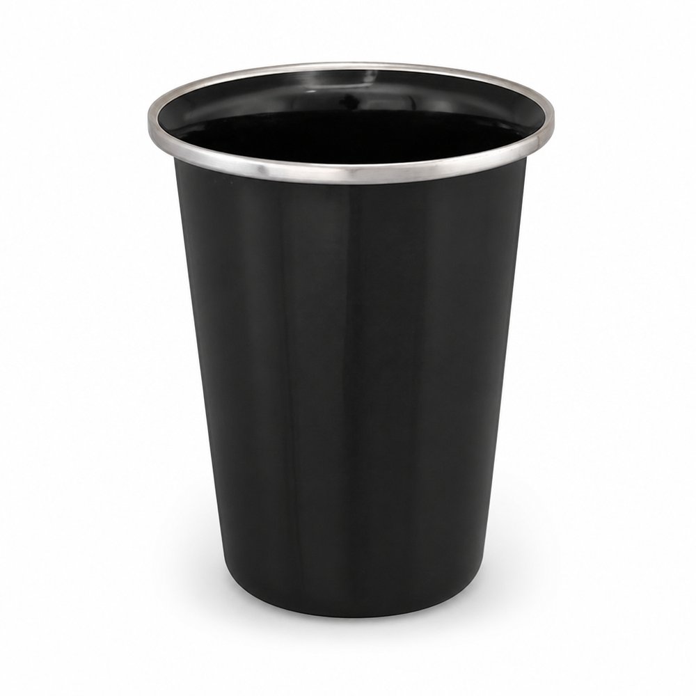
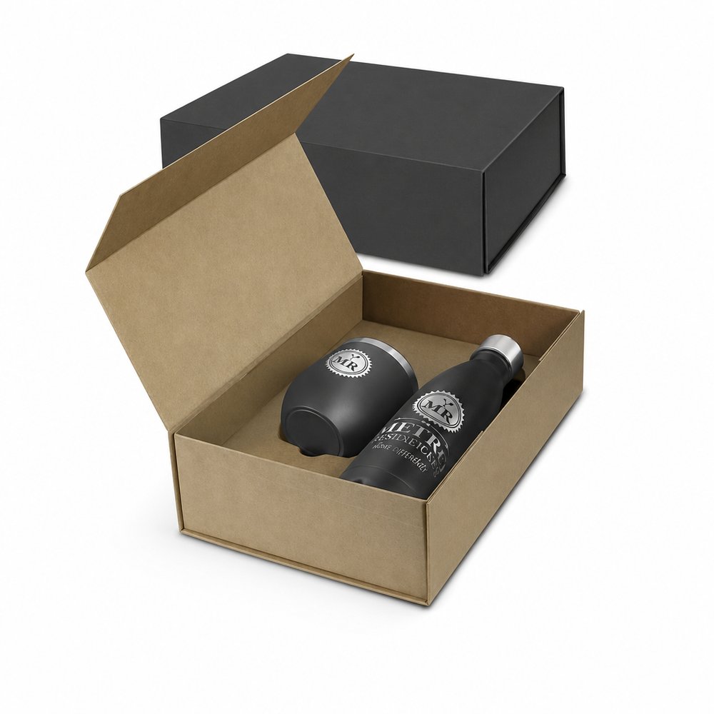
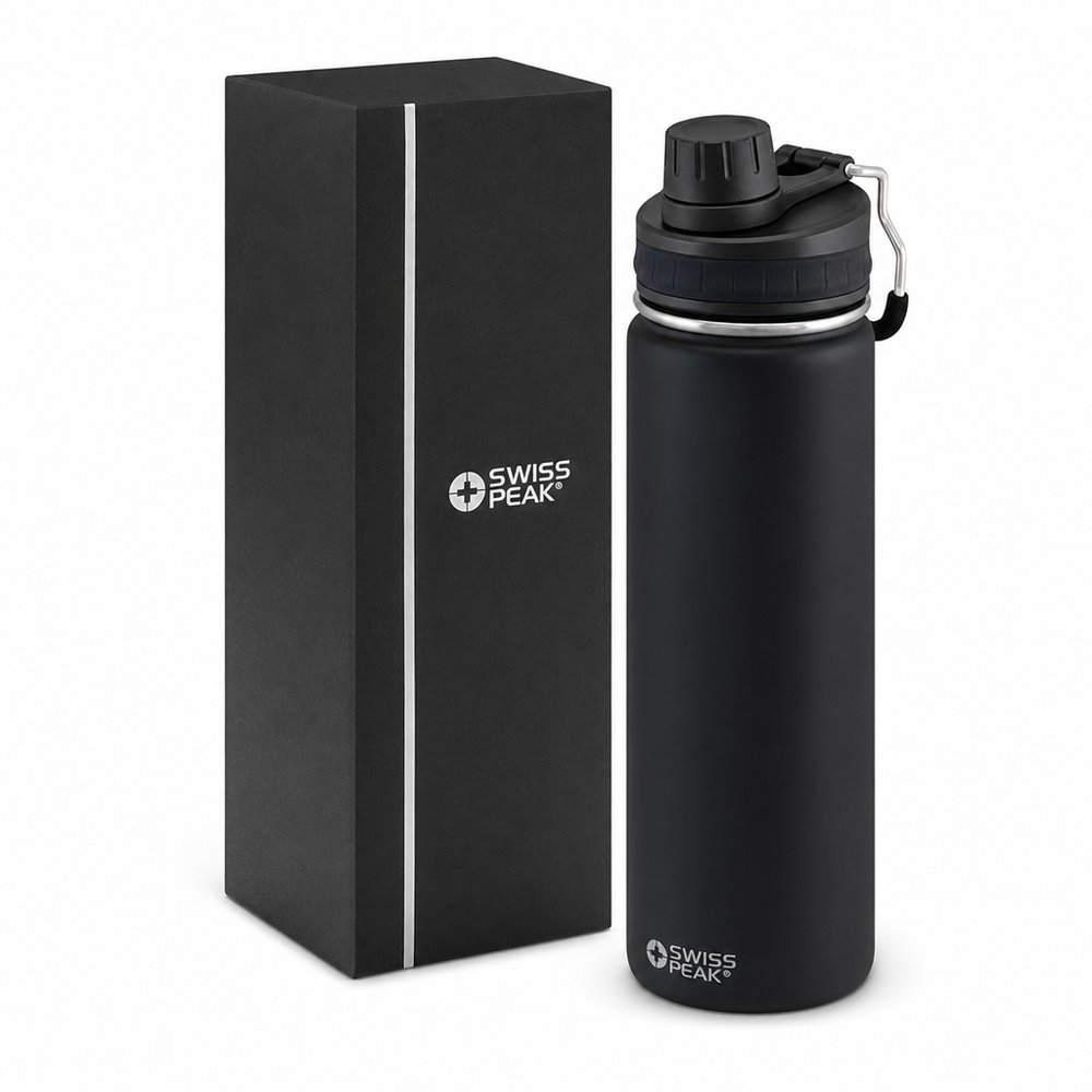
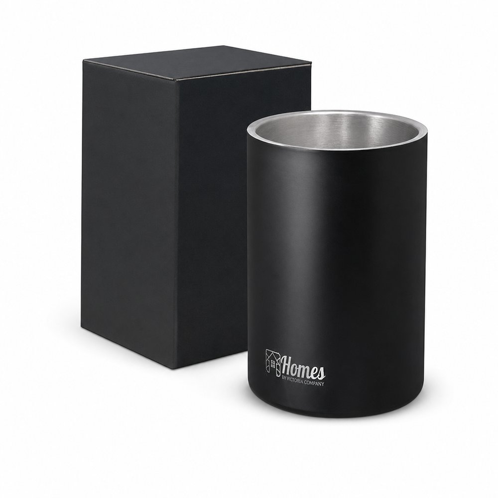
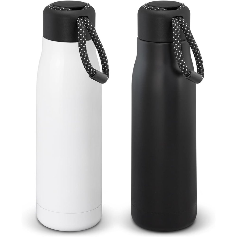
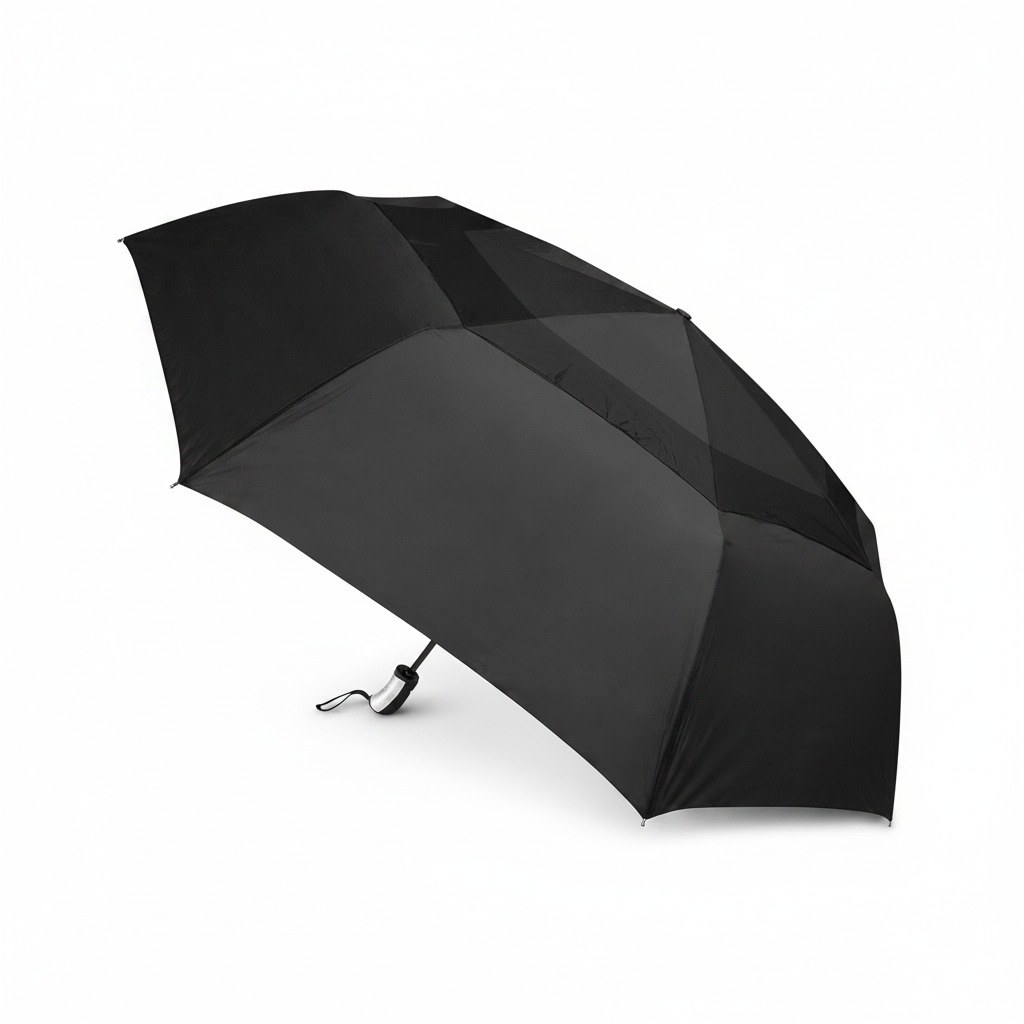
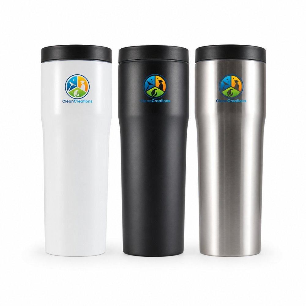
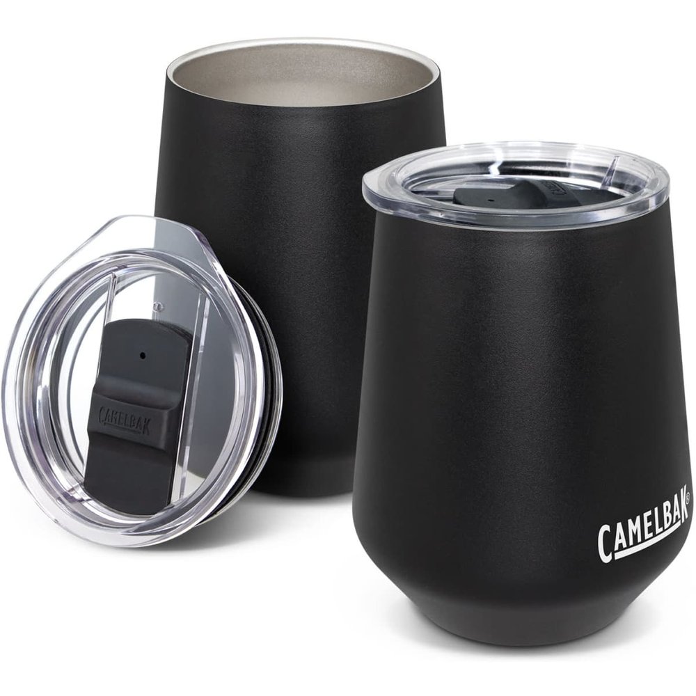
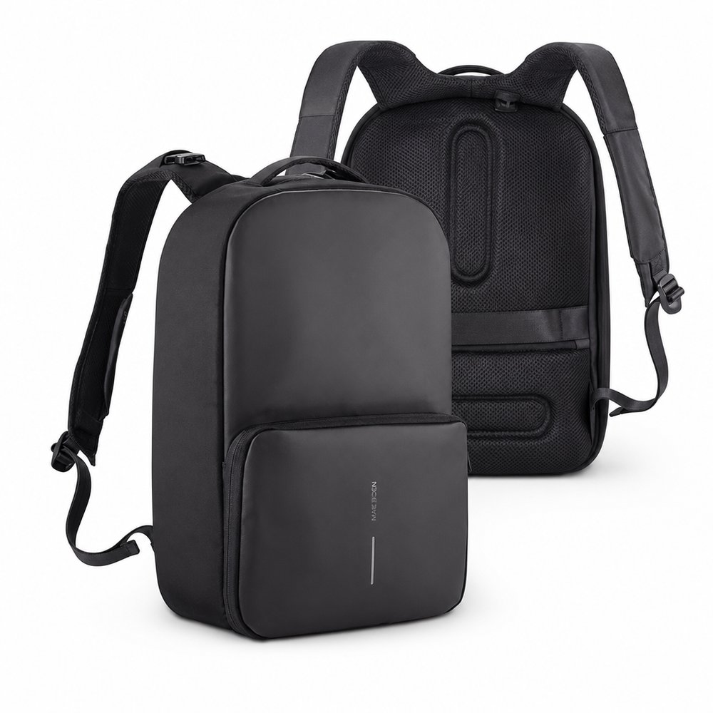
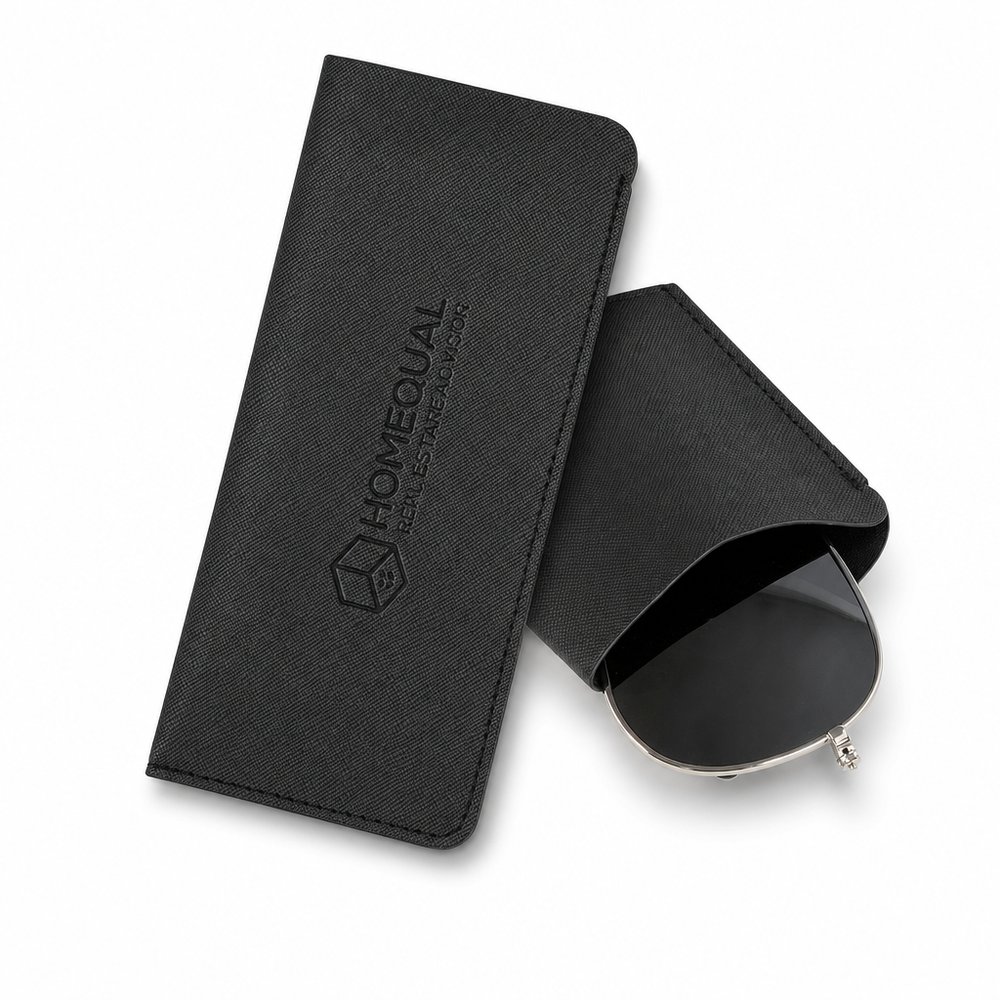
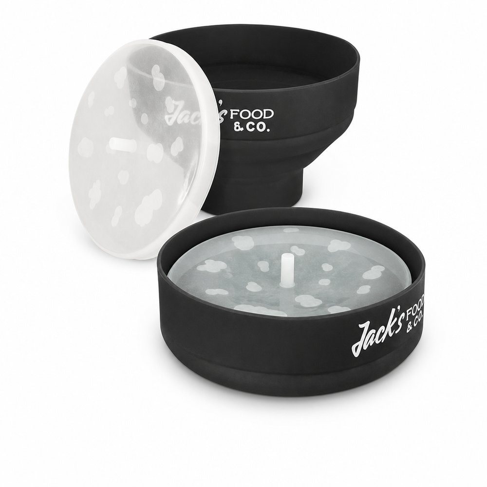
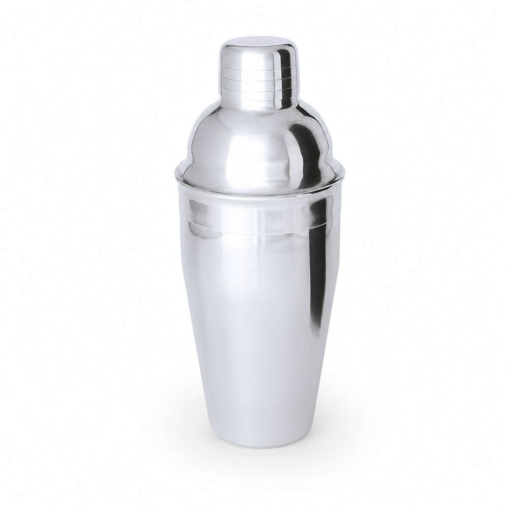
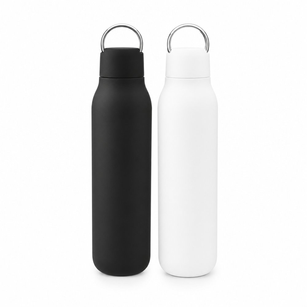
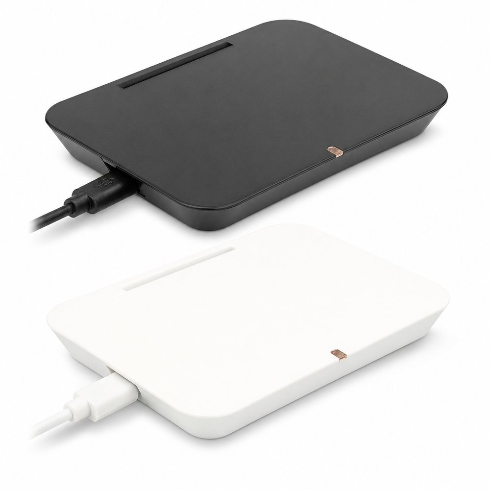
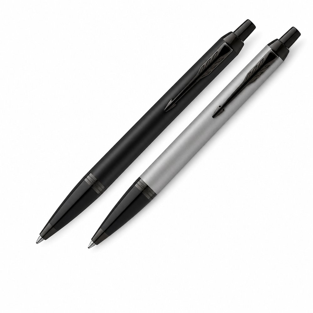
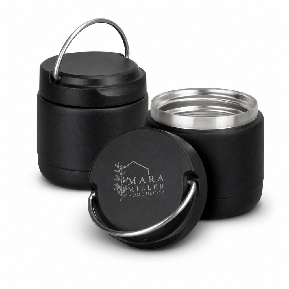
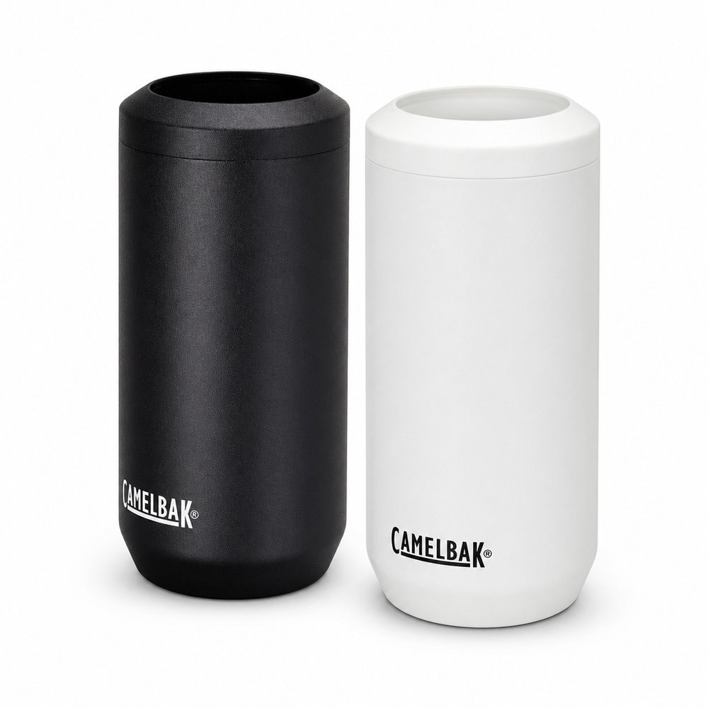
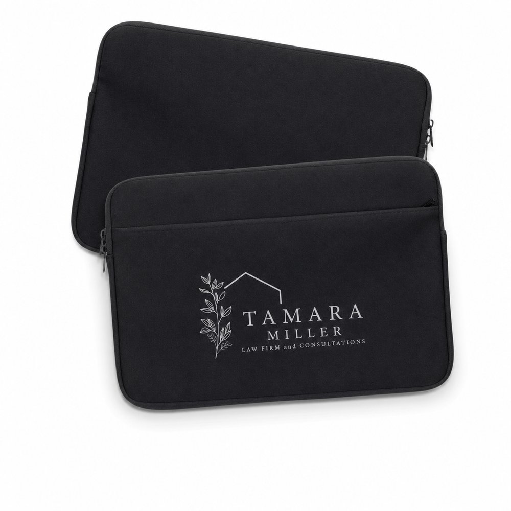
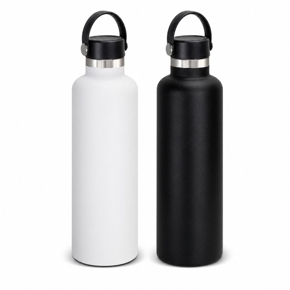
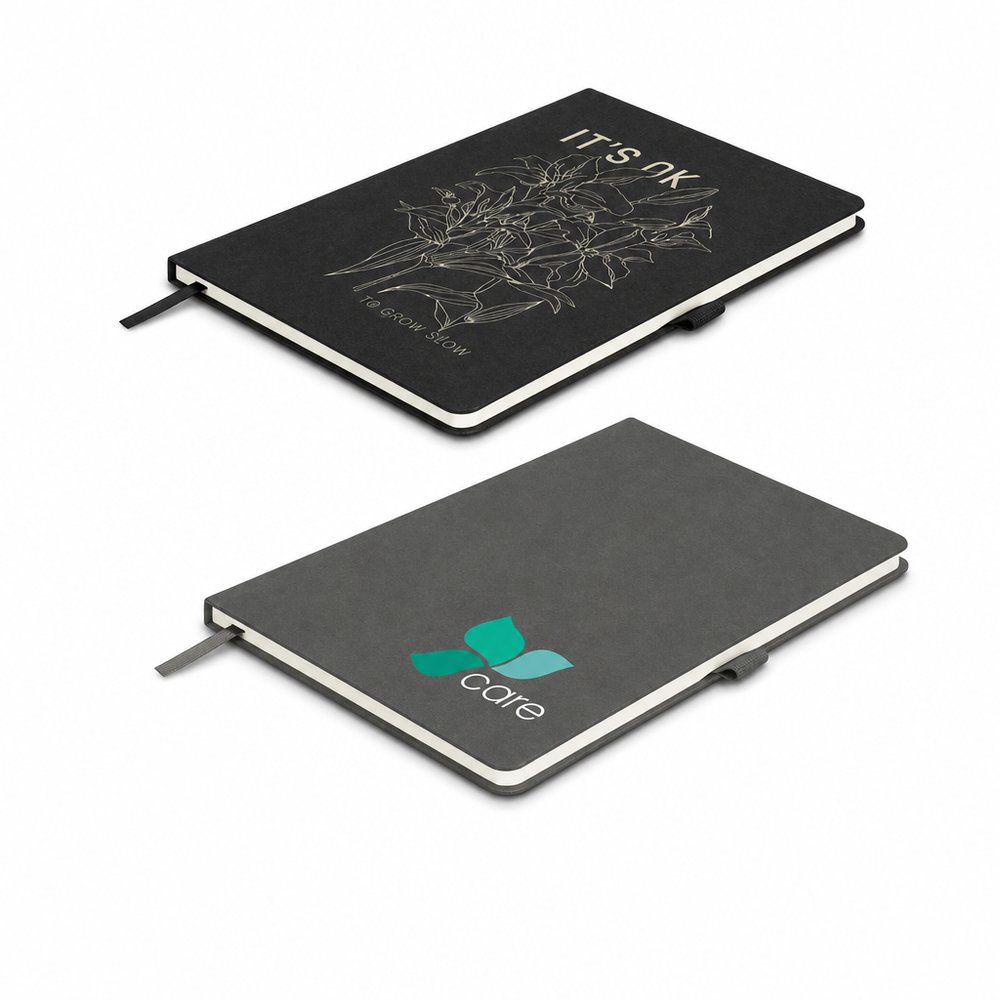
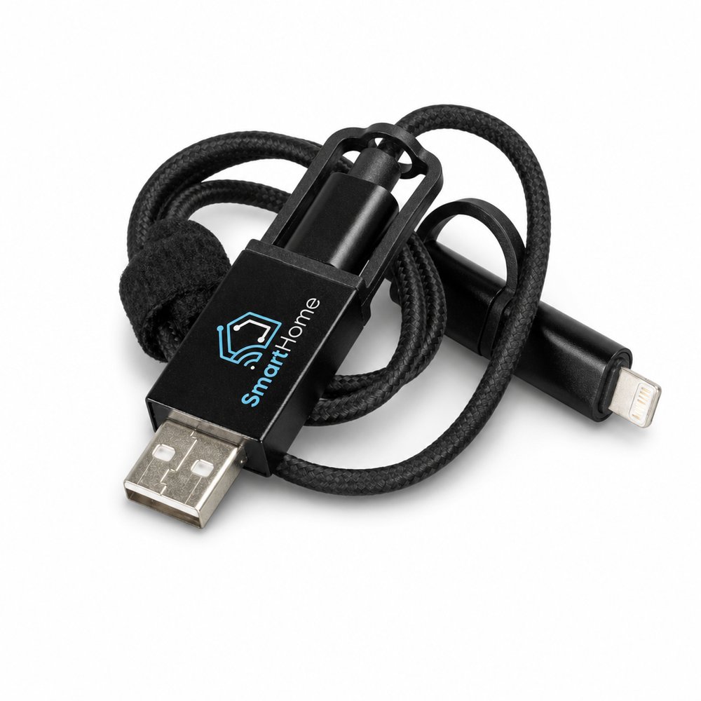
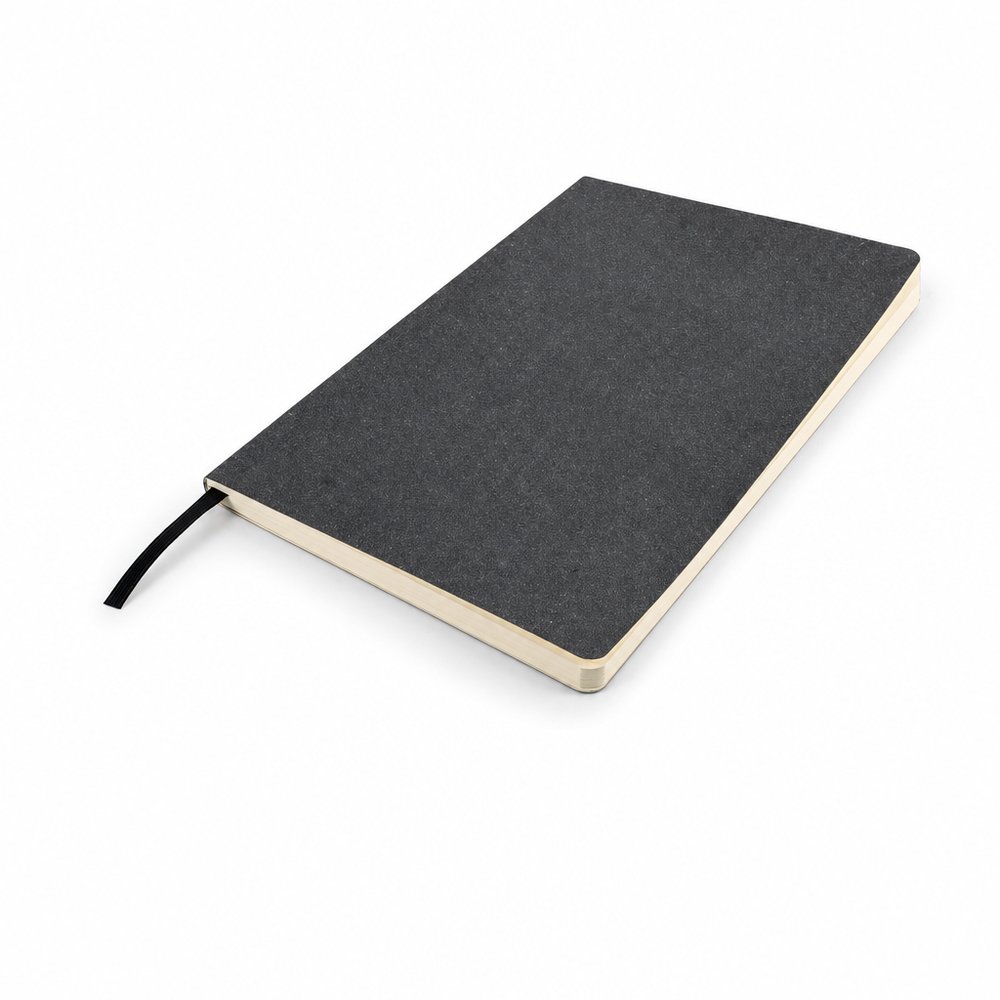
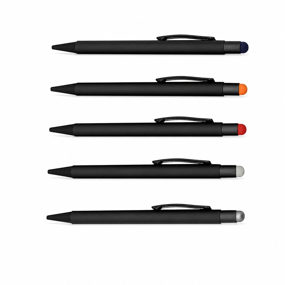
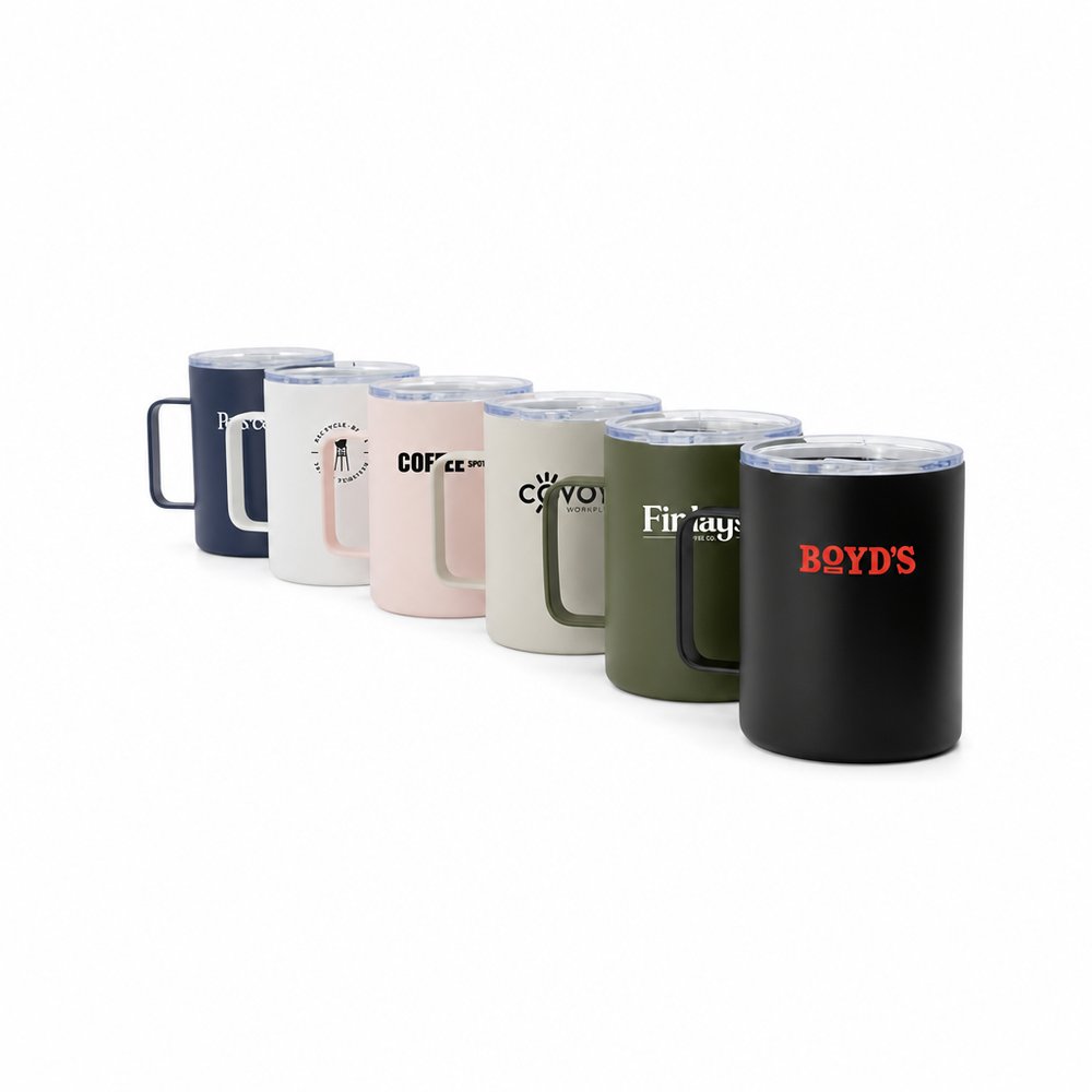
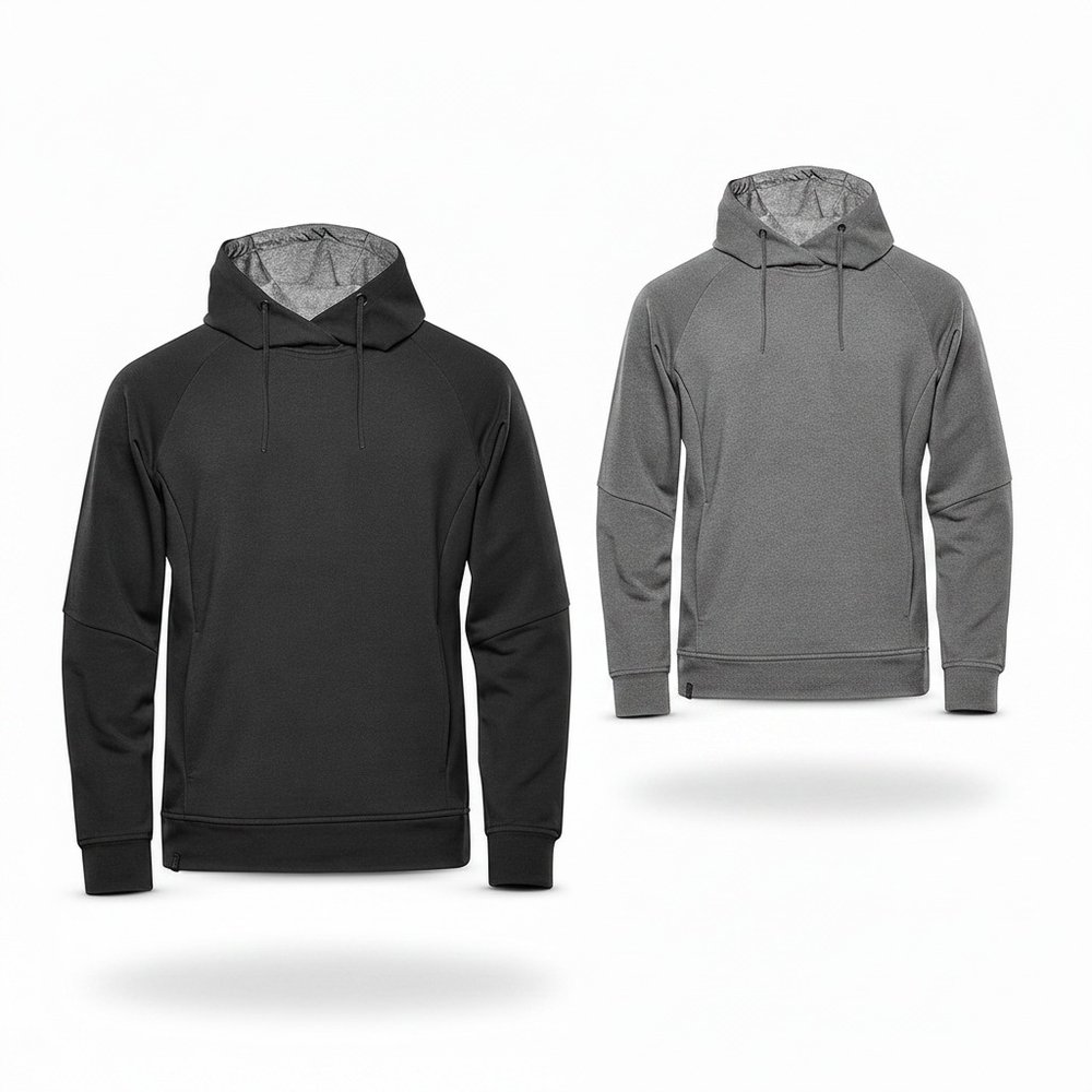
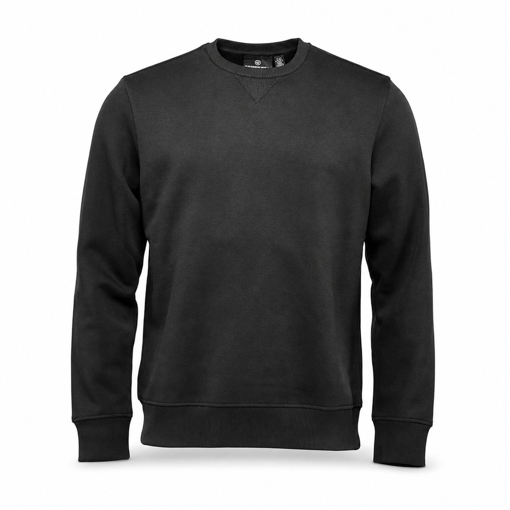
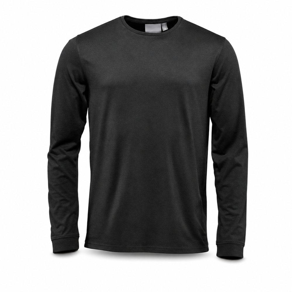
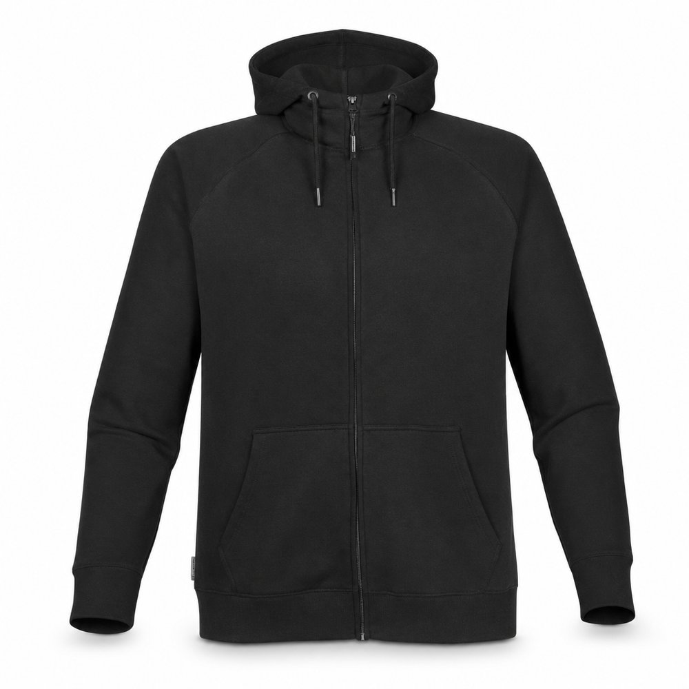
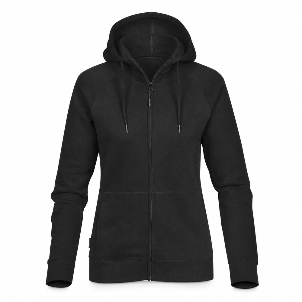
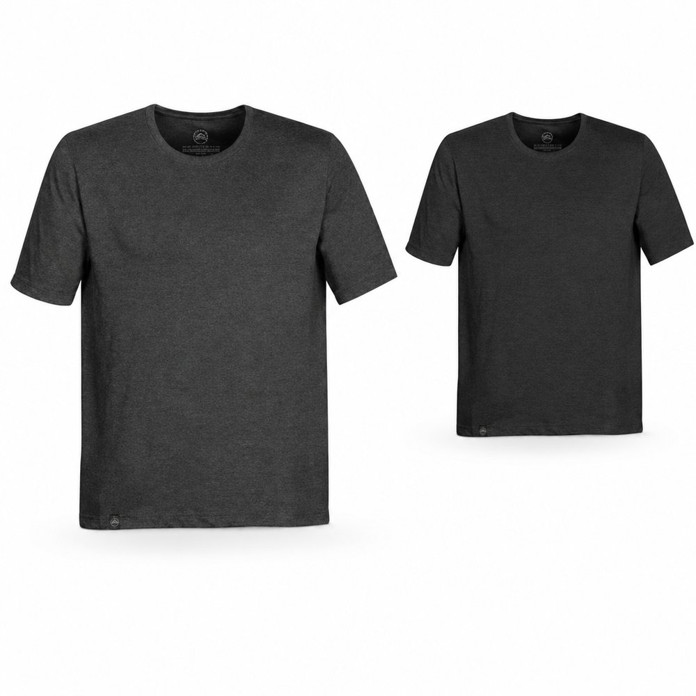
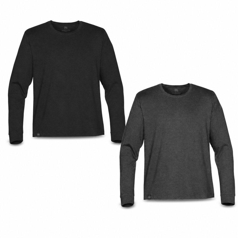
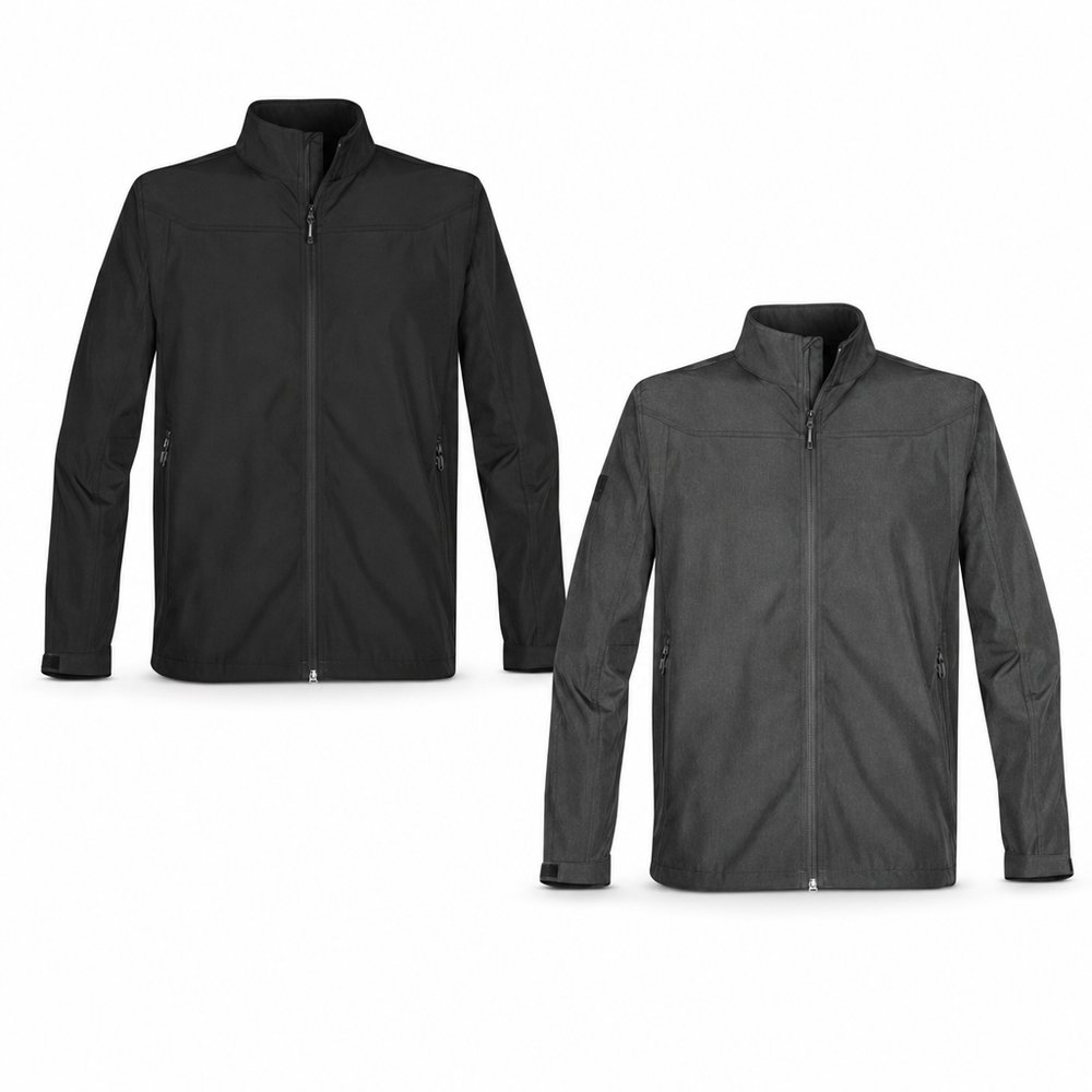
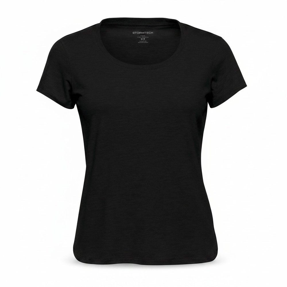
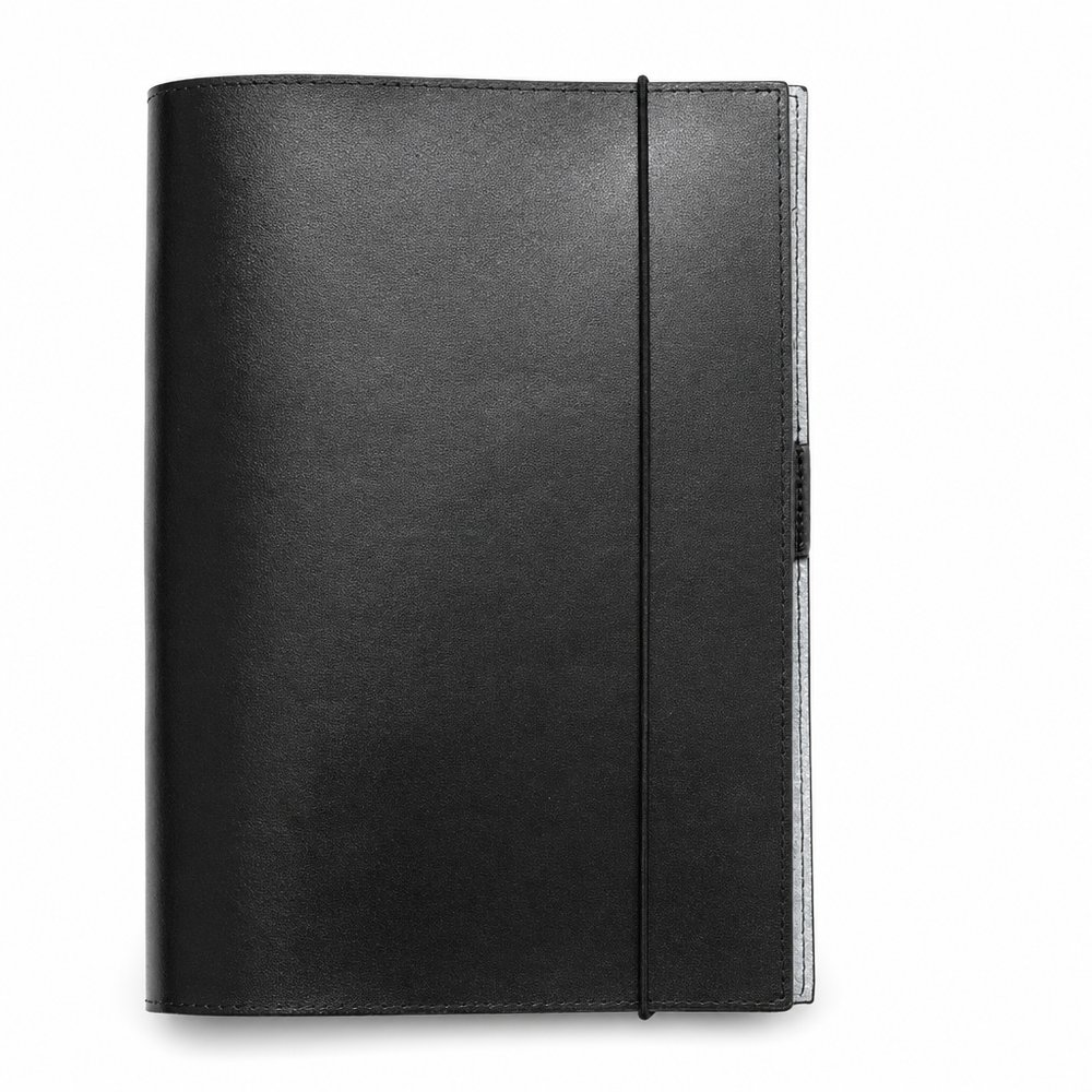
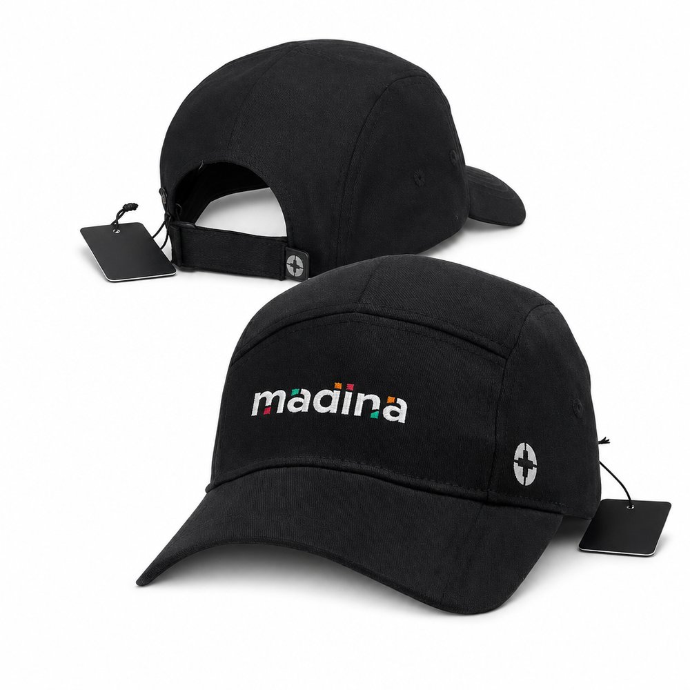
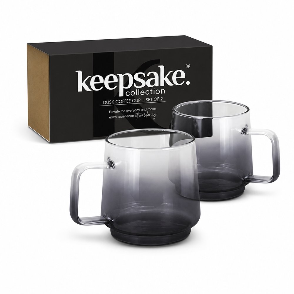
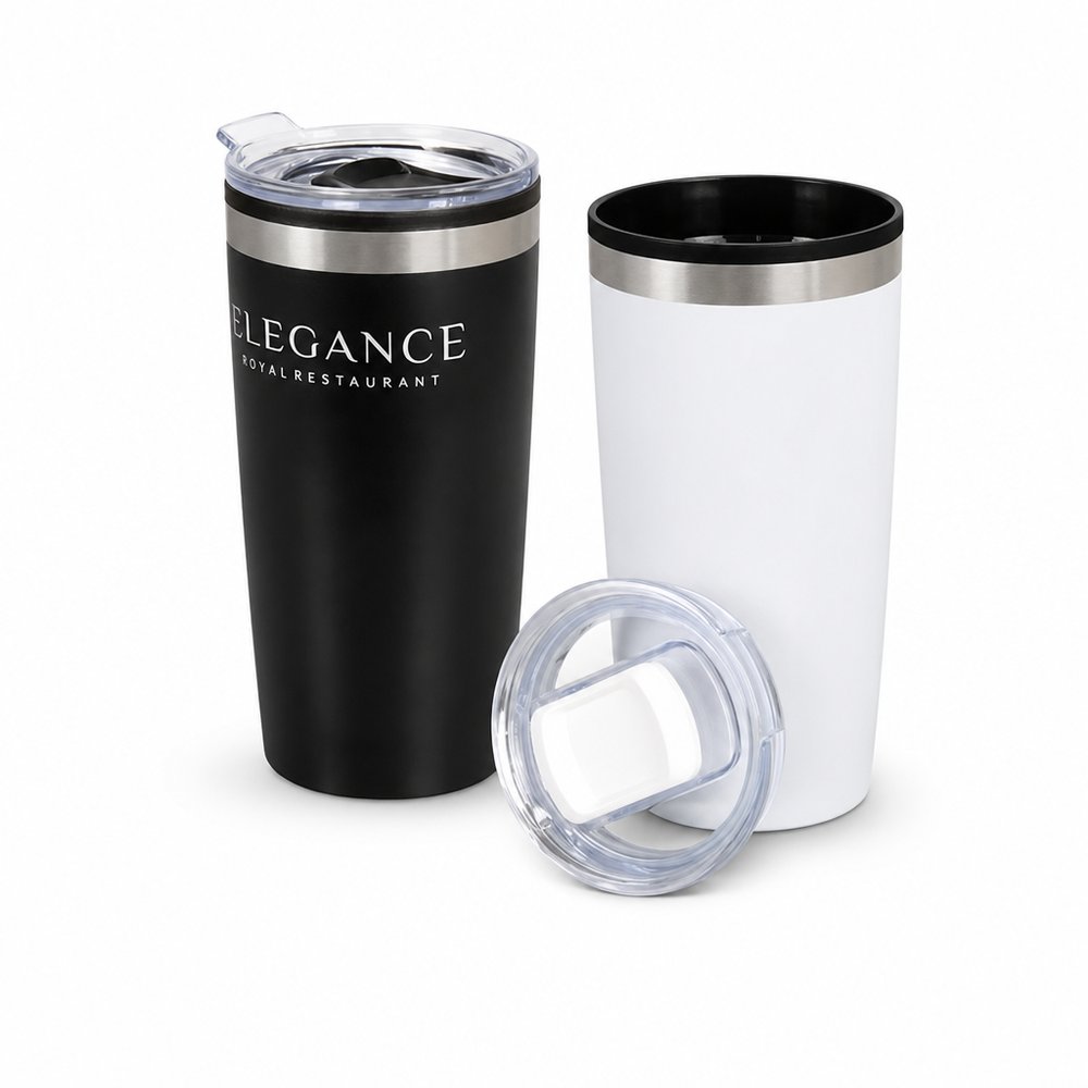
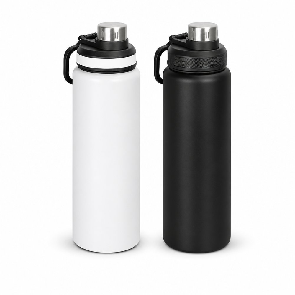
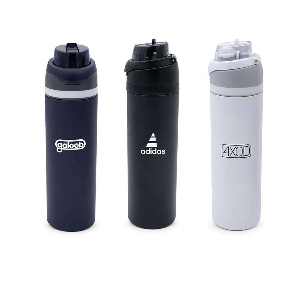
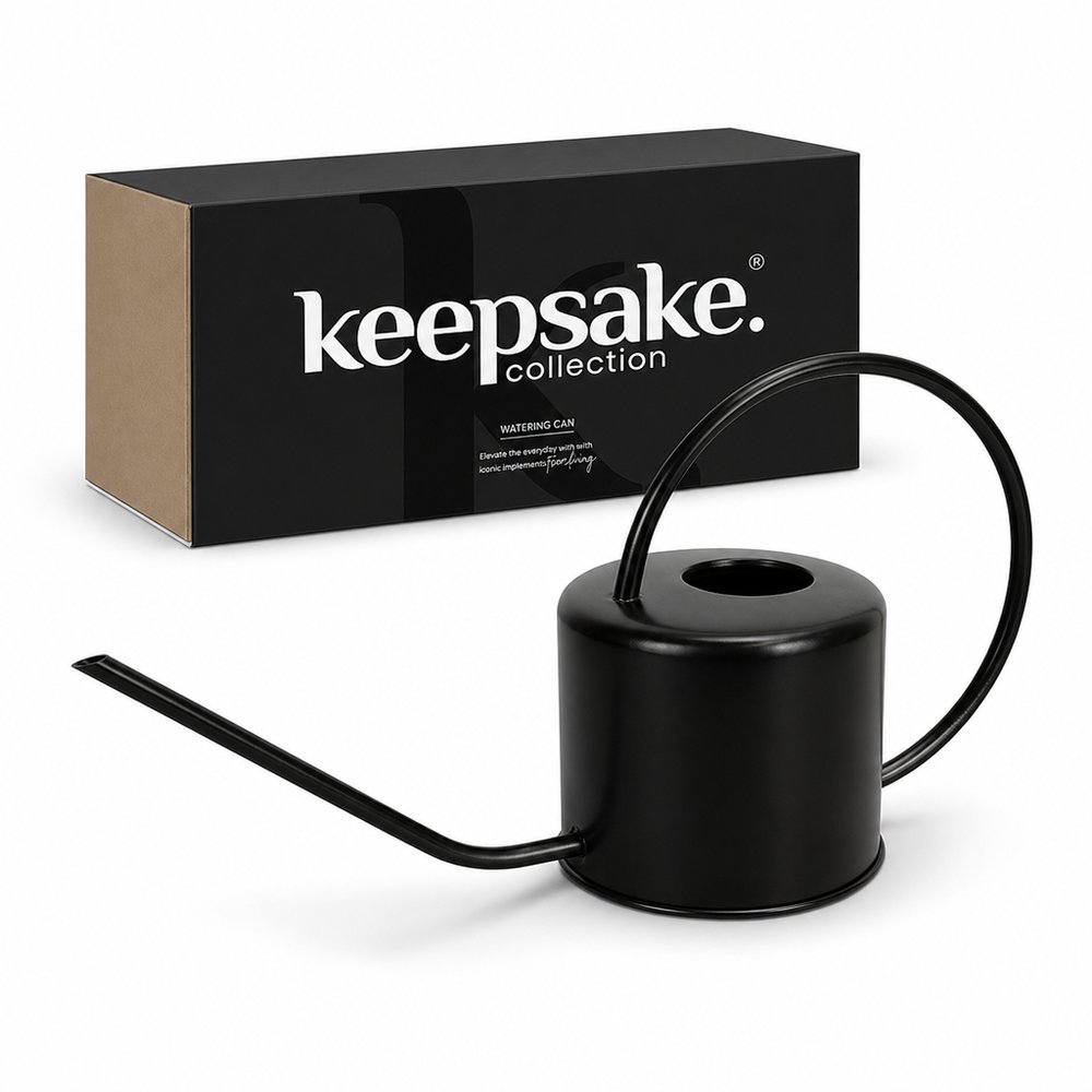
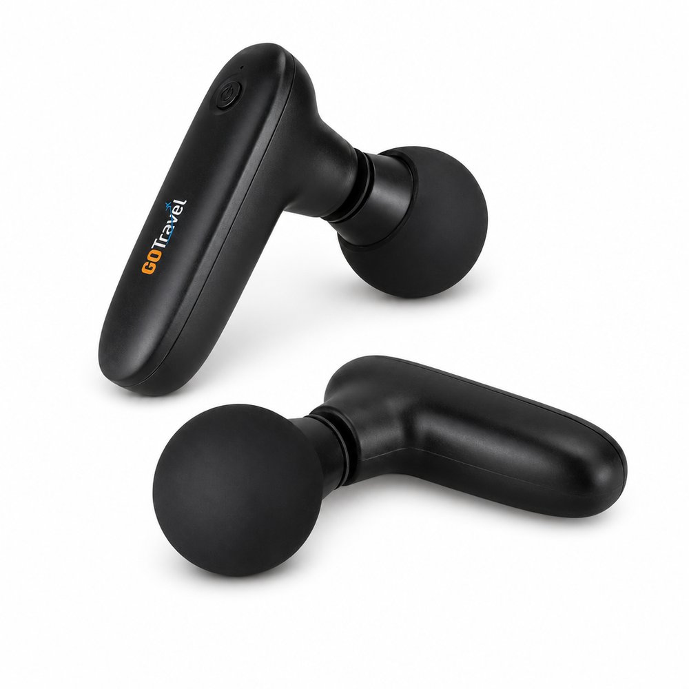
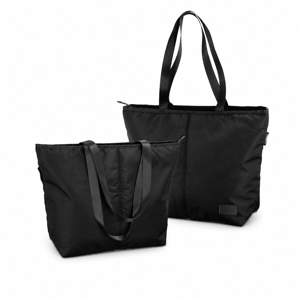
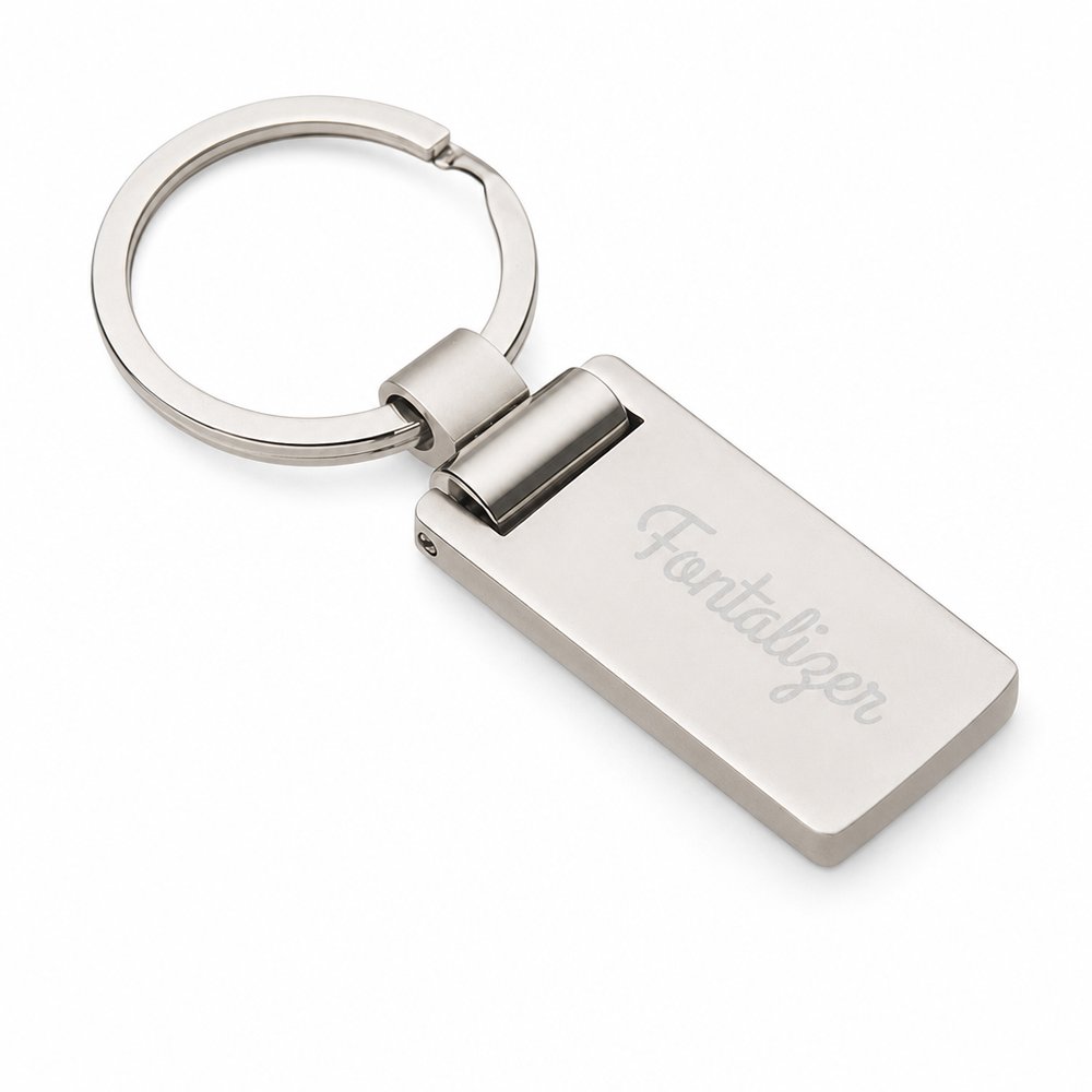
Sometimes less colour says more. A restrained palette lets your branding become the hero.
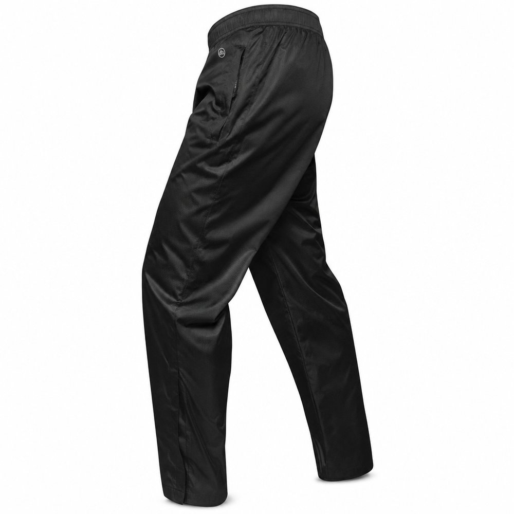
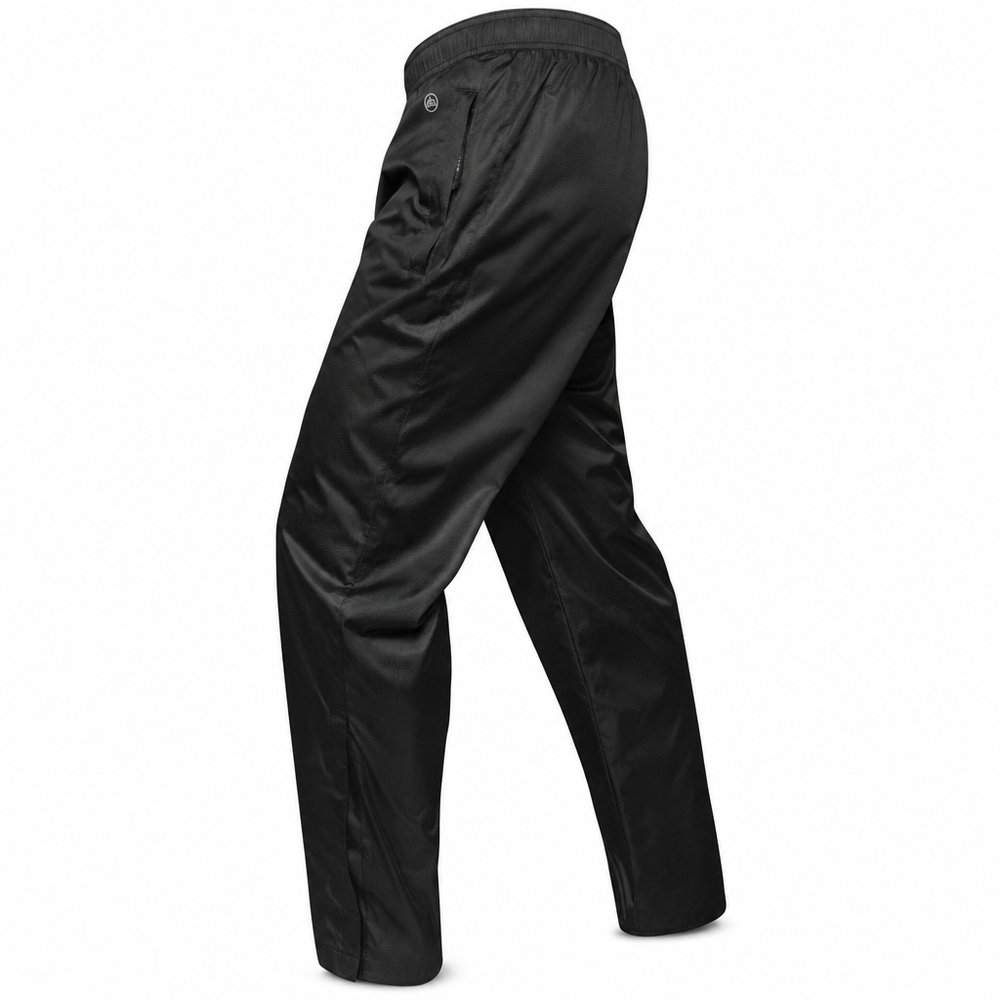
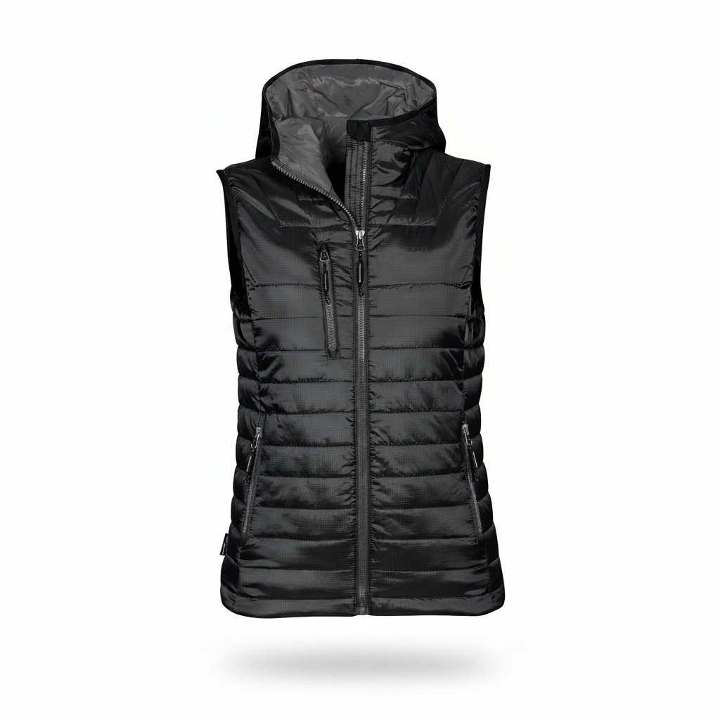
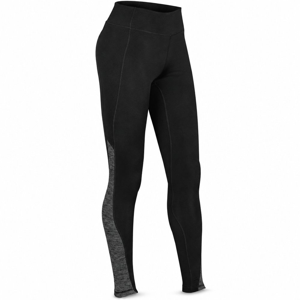
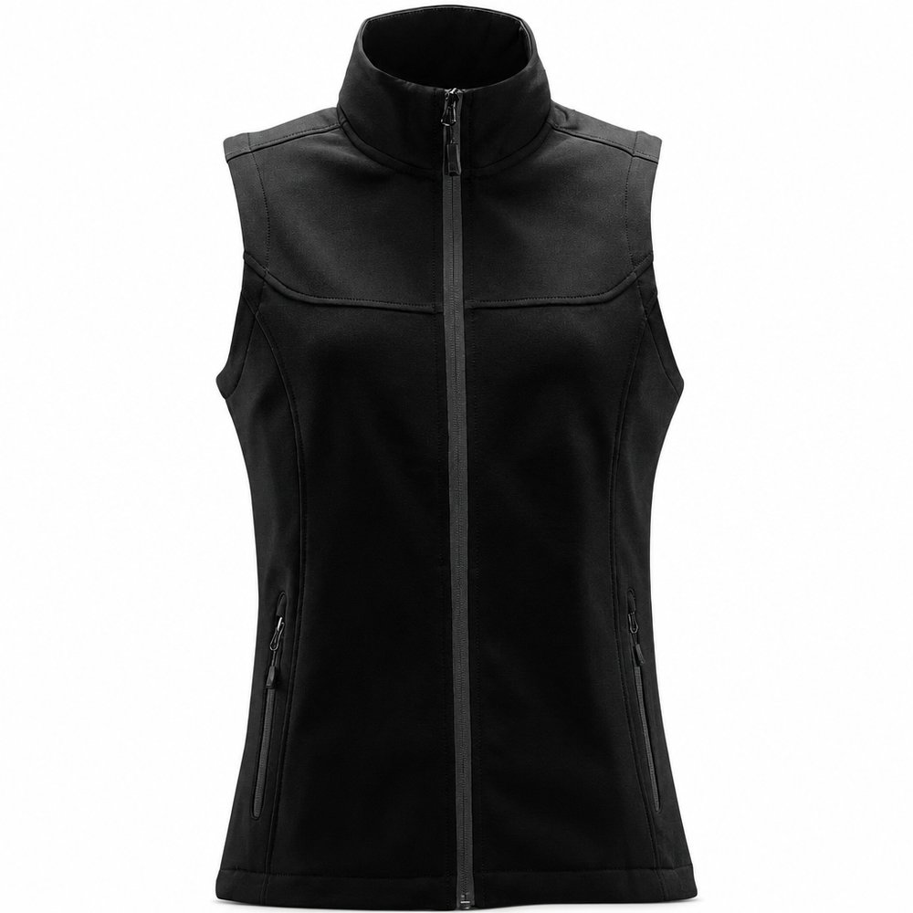
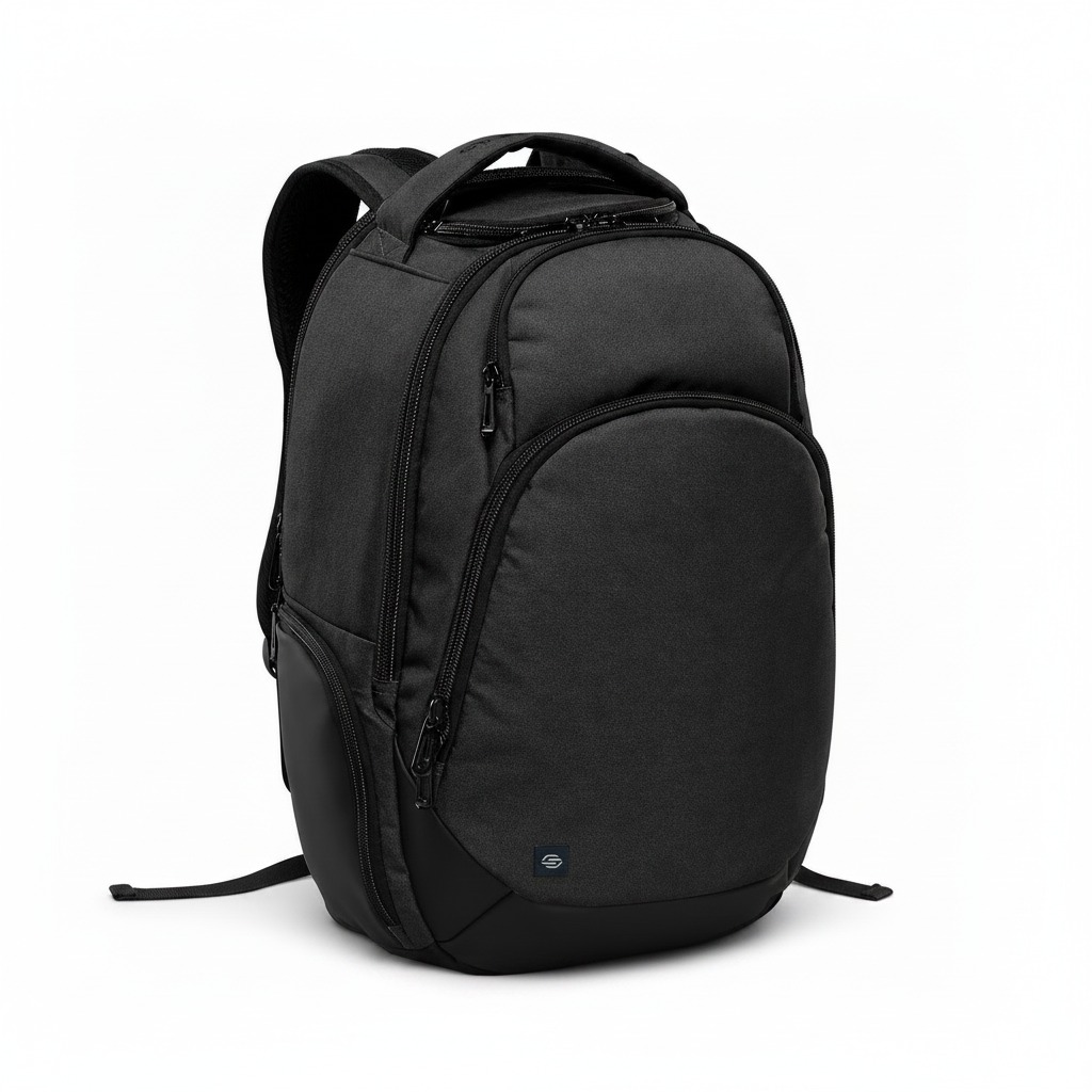
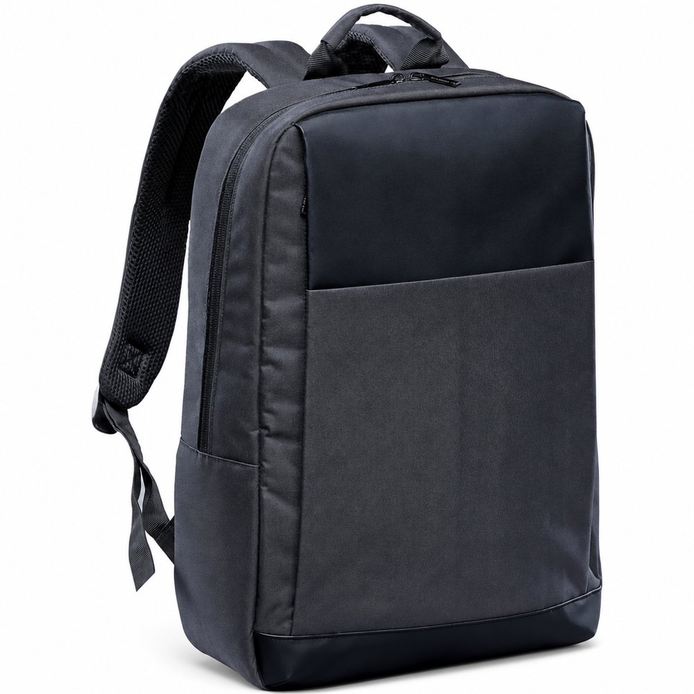
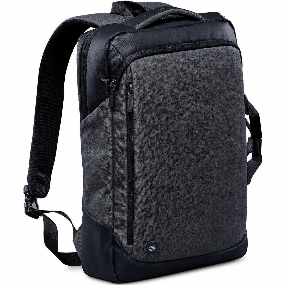
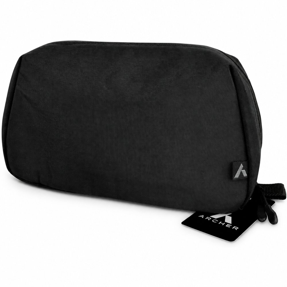
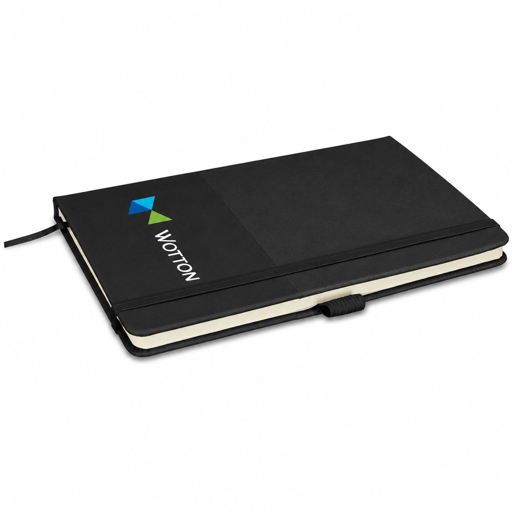
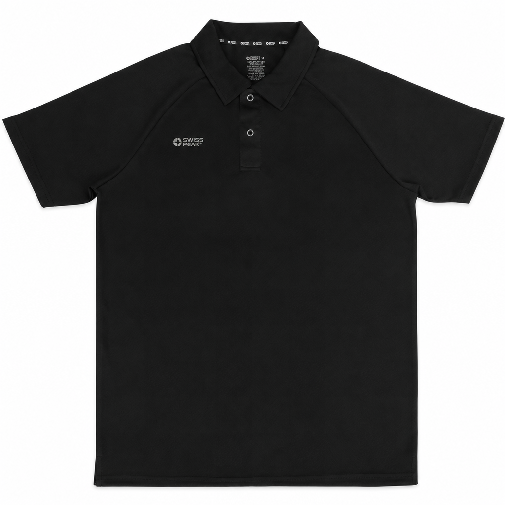
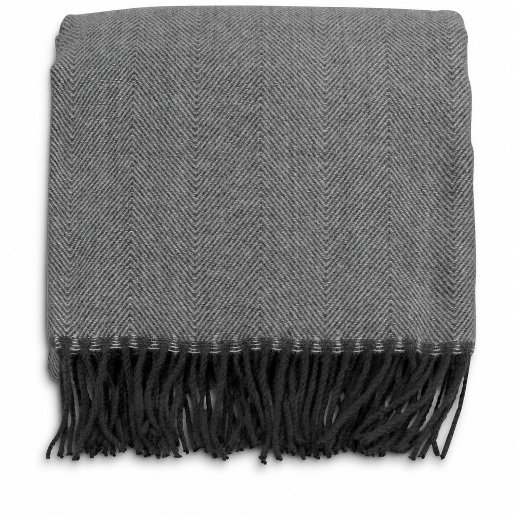
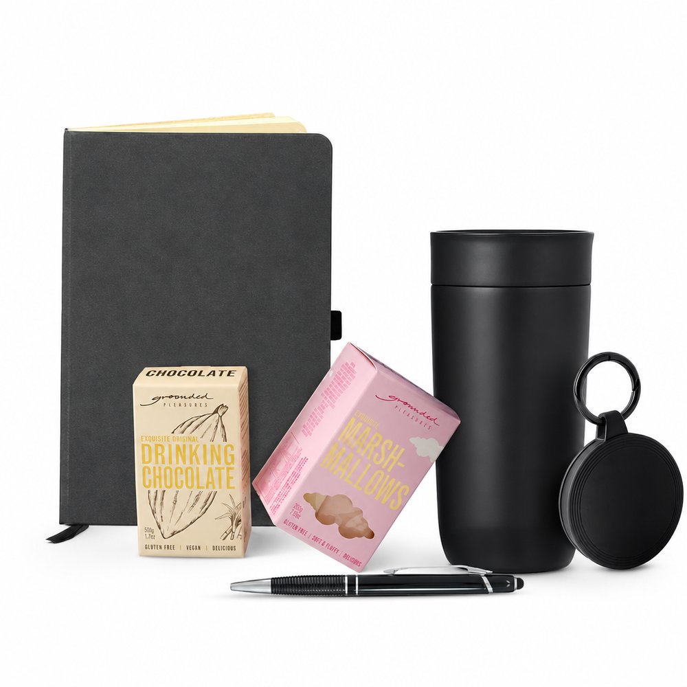
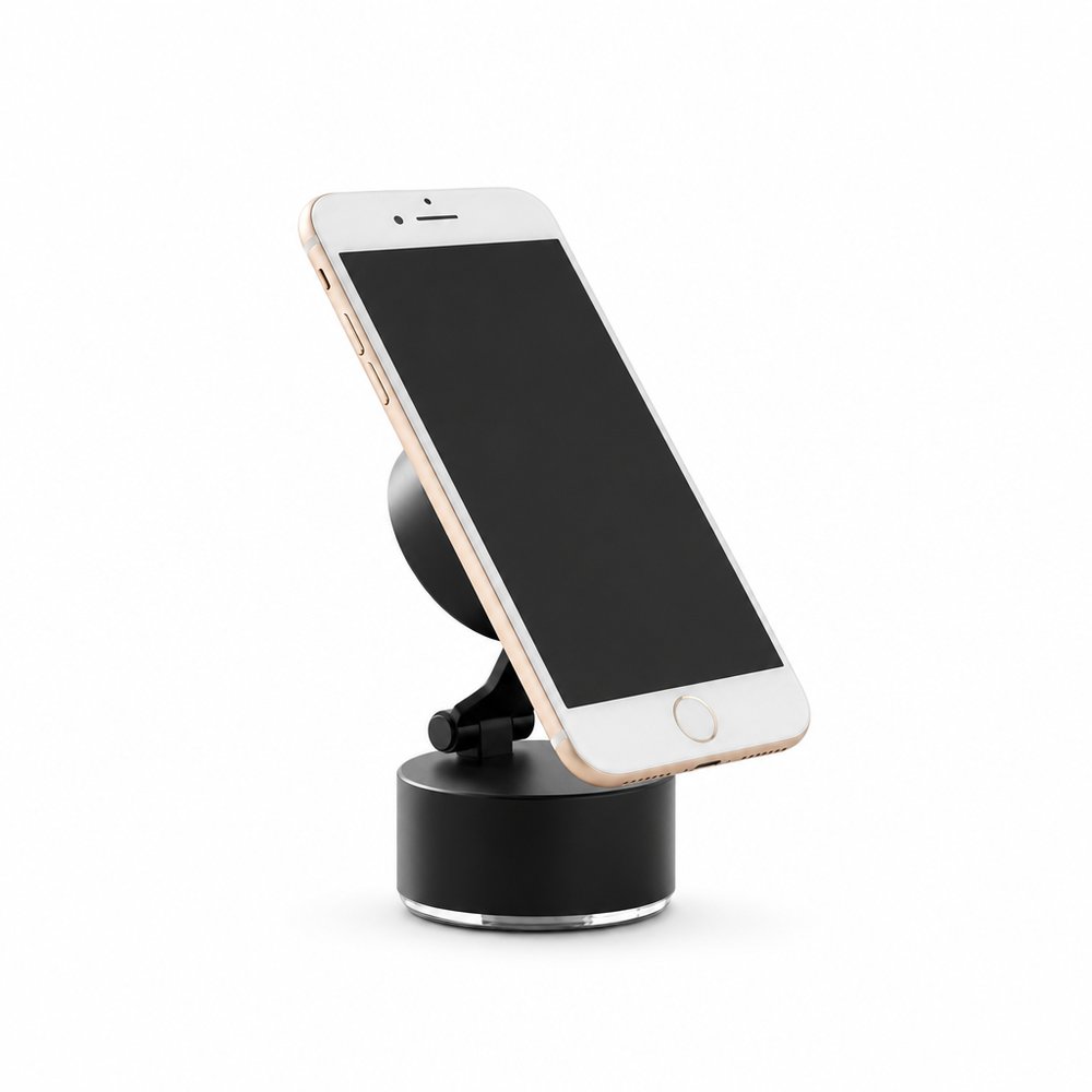
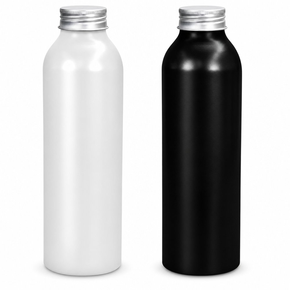
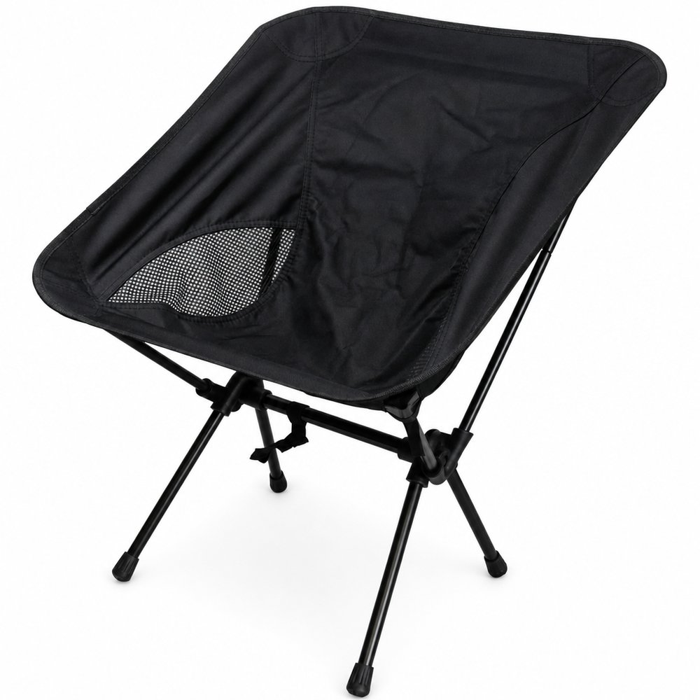
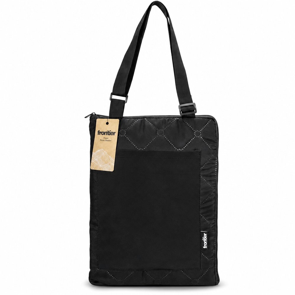
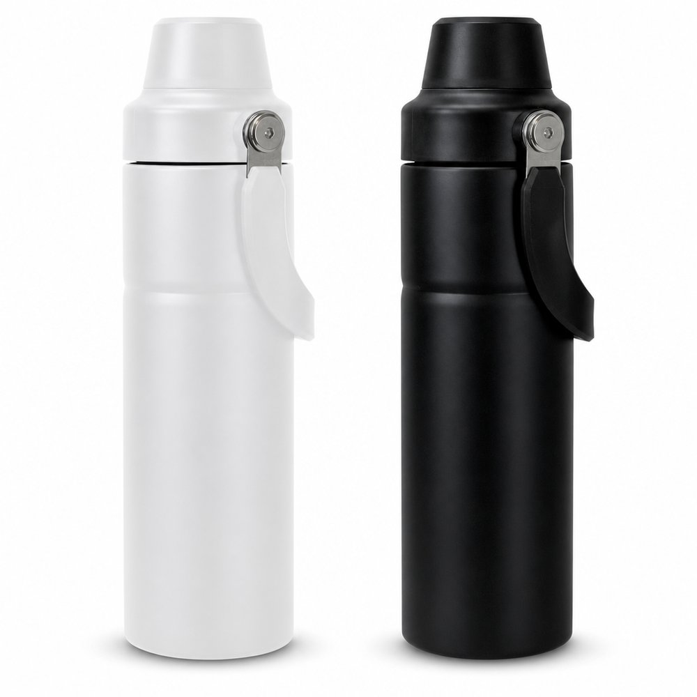
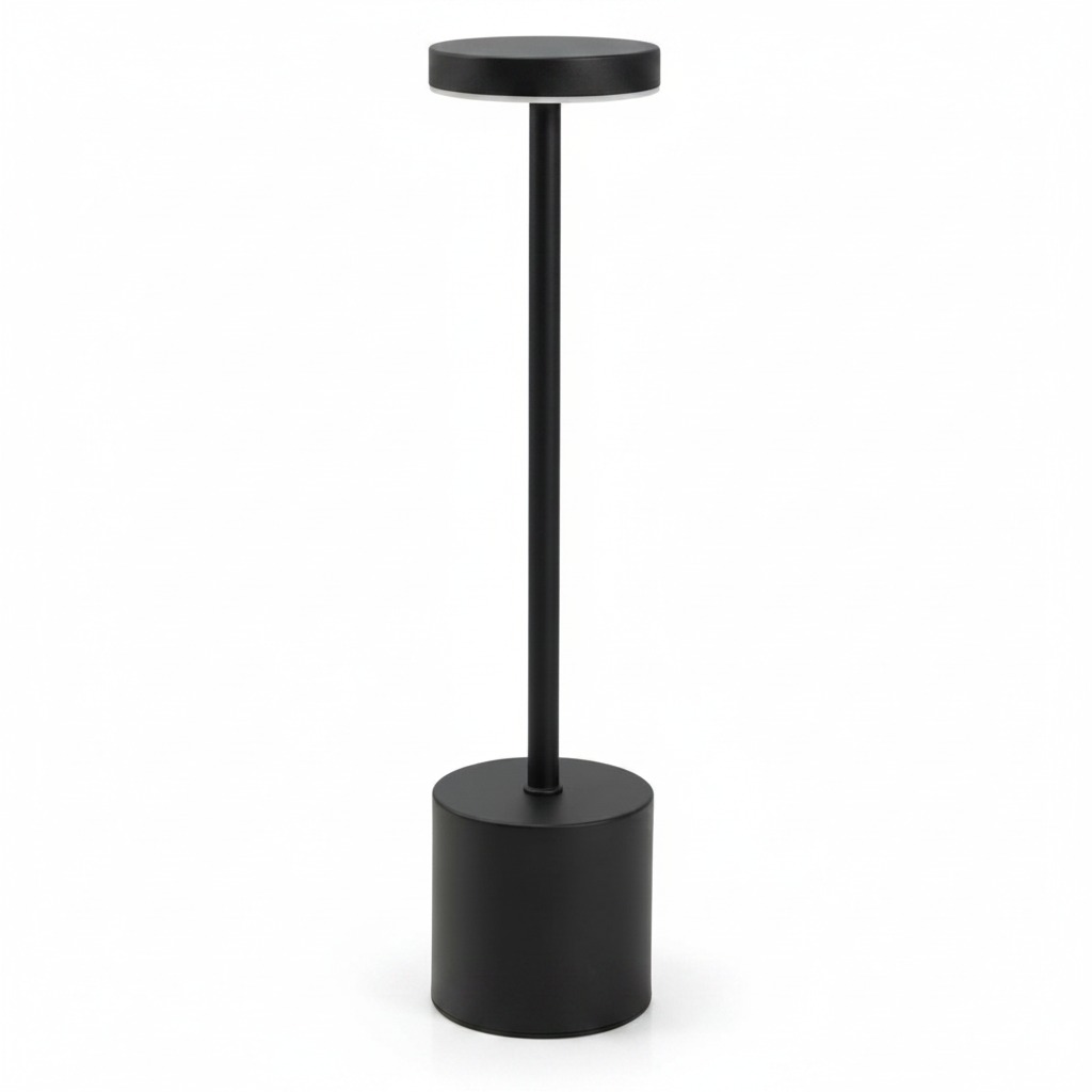
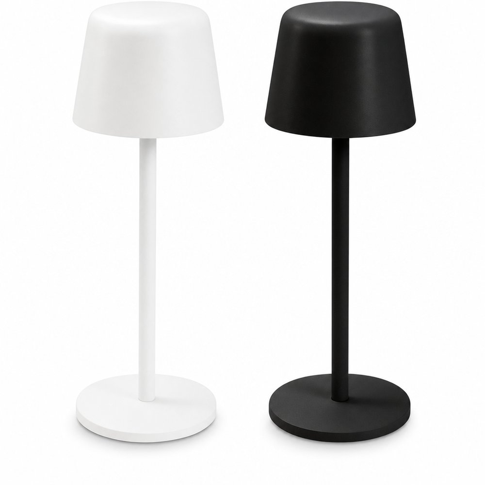
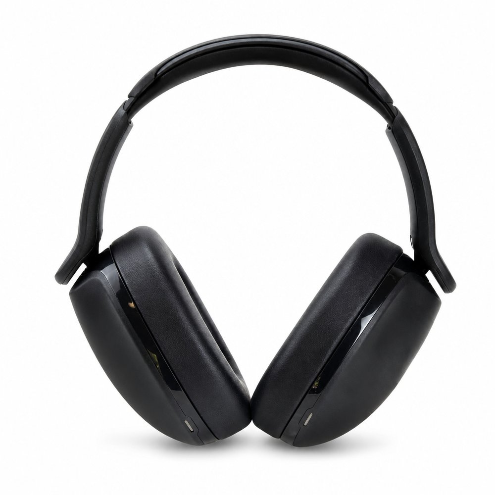
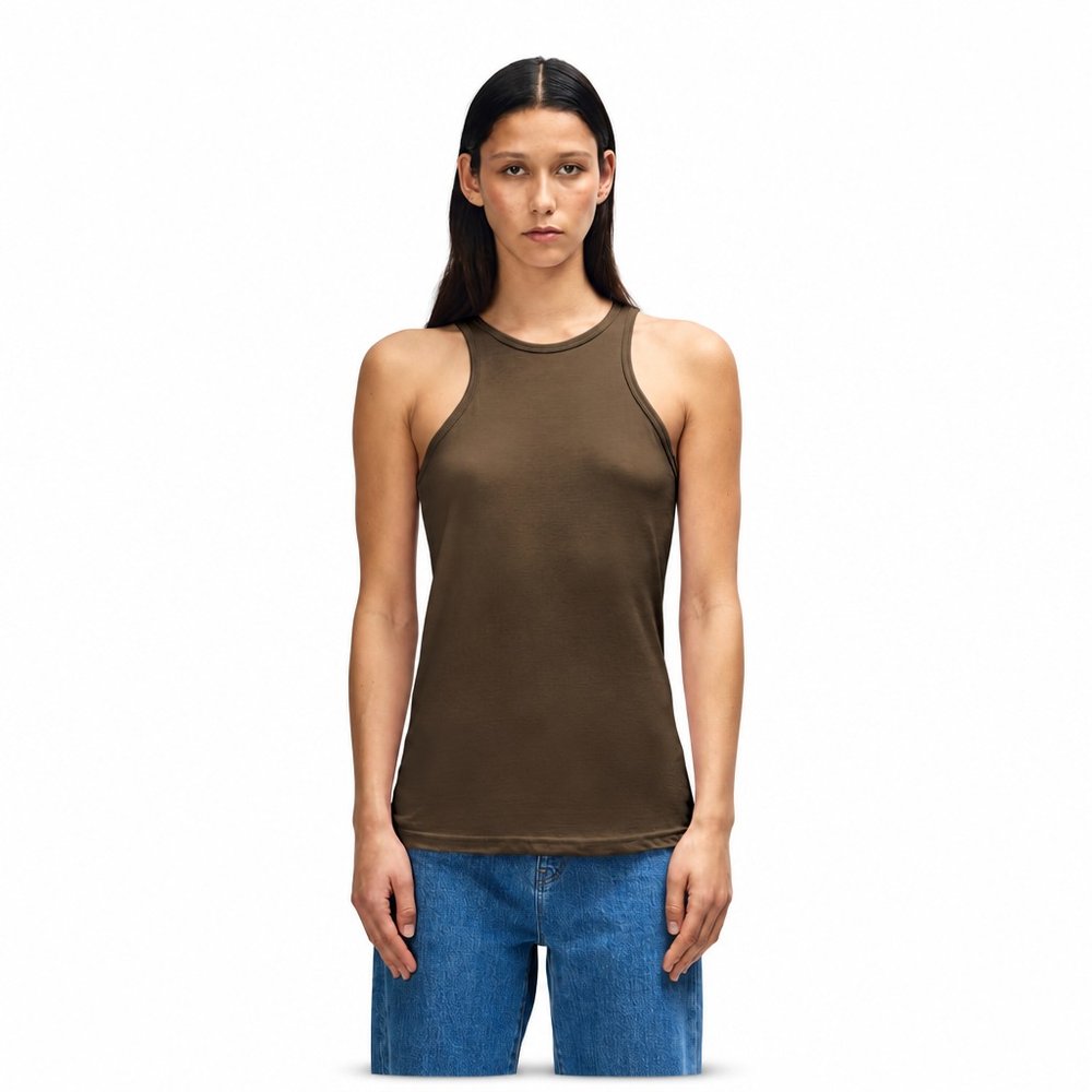
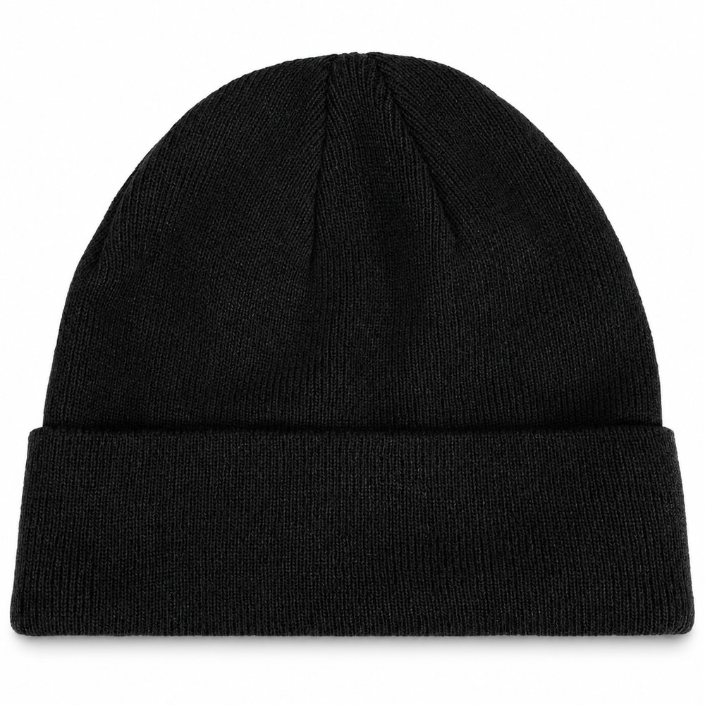
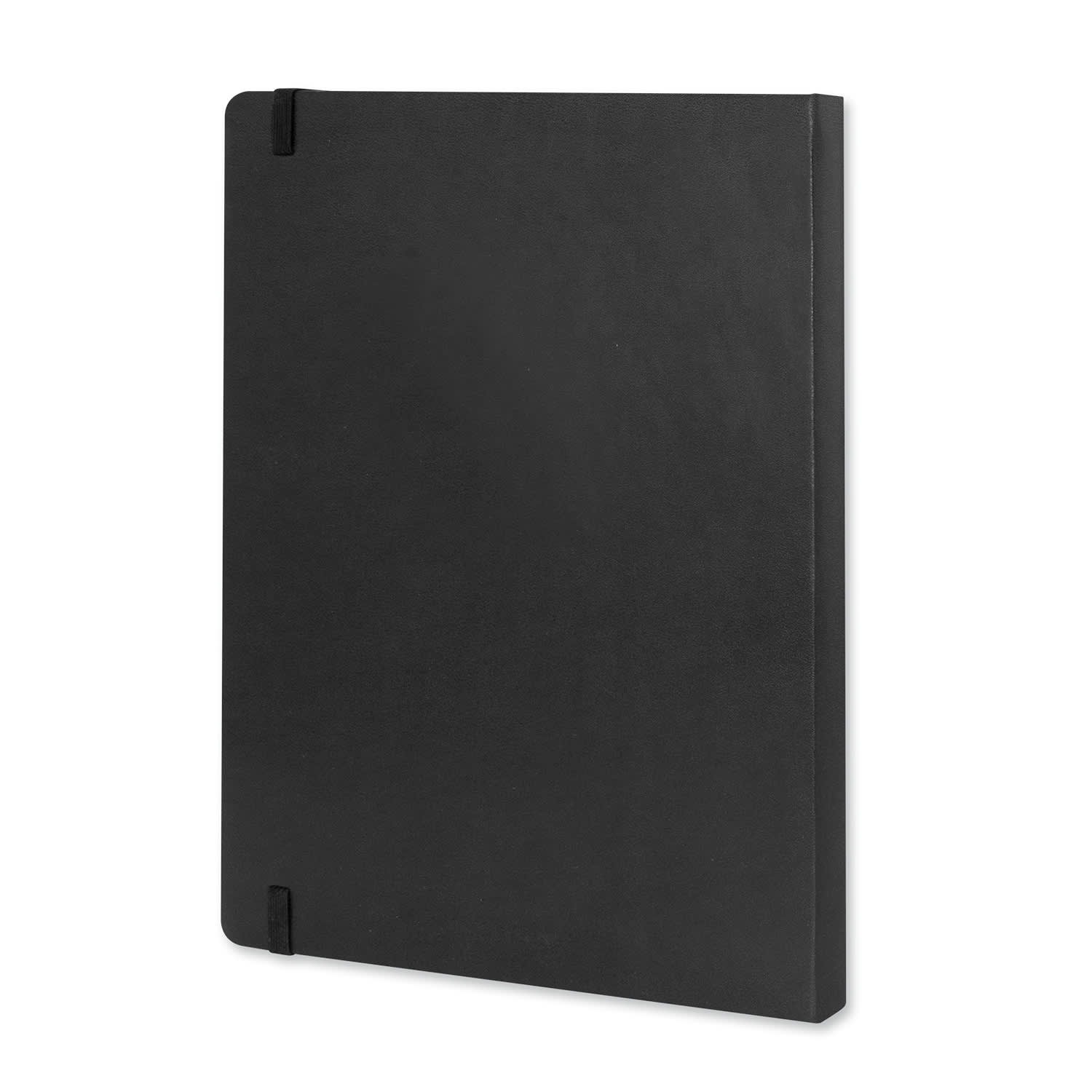
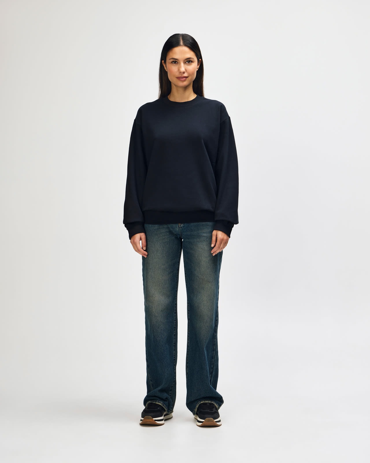
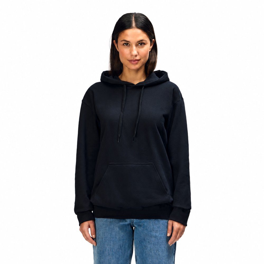
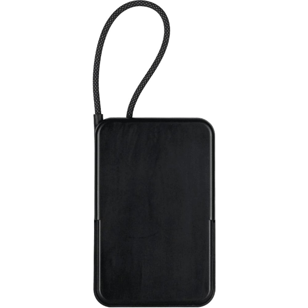
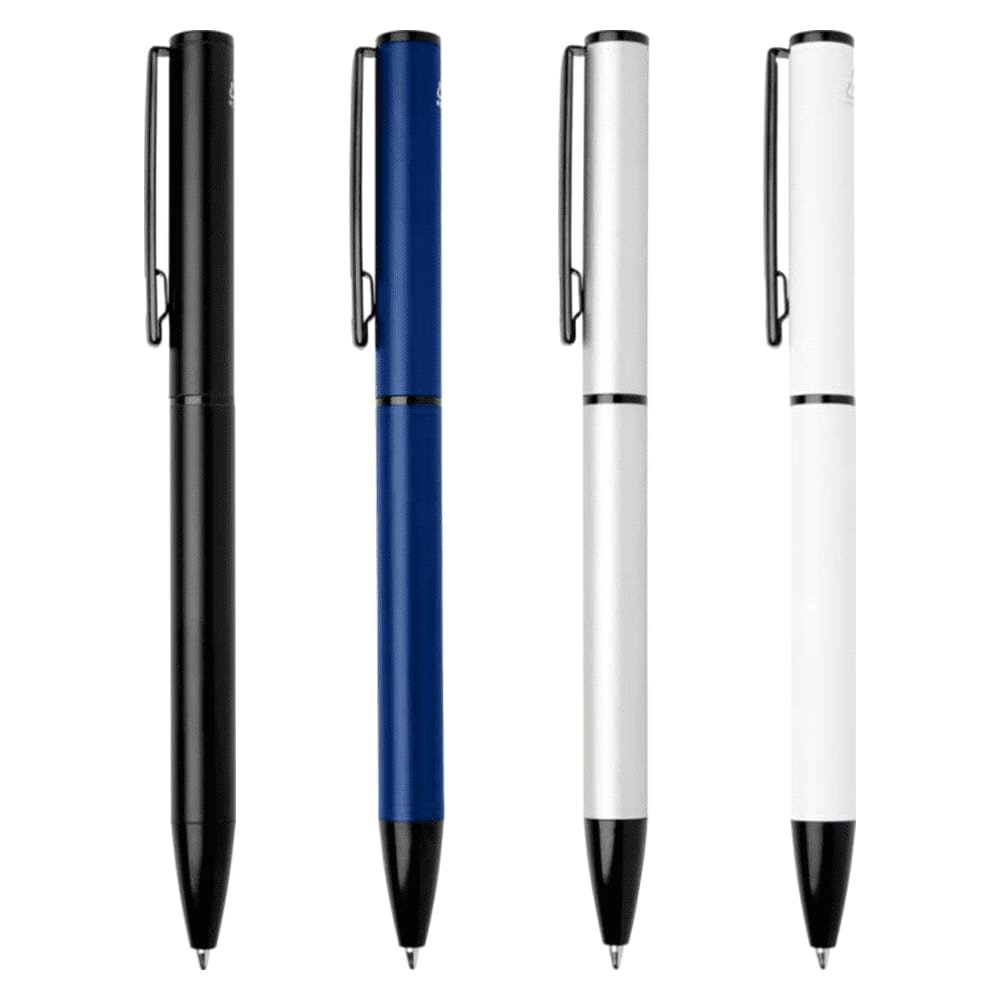
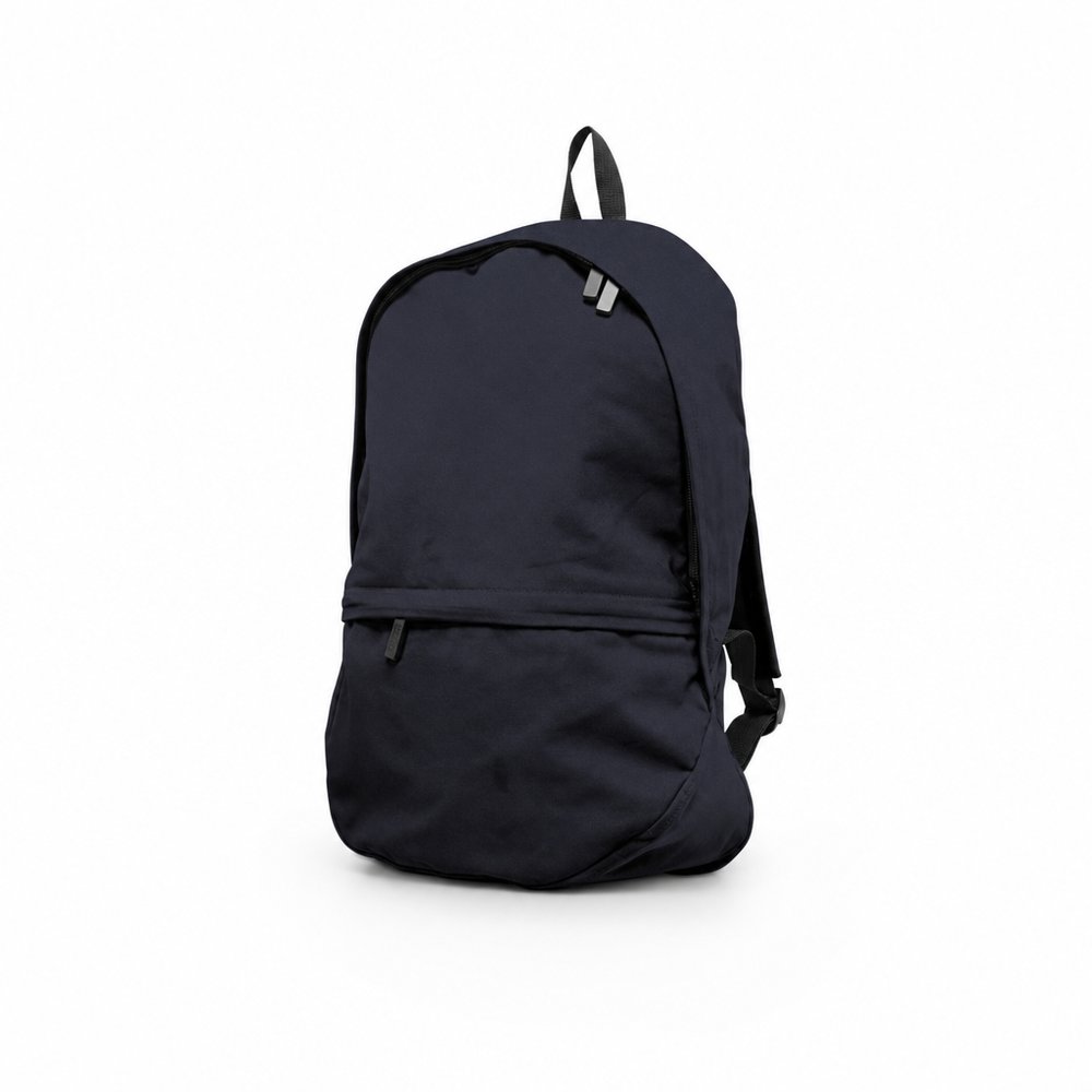
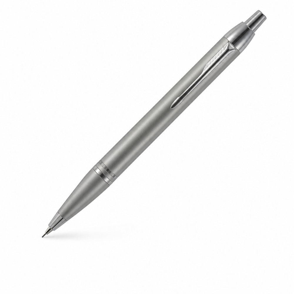
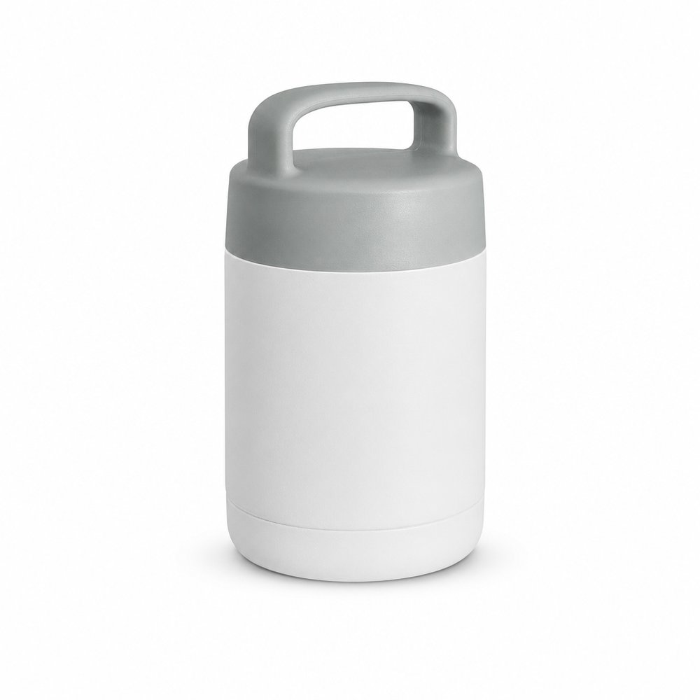
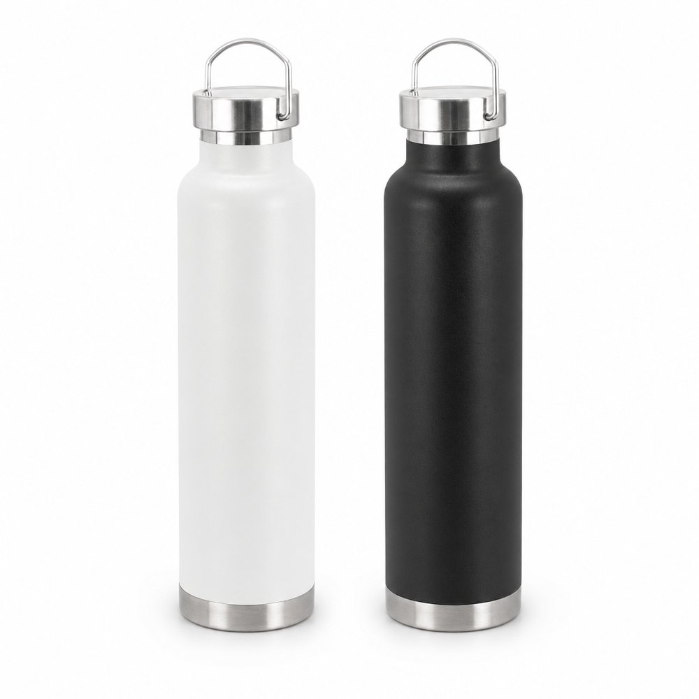
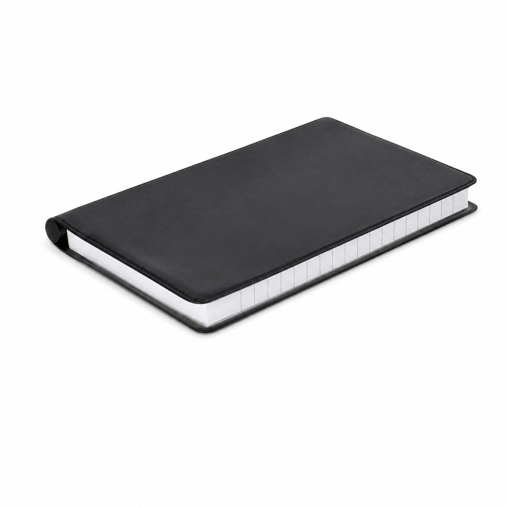
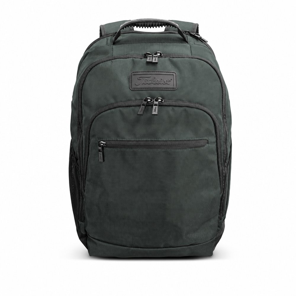
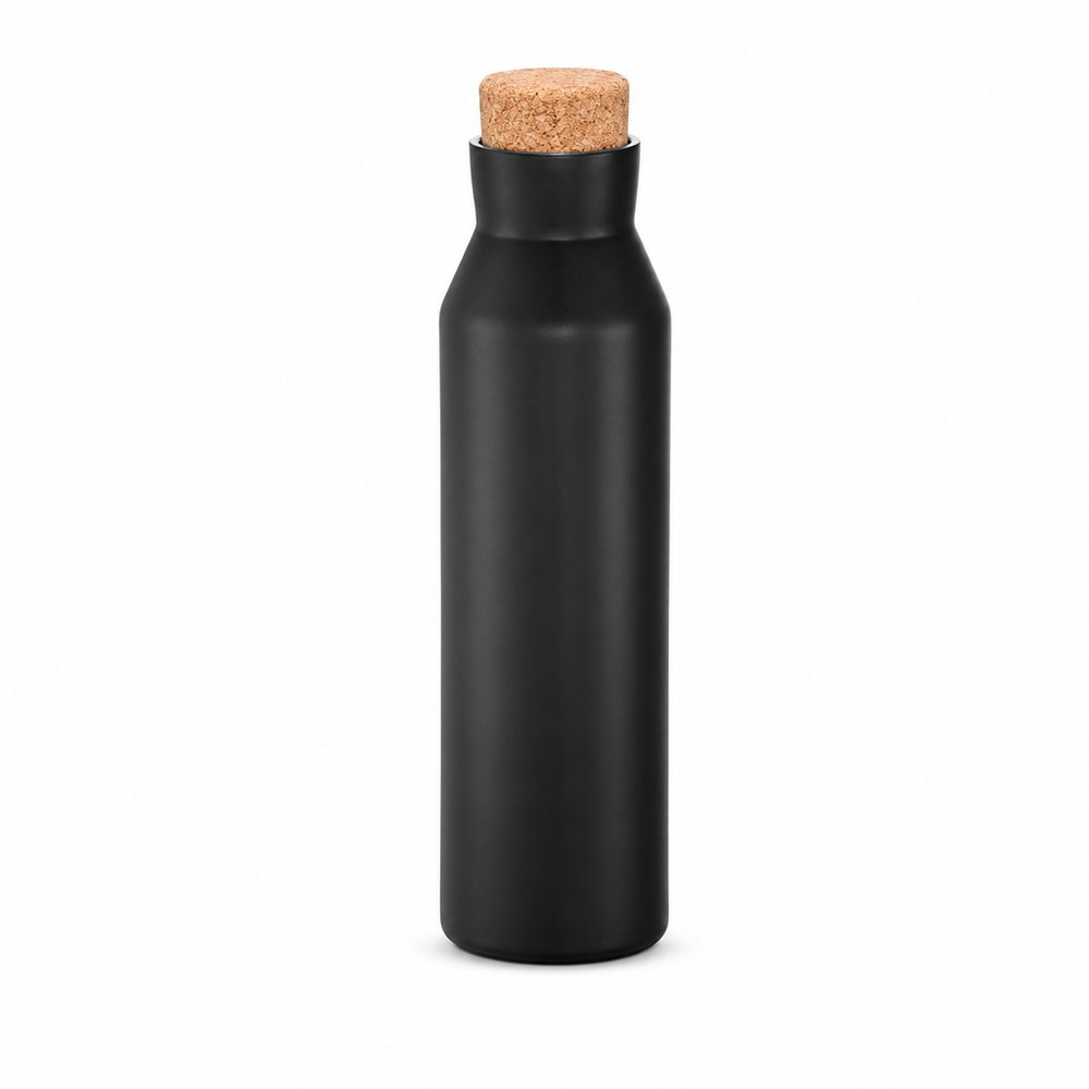
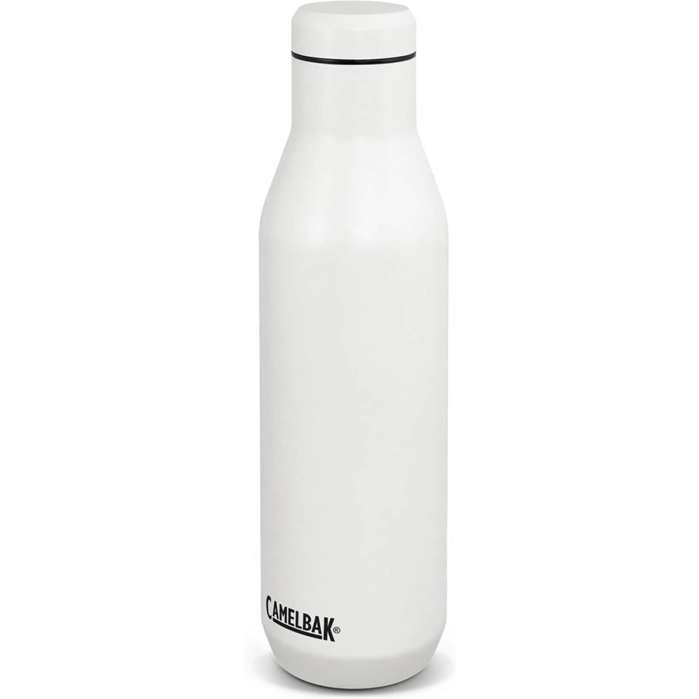
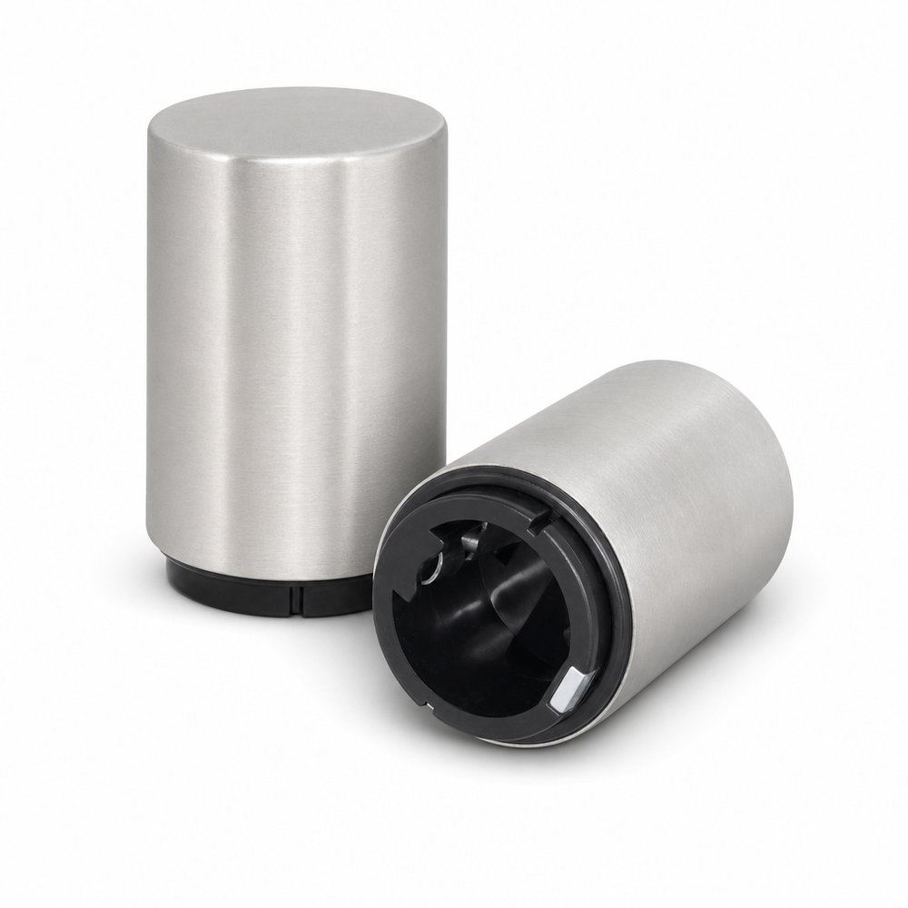
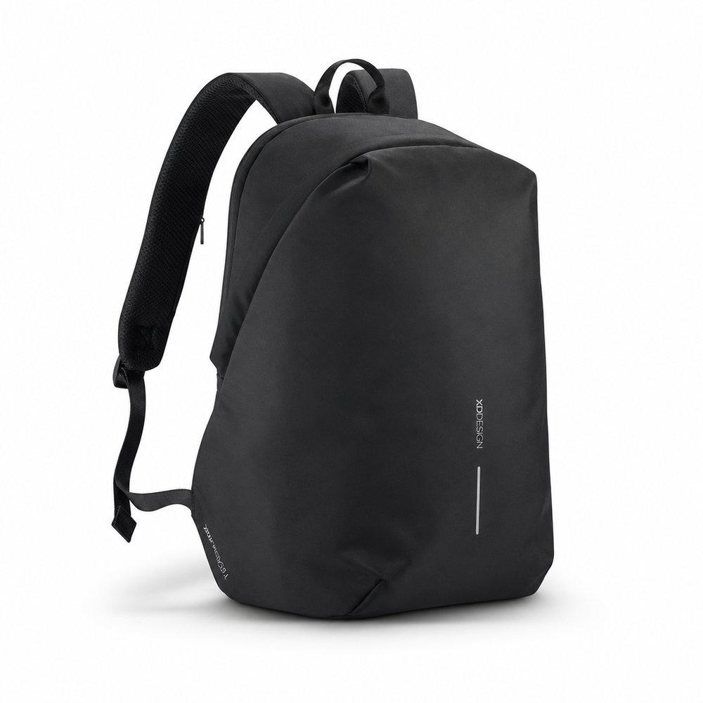
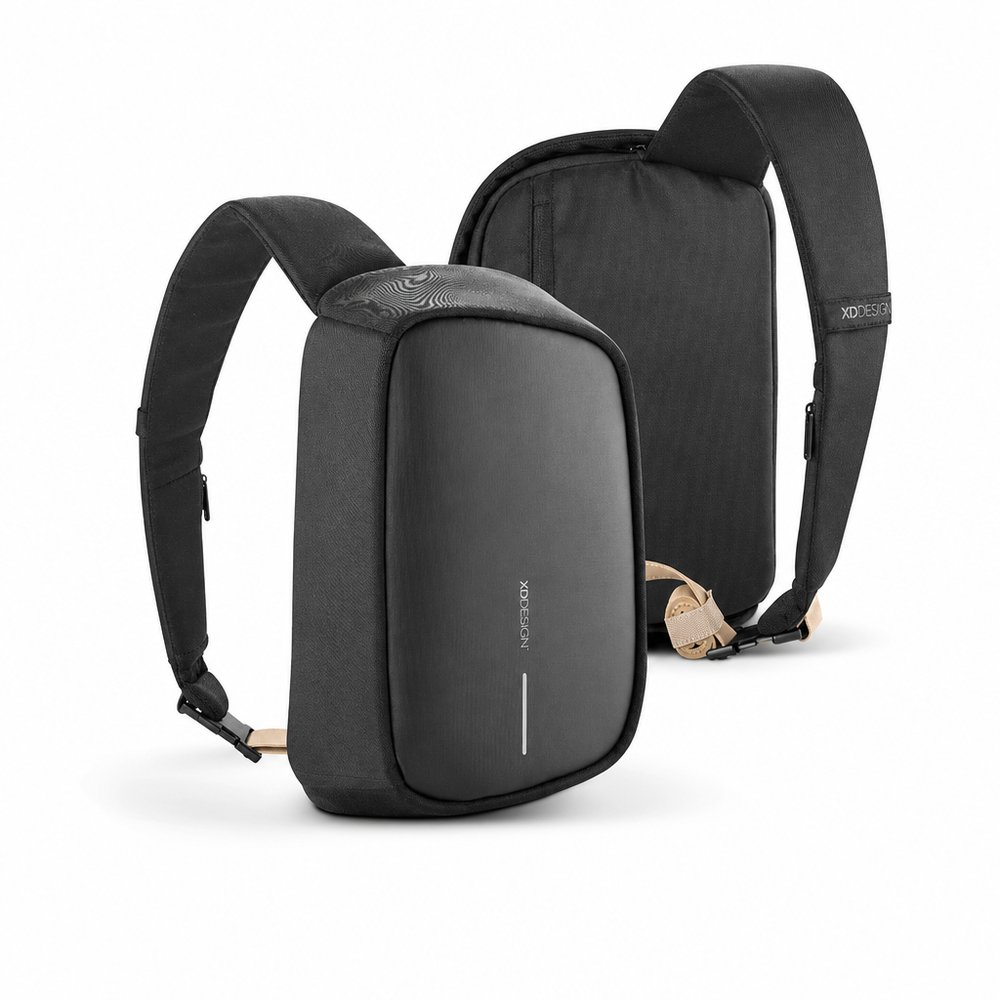
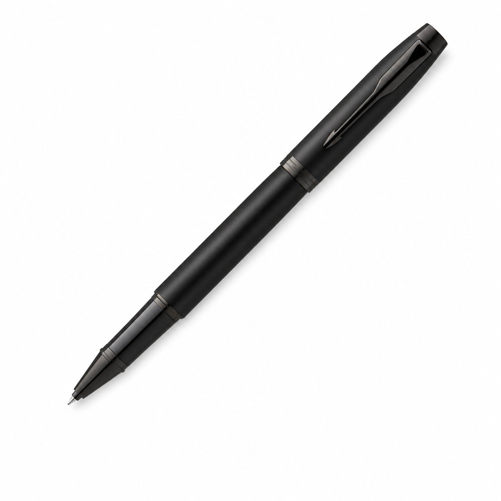
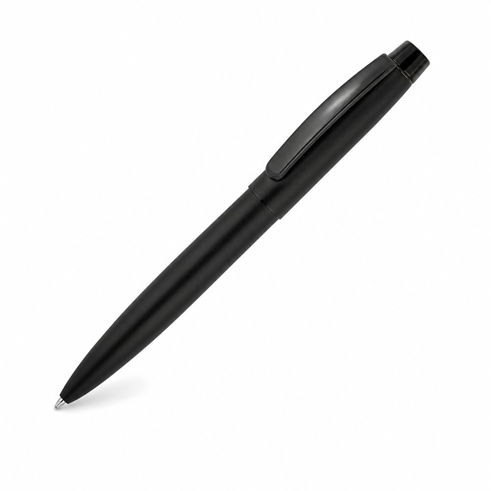
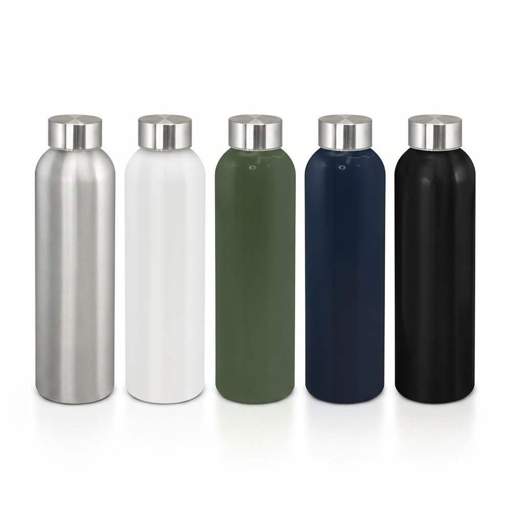
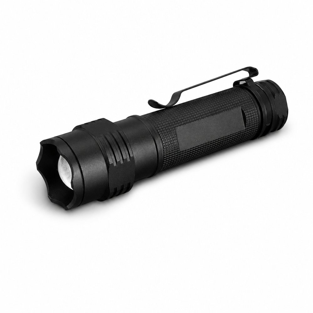
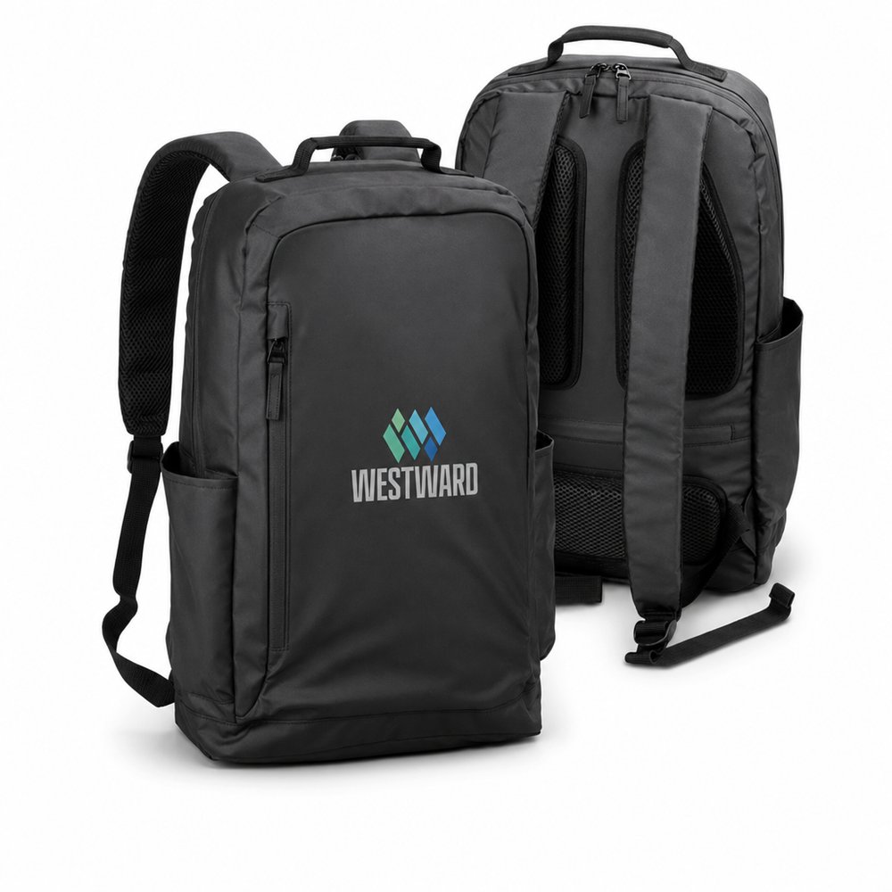
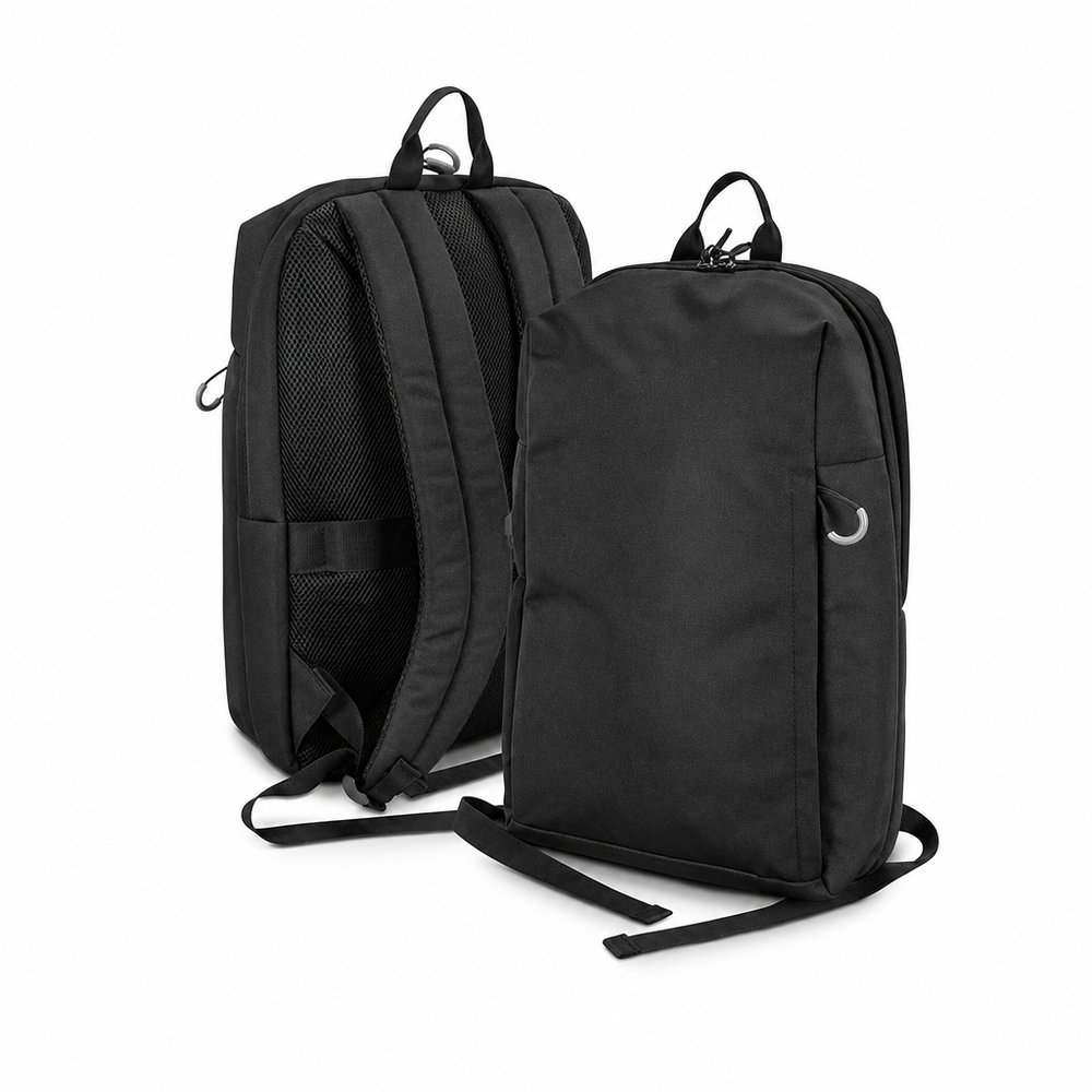
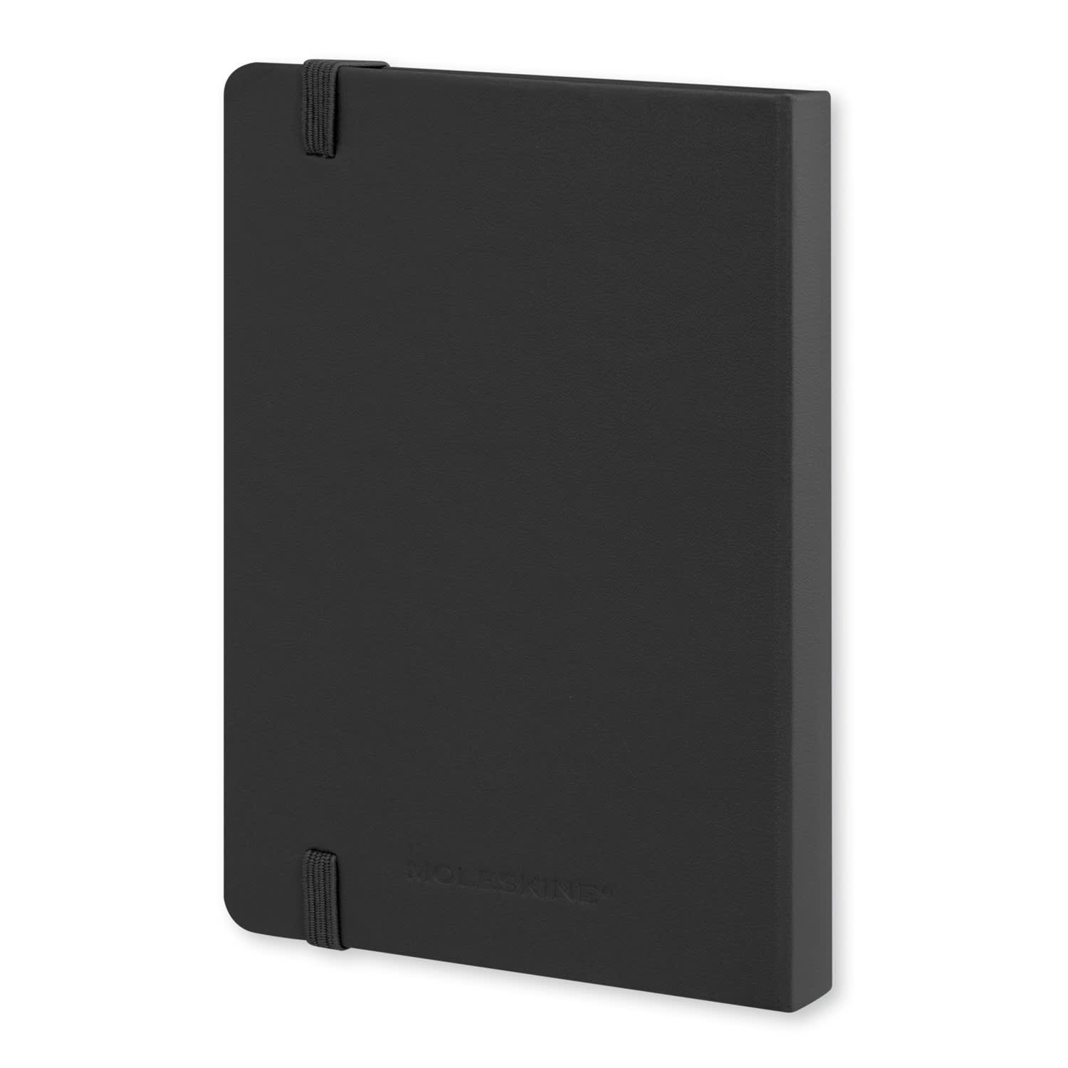
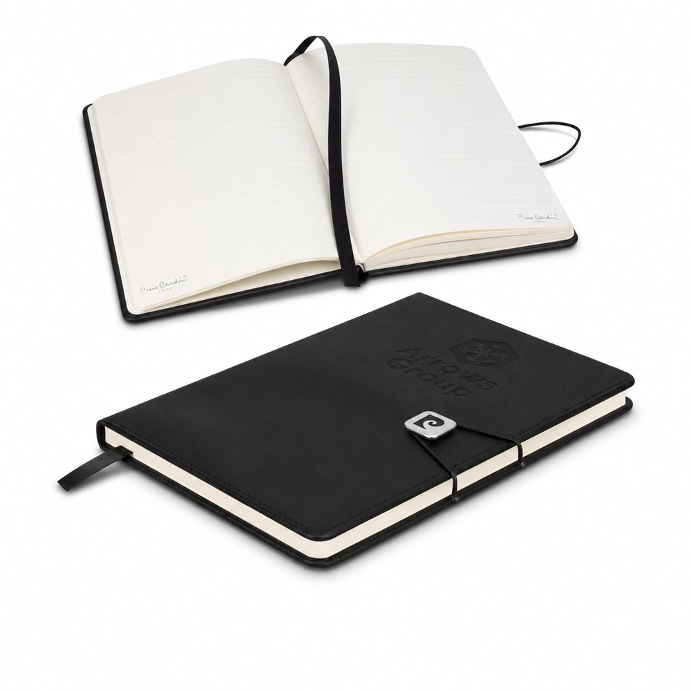
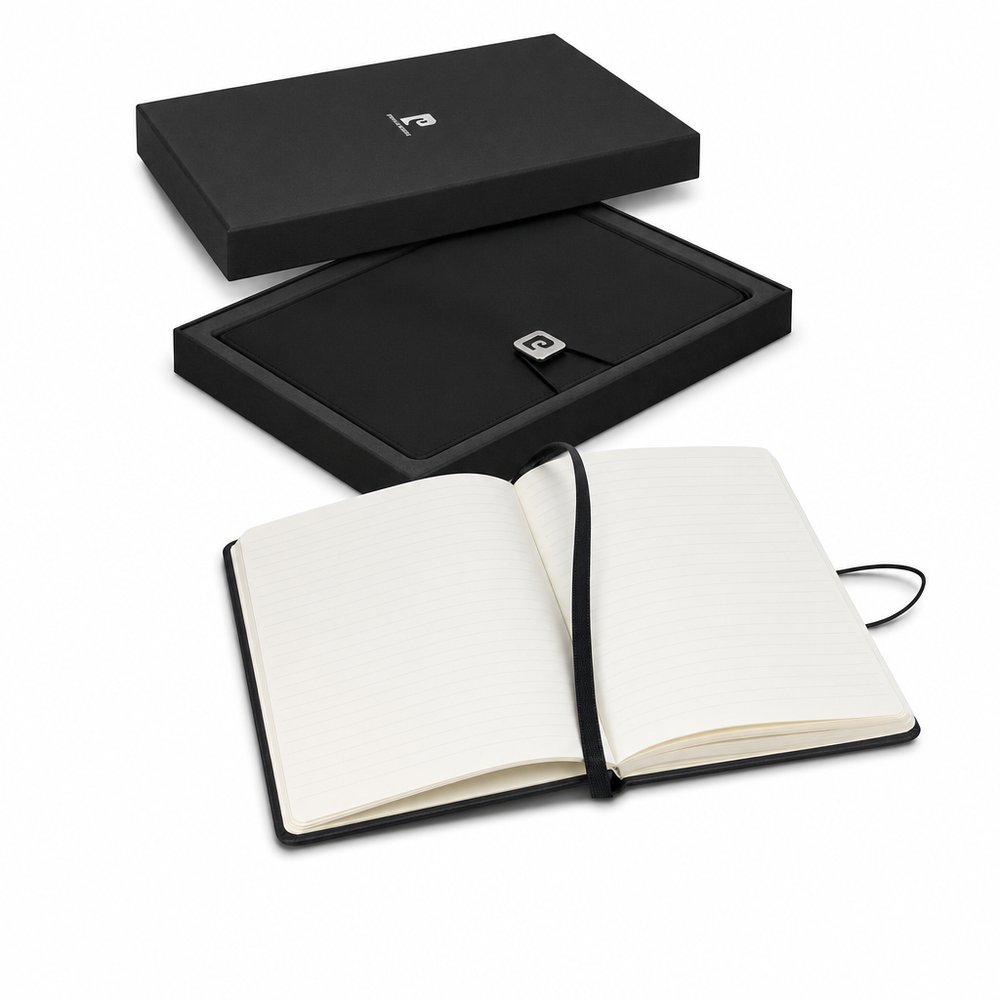
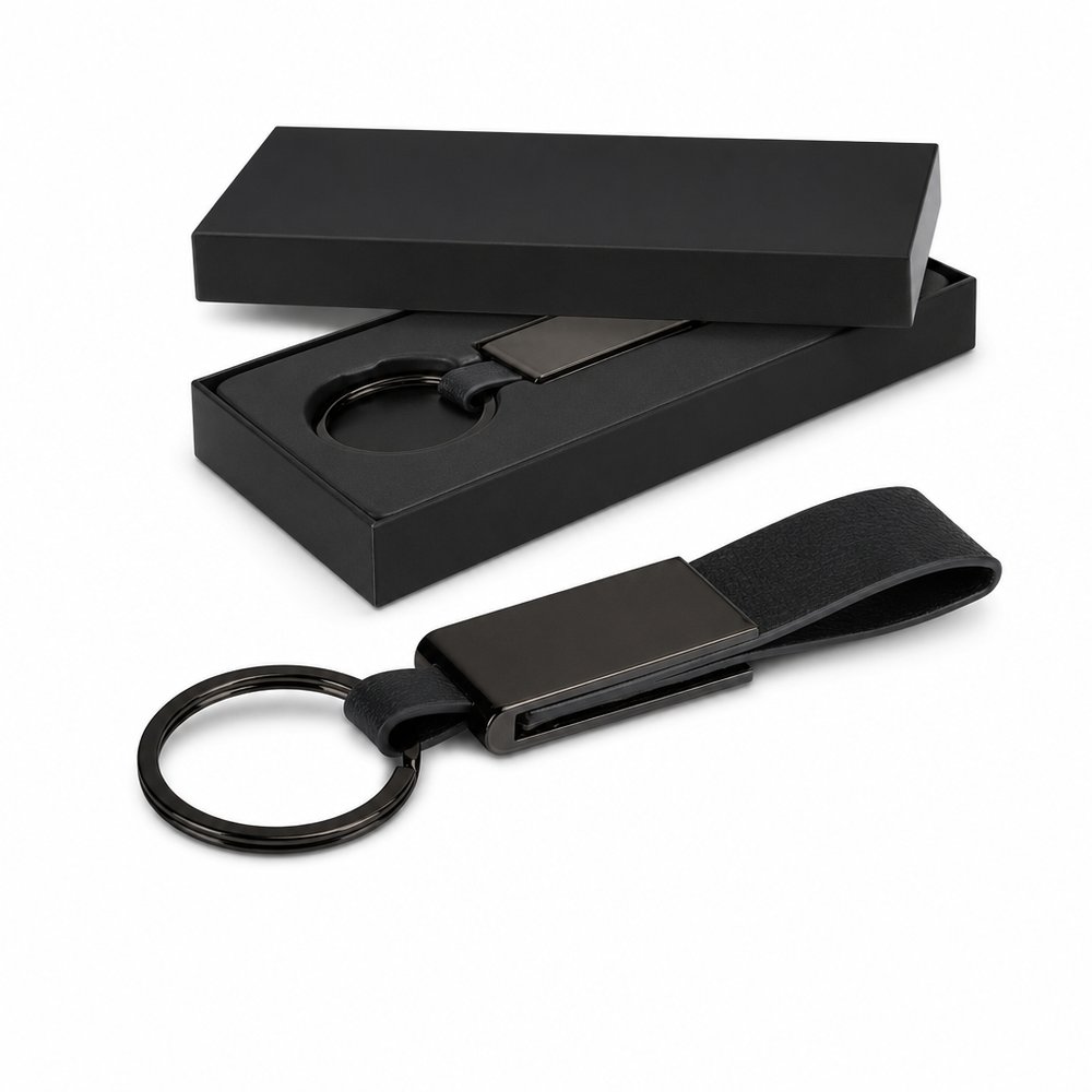
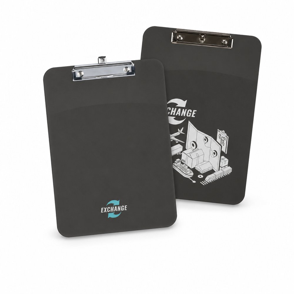
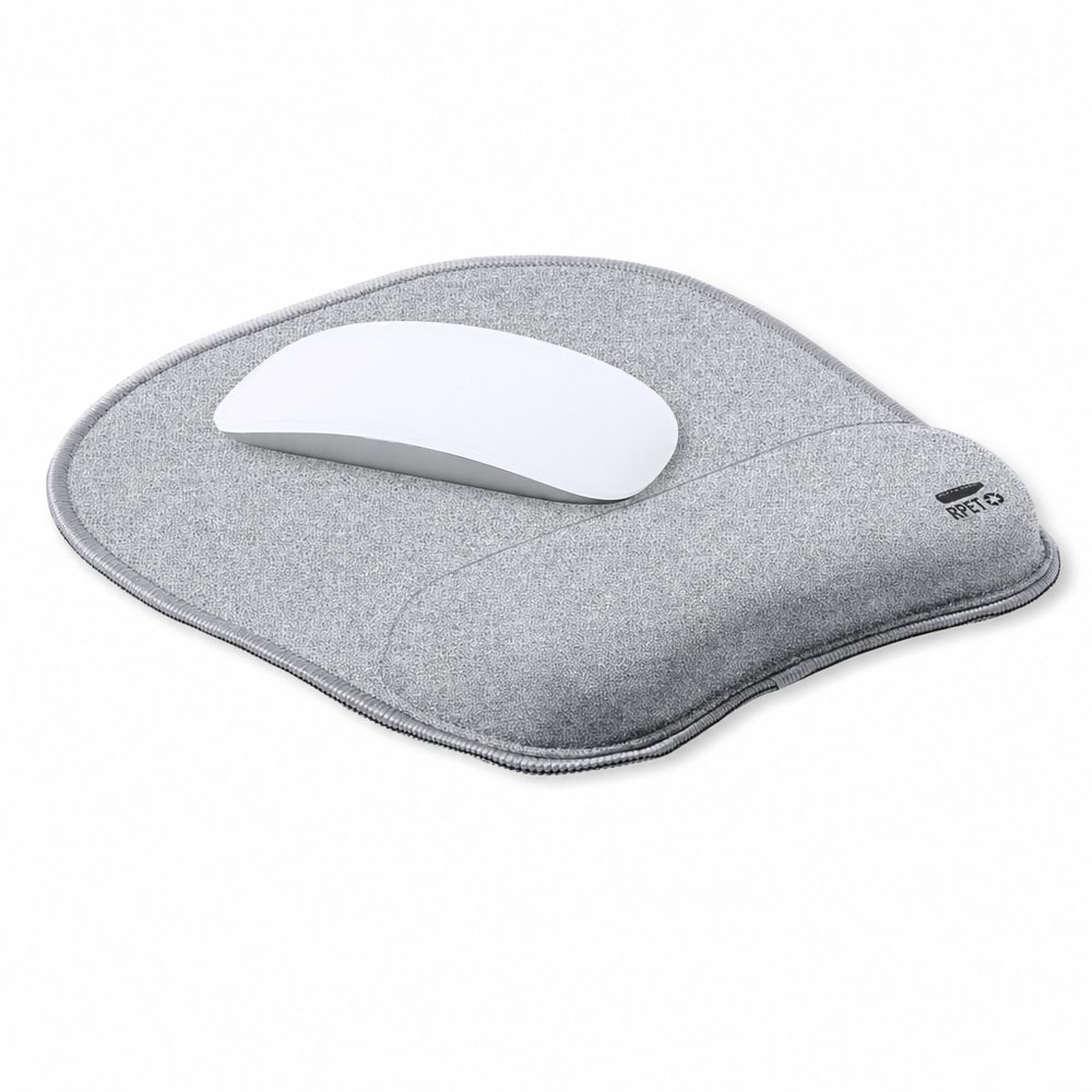
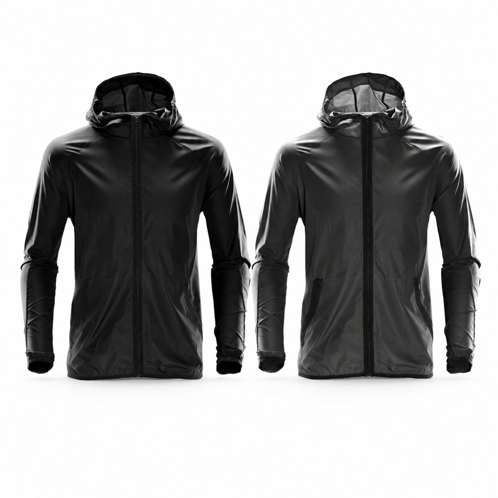
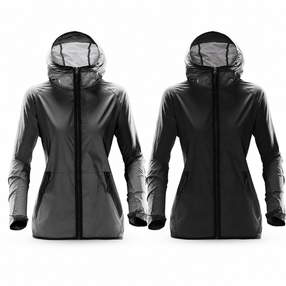
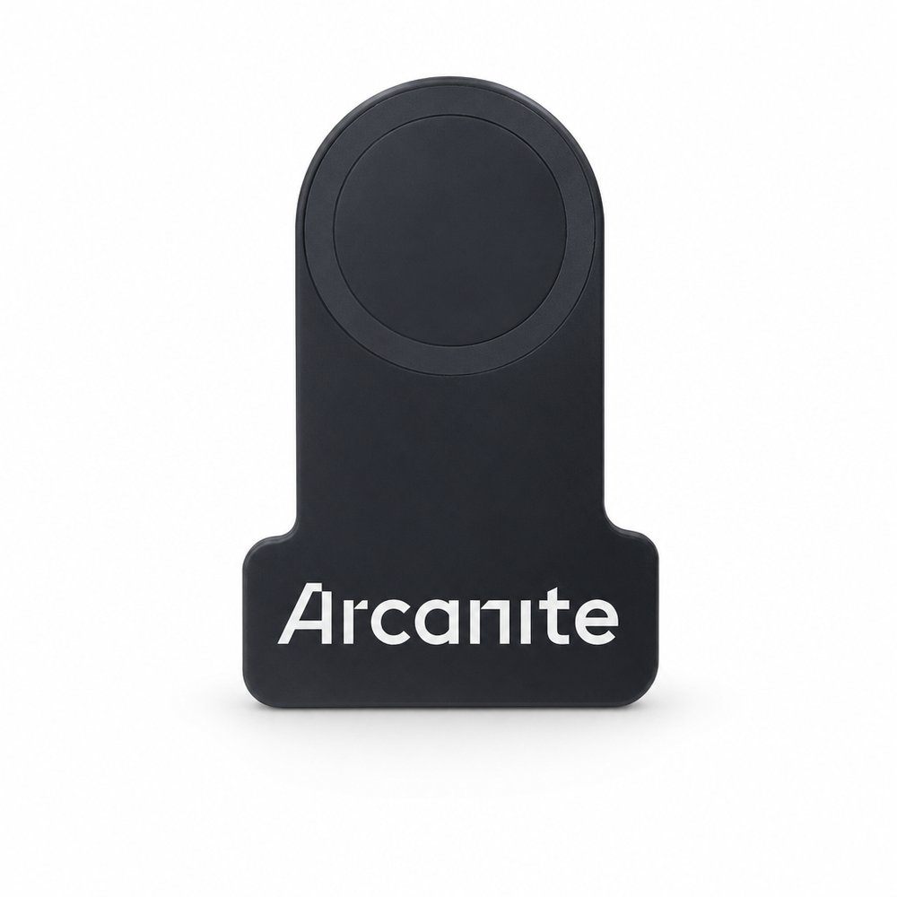
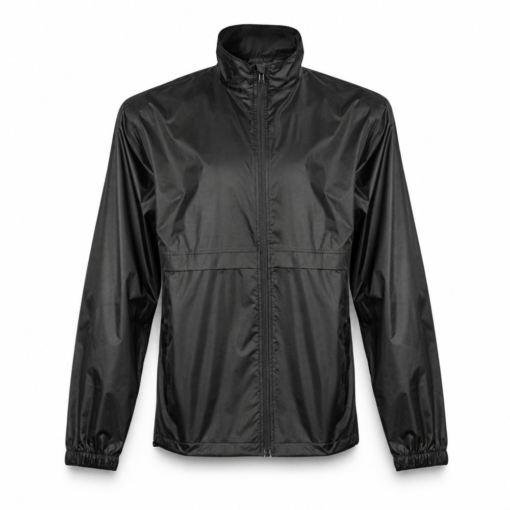
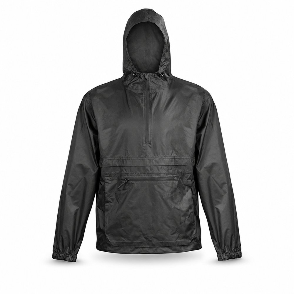
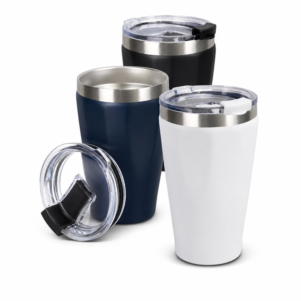
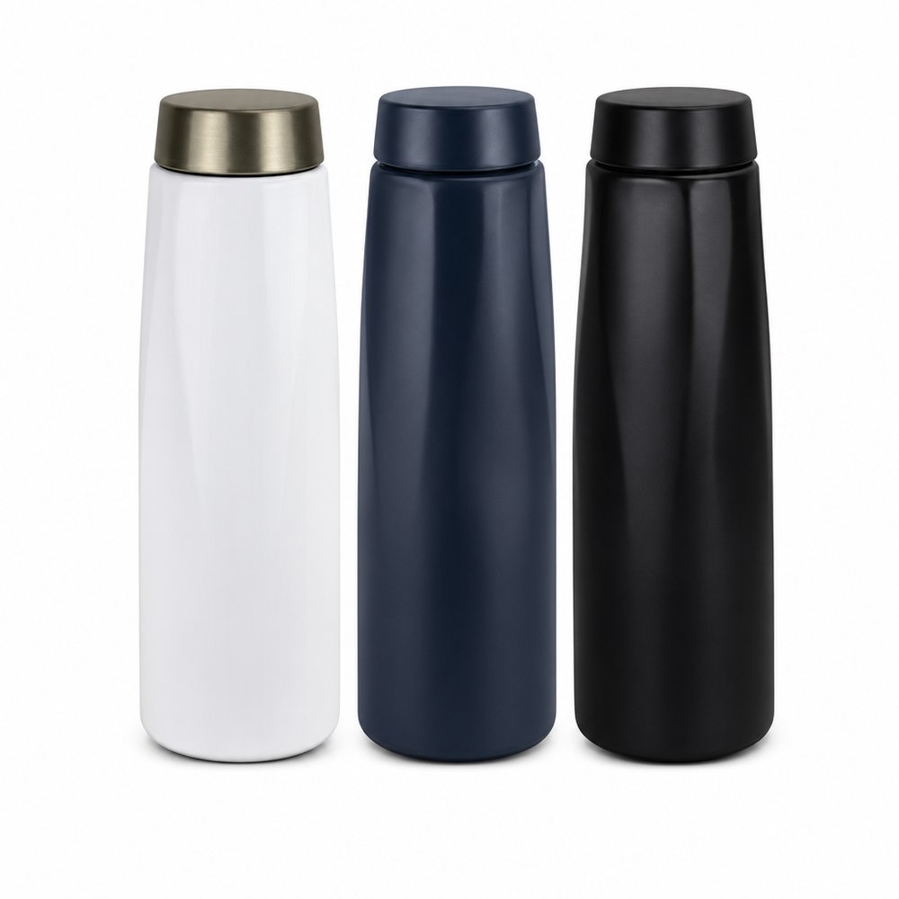
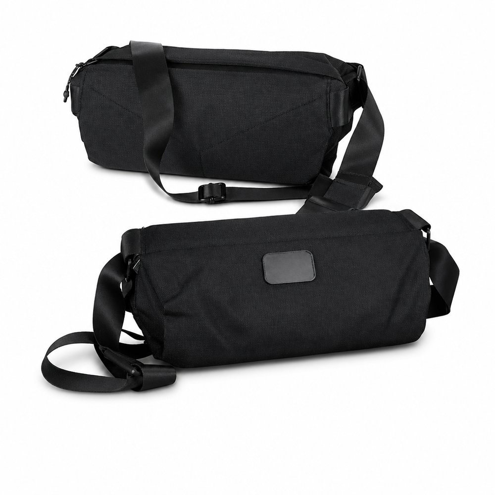
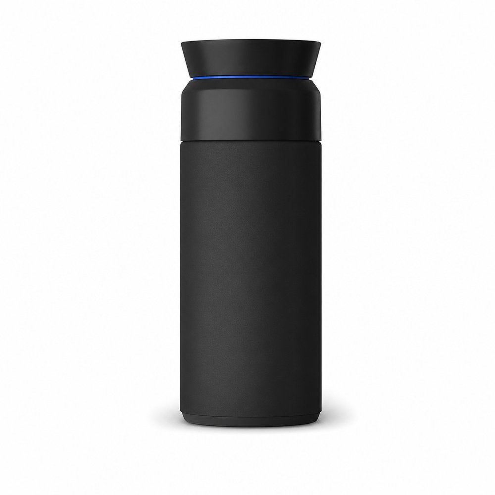
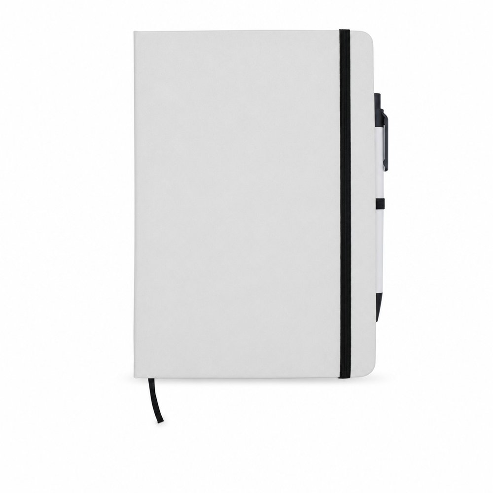
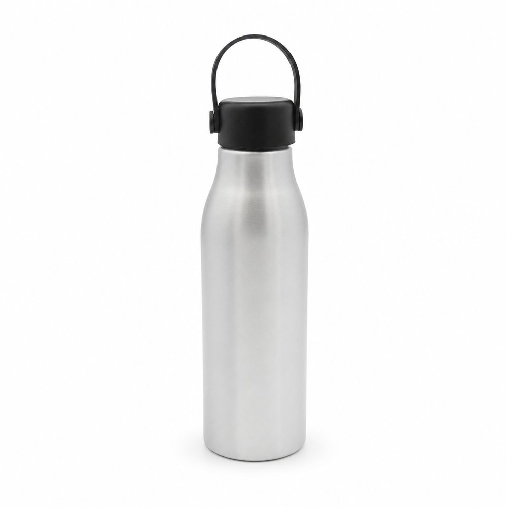
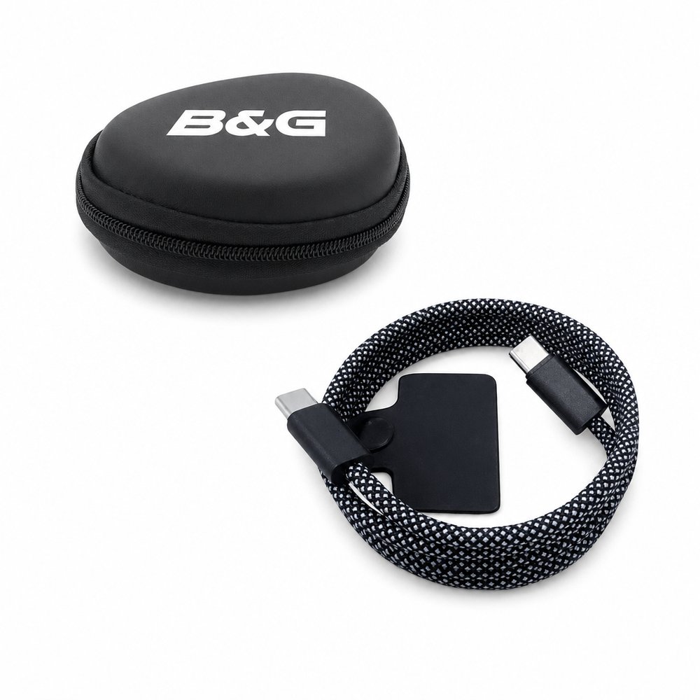
Think: Black · White · Grey · CharcoalSee the hand-picked edit →
A premium Manuka honey brand that resists every honey cliché — no amber gradients, no hexagons, no bees. The monochrome discipline makes the product feel pharmaceutical-grade, which for wellness is the entire trust battle. Australian brands take note: 'natural' doesn't have to mean 'beige and busy'.
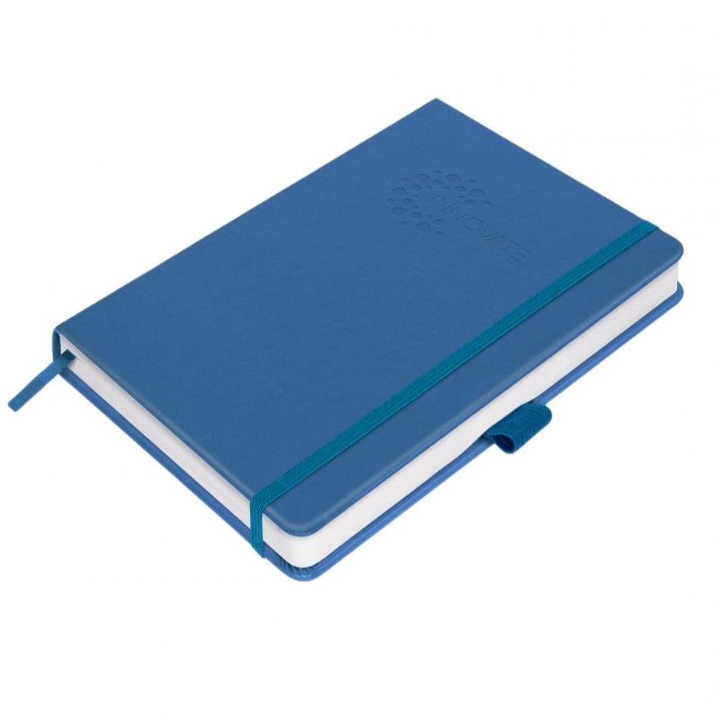
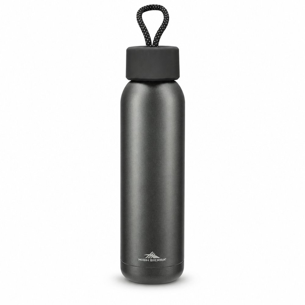
Read the full study →Deep shadows pooling in circular impressions against granular metallic stock — the mark feels permanent because it's IN the material, not on it. Monochrome's superpower is exactly this: remove colour and every remaining variable (depth, texture, light) becomes a branding tool. On merch: deboss > print, always, when the palette is silent.
Read the full study →















 Express
 Express
 Express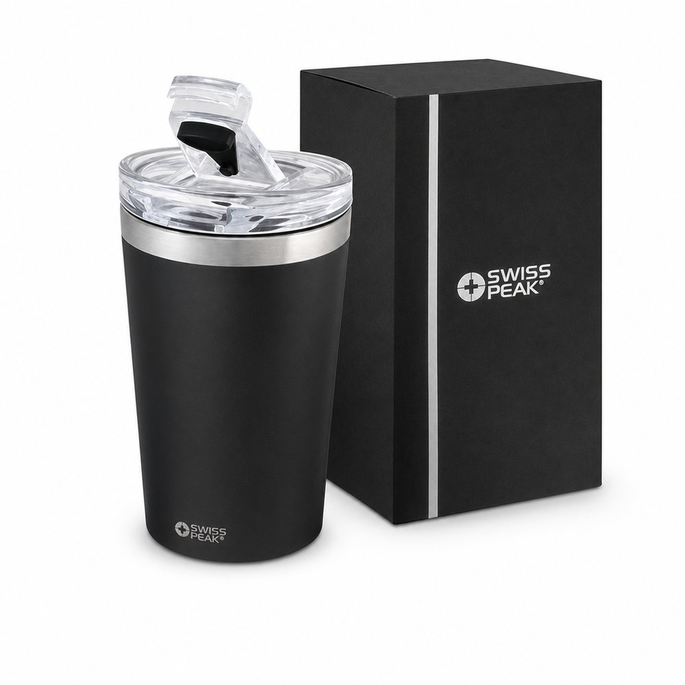
 Express
 Express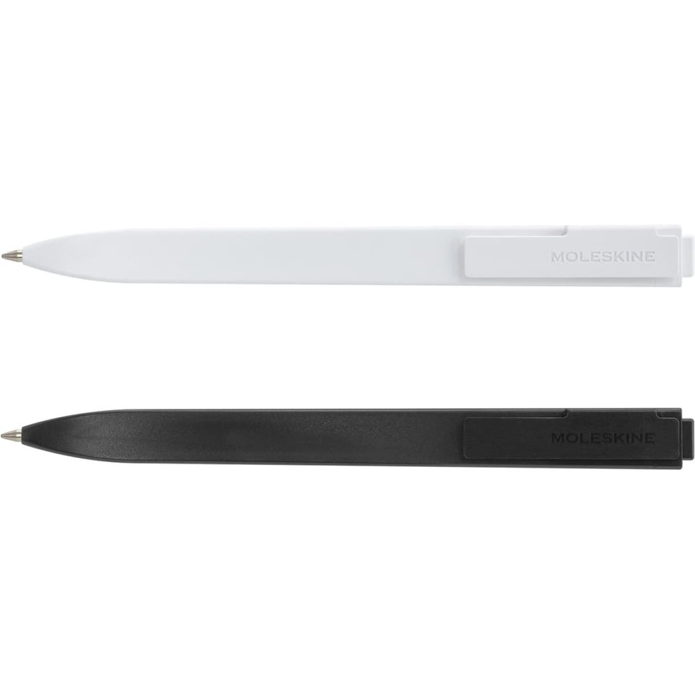










 Express