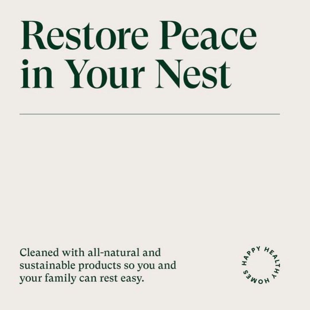
botanical minimalism, tonal green palette, organic modern (slide 1 of 5)
botanical minimalism, tonal green palette, organic modern (slide 2 of 5)
botanical minimalism, tonal green palette, organic modern (slide 3 of 5)
botanical minimalism, tonal green palette, organic modern (slide 4 of 5)
botanical minimalism, tonal green palette, organic modern (slide 5 of 5)
1 / 5

Brand crush

Brand study

Identity by sense2lovesbranding

macro-tonal-graphicsbotanical minimalism, tonal green palette, organic modern

The heavy dark green fabric acts as an anchor for a massive, tonal flood of lighter green ink, pushing the actual text into a tiny top corner. By letting organic shapes dominate the real estate rather than a logo, the bag reads like a retail piece rather than a corporate giveaway.

The portable idea

Look at how the graphic scale completely overpowers the typography here. Shrinking your logo down to five percent and letting a macro, tonal pattern eat up the rest of the surface turns a basic item into retail-grade design. People carry interesting shapes, not corporate names.

21. Mai 2026
Steal this for your brand world

Findie's translation of the move above into specific Sense2 products by industry. Pick the row that fits your brief — pricing is per piece at minimum order quantity.

The Brand Move

Organic shapes crowding the logo into the corner

Part of the sustainable by design aesthetic →

What makes it work

Heavy dark green fabric anchoring a massive tonal flood of lighter green ink, this study pushes the actual text into a tiny top corner and lets organic shapes dominate the real estate. Macro-tonal graphics prove a brand can own space through form and colour rather than a big mark. For a sustainable identity the tonal green-on-green reads as calm and grown-from-the-earth rather than shouted. It argues for letting botanical or organic shapes fill the surface while the wordmark stays small and confident. The colour carries the story. When green dominates the object and the logo whispers from a corner, the brand reads as rooted in something real, which is precisely the credibility eco design has to earn before it can sell anything.

What it signals

Use this aesthetic when sustainability is a claim you can prove — it's the visual language of certification, recycled content and refill systems. In 2026 the greenwash backlash is fully priced in: consumers expect the eco story printed on the object with numbers attached. Design-wise that means honest materials shown raw, single-material construction, and green used as an accent rather than a costume.

Apply it to merchandise

This move translates naturally to B-Corps & social enterprises, Councils & government programs, Universities, Renewables & climate tech, Outdoor & conservation brands, and FMCG refill pioneers.

Who owns this look

  • Patagonia:the benchmark — repair culture and materials honesty as four decades of identity
  • Who Gives A Crap:Australian proof that sustainable can be loud, funny and shelf-dominant
  • Seed Phytonutrients:shower-safe paper bottles that made the material innovation the hero
  • KeepCup:Melbourne-born reuse icon — the product category became the brand

Why it matters now

  • Plastic-free refills & compostables

    2026 Dieline/Pentawards juries put refill systems and compostable films at the top — the aesthetic follows the engineering.

  • Single-material simplification

    mono-material objects (all-aluminium, all-paper) recycle cleanly and photograph honestly — a design constraint that reads as integrity.

  • Storytelling through upcycled materials

    bio-based and waste-stream materials (ocean plastic, coffee husk, wheat straw) carry the narrative physically.

The psychology

Why we study brands we admire

Great identities are solved problems you get to inherit for free. Every brand crush in this collection made a decision — about material, restraint, colour, voice — that took them years to land. Studying the decision costs you four minutes and skips the years.

Apply the move

Übertragen Sie das auf Ihre eigenen Werbeartikel

Diese Produkte tragen die Idee von sich aus – jedes beschrieben durch seine eigene Produktintelligenz, so wie Findie darüber nachdenkt.

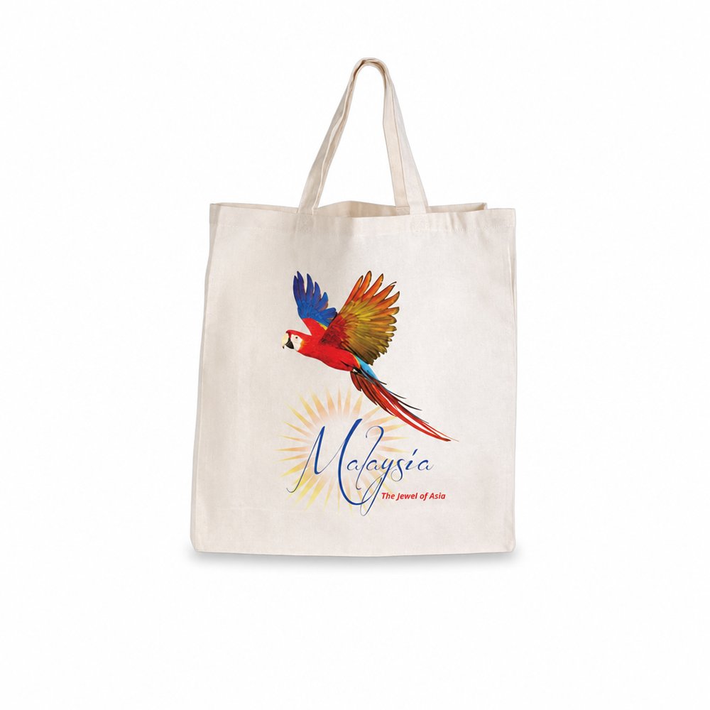
  • Bamboo Tote Bags (Short Handle)
    Bamboo Tote Bags (Short Handle)from 1,87 € incl. MwSt

    Why it carries the move: a carrier = what you choose to take with you, the open intent to gather and keep — The natural texture of bamboo pairs perfectly with a massive, tonal botanical print, keeping the agency name tiny and quiet..

    A new homeowner → the Saturday after move-in, walking back from the market with it on their forearm, realising it's the first thing they bought 'for the house'.

  • Marble Cheeseboard & Knife Sets
    Marble Cheeseboard & Knife Setsfrom 12,95 € incl. MwSt

    Why it carries the move: a marble cheeseboard = the threshold of hospitality, the moment a home or table opens itself to guests — Keep the branding tiny in the corner of the wood, letting the marble and timber texture do the heavy lifting for a premium settlement gift..

    A newly-moved couple → that first Friday in the empty house, boxes still stacked, when they realise they have nothing to eat off and remember the agent's board in the kitchen drawer.

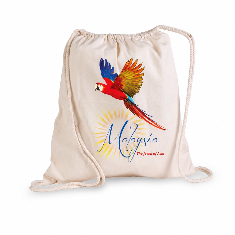
  • Drawstring Library Calico Bags
    Drawstring Library Calico Bagsfrom 1,78 € incl. MwSt

    Why it carries the move: a humble carry-all = gathering what matters and taking it with you, the open hand that holds the day's findings — A blank canvas for an edge-to-edge organic shape print that completely ignores the usual centre-chest placement..

    A library-event attendee → the Saturday morning they grab it off the door hook on instinct because it's the bag that holds exactly the right number of books.

Three more from the studio

Weitere Momente, die einen Blick wert sind.

Want something like these?

Ask Findie for a quick conversation, or hand the brief to Susan and the team. Either works.