
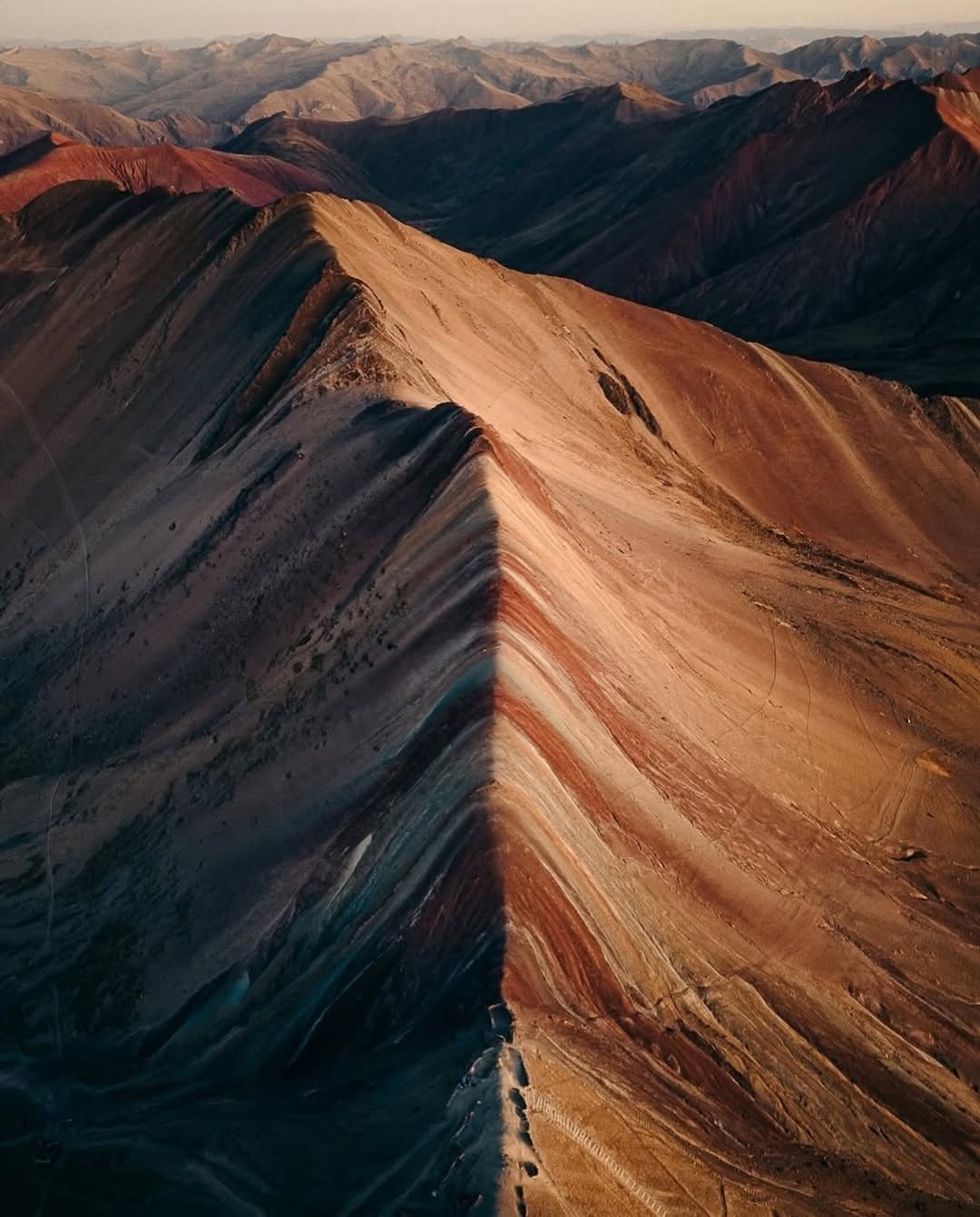
discoverearth (slide 1 of 7)
discoverearth (slide 2 of 7)
discoverearth (slide 3 of 7)
discoverearth (slide 4 of 7)
discoverearth (slide 5 of 7)
discoverearth (slide 6 of 7)
discoverearth (slide 7 of 7)
1 / 7

Brand crush

discoverearth

Identity by discoverearth

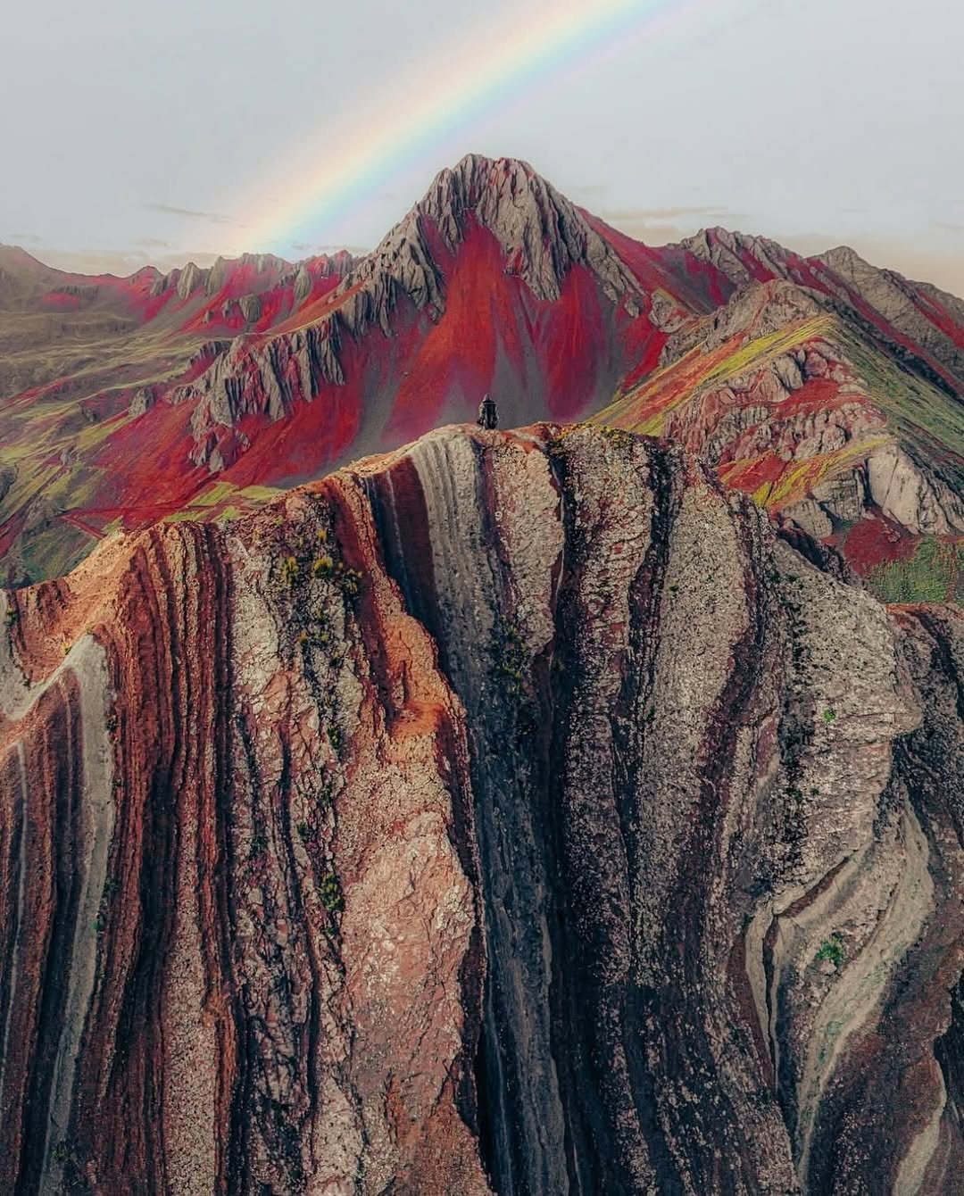
We travel to see colour — ochre deserts, teal shallows, rust canyons. This post nails why earth palettes work so hard in branding: they borrow emotional memory from landscapes people already love. A terracotta tote isn't 'brown merchandise'; it's the same colour as the place your customer daydreams about. When you brief an earth-tone range, name the landscape, not the Pantone.

5. Juni 2026Brand study
The Brand Move

Colour is the destination

Part of the earth tones aesthetic →

What makes it work

We travel to see colour — ochre deserts, teal shallows, rust canyons. This post nails why earth palettes work so hard in branding: they borrow emotional memory from landscapes people already love. A terracotta tote isn't 'brown merchandise'; it's the same colour as the place your customer daydreams about. When you brief an earth-tone range, name the landscape, not the Pantone.

What it signals

Reach for earth tones when the brand promise is grounded in something real — ingredients, soil, craft, provenance. They signal patience and substance, which is why they dominate wellness, food provenance and anything farm-to-anywhere. They're also the safest premium move for a brand that can't wear black: warm, credible, never trying too hard.

Apply it to merchandise

This move translates naturally to Skincare & wellness, Specialty food & coffee, Wineries & distilleries, Landscape & garden design, Regenerative agriculture, Interior & ceramic studios, and Eco-tourism.

Who owns this look

  • Aesop:amber glass turned a UV-protection necessity into the most recognisable shelf in retail
  • Le Labo:kraft labels and apothecary type — industrial warmth at luxury pricing
  • Rothy's & Allbirds:made 'undyed' read as a status colour, not an absence of one
  • Grown Alchemist:the Australian proof that botanical can look laboratory-precise

Why it matters now

  • Verified sustainability

    2026 consumers expect certification printed on the object, not claimed in the caption — earth palettes carry that story visually before the fine print.

  • Craft & imperfection

    the anti-AI design wave (visible grain, hand-stamped marks, uneven deboss) lives most comfortably on clay, kraft and stone tones.

  • Quiet luxury crossover

    stealth-wealth fashion pushed taupe, olive and stone into boardrooms — earth tones are now a premium signal, not a rustic one.

The psychology

Why we study brands we admire

Great identities are solved problems you get to inherit for free. Every brand crush in this collection made a decision — about material, restraint, colour, voice — that took them years to land. Studying the decision costs you four minutes and skips the years.

Three more from the studio

Weitere Momente, die einen Blick wert sind.

Want something like these?

Ask Findie for a quick conversation, or hand the brief to Susan and the team. Either works.