Brand crush
northlandscapes
Identity by @northlandscapes
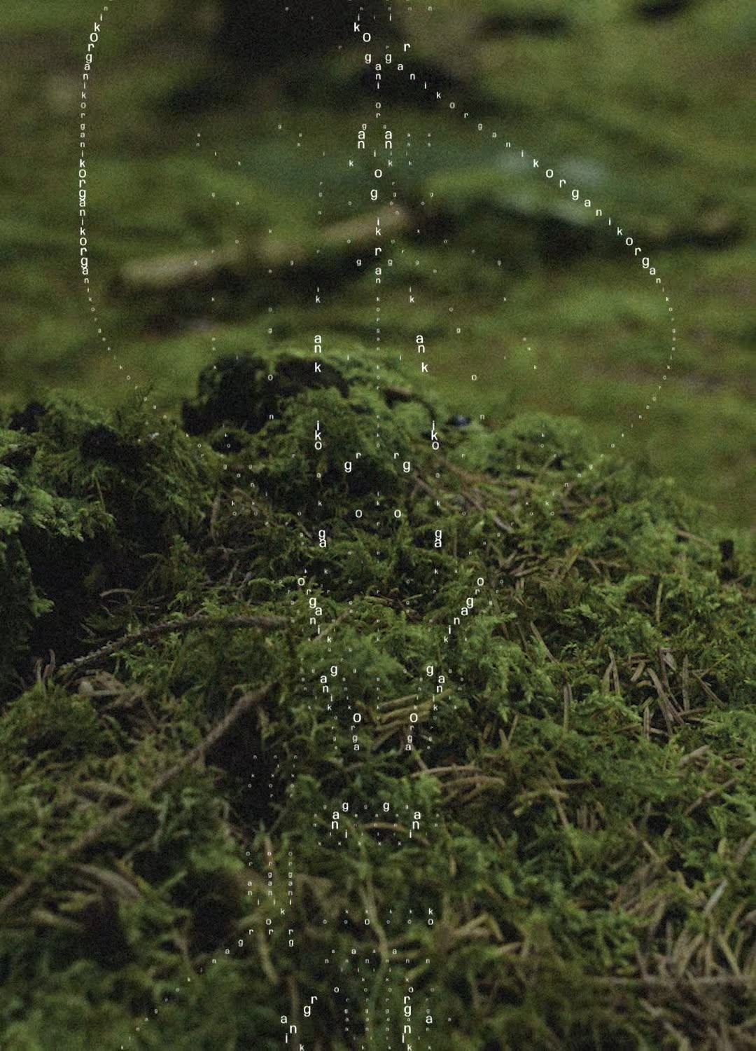
#texture-as-heromoody textural minimalism, slate tones, quiet confidence
Look at the deep, undulating shadows across that slate surface. The visual weight here comes entirely from the physical texture, letting the actual branding step back into a single, quiet tone with generous kerning.
The portable idea
That heavy, fluid texture does all the heavy lifting so the typography doesn't have to shout. When your base material holds this much depth, your strongest play is to pull back the ink density and let the physical finish own the room.
26. Mai 2026spotted via @northlandscapes