Brand crush
thomasfotomas
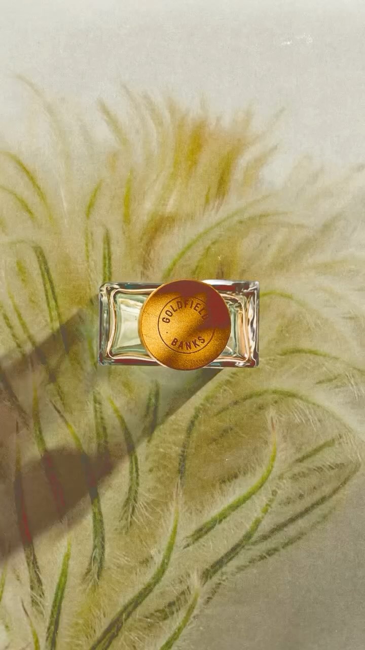
Identity by @thomasfotomas
#gradient-as-negative-spacesunset gradients, high-contrast focal points, quiet confidence
Look at how the aggressive horizontal motion blur flattens the ocean into soft bands of pastel, forcing the sharp silhouette and that high-vis yellow board to command the frame. The contrast between the washed-out background and the crisp, highly saturated focal point does all the heavy lifting for the eye.
The portable idea
You can manufacture focus by washing out your background and letting a single, highly saturated brand asset sit in the middle of it. Pulling a soft, blurred gradient across the bulk of a flat printable surface gives your logo somewhere quiet to land. It is a smart way to use full-colour print without shouting.
28. Mai 2026spotted via @thomasfotomas