Brand crush
@ten.10.design
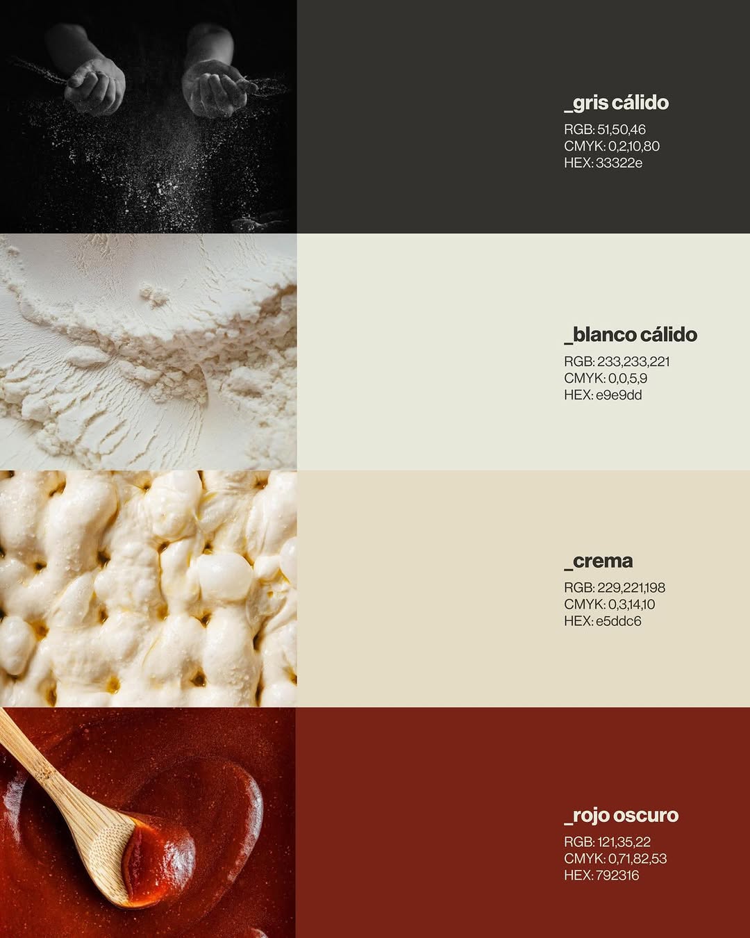
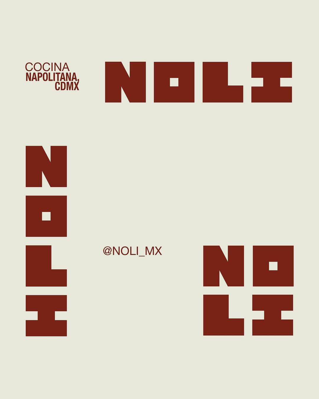
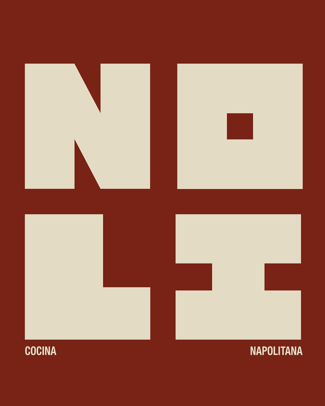
[ Naming + Branding Project ] NOLI — CDMX (Mexico)
Logo / Identidad / Colores / Tipografías / Texturas / Patterns
Prossimamente en Chicago 113, Esq Av. del Parque, Nápoles📍
21. Mai 2026spotted via @ten.10.design
Brand crush
[ Naming + Branding Project ] NOLI — CDMX (Mexico)
Logo / Identidad / Colores / Tipografías / Texturas / Patterns
Prossimamente en Chicago 113, Esq Av. del Parque, Nápoles📍
More moments worth a look.

It is the weight and the typography doing the work here. By treating a keyring like a boutique hotel room key, using soft serifs and heavy metal finishes, they turn a piece of utility into a membership token.

The design uses a horizontal distortion effect to imply kinetic energy, pairing sharp, outlined typography with a blurred background. It forces a static image to feel like it has a pulse.

The sharp ridges of this blind emboss catch the ambient light, turning a standard matte silver pouch into a textural study. By dropping ink entirely and letting a mechanical press alter the surface, the wordmark relies purely on shadow to be seen.
Ask Findie for a quick conversation, or hand the brief to Susan and the team. Either works.