Brand crush
@ten.10.design
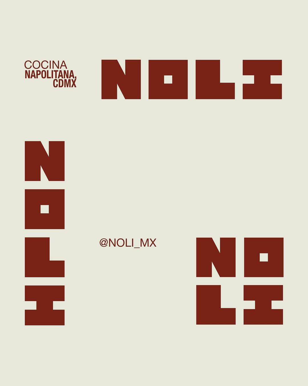
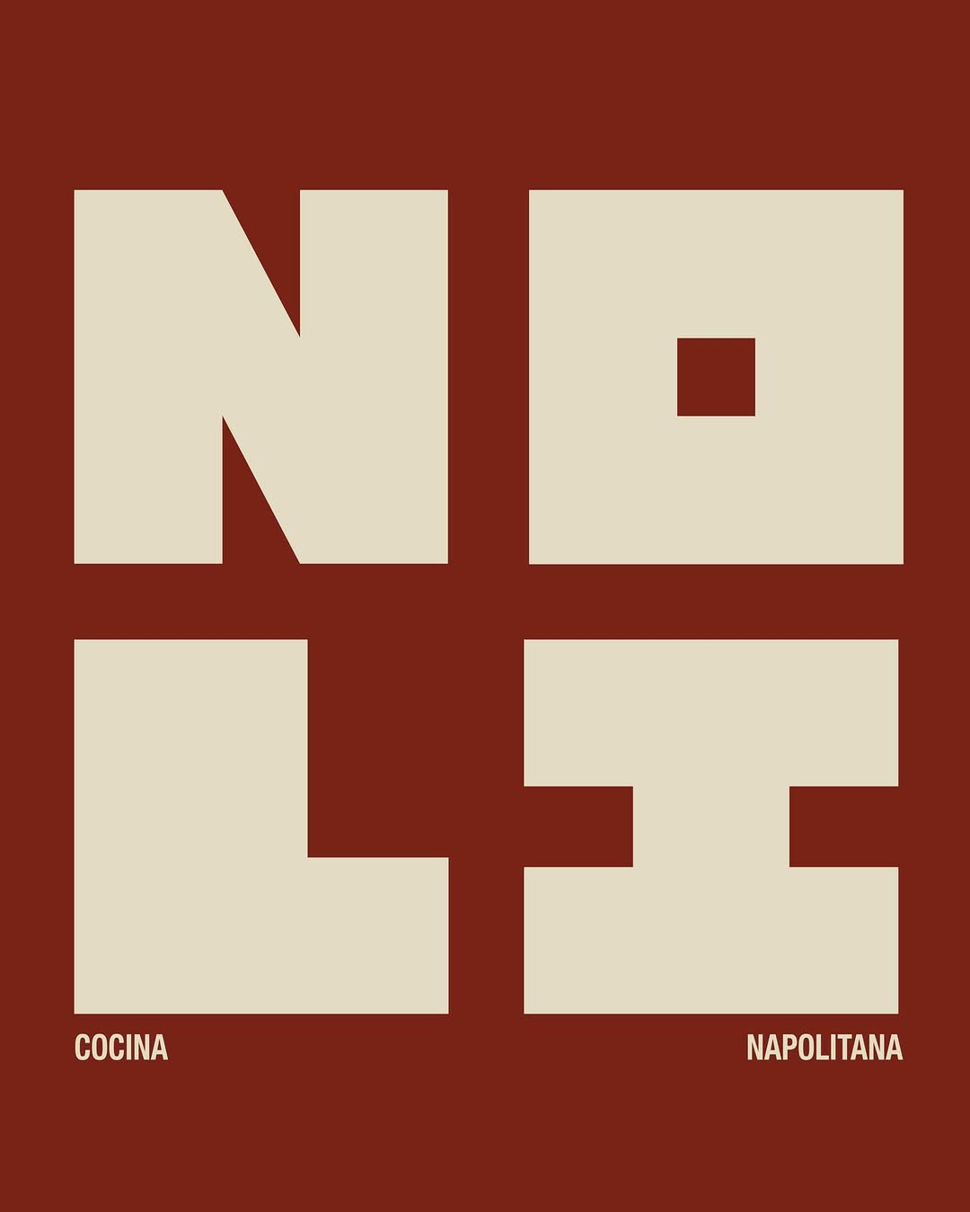
[ Naming + Branding Project ] NOLI — CDMX (Mexico)
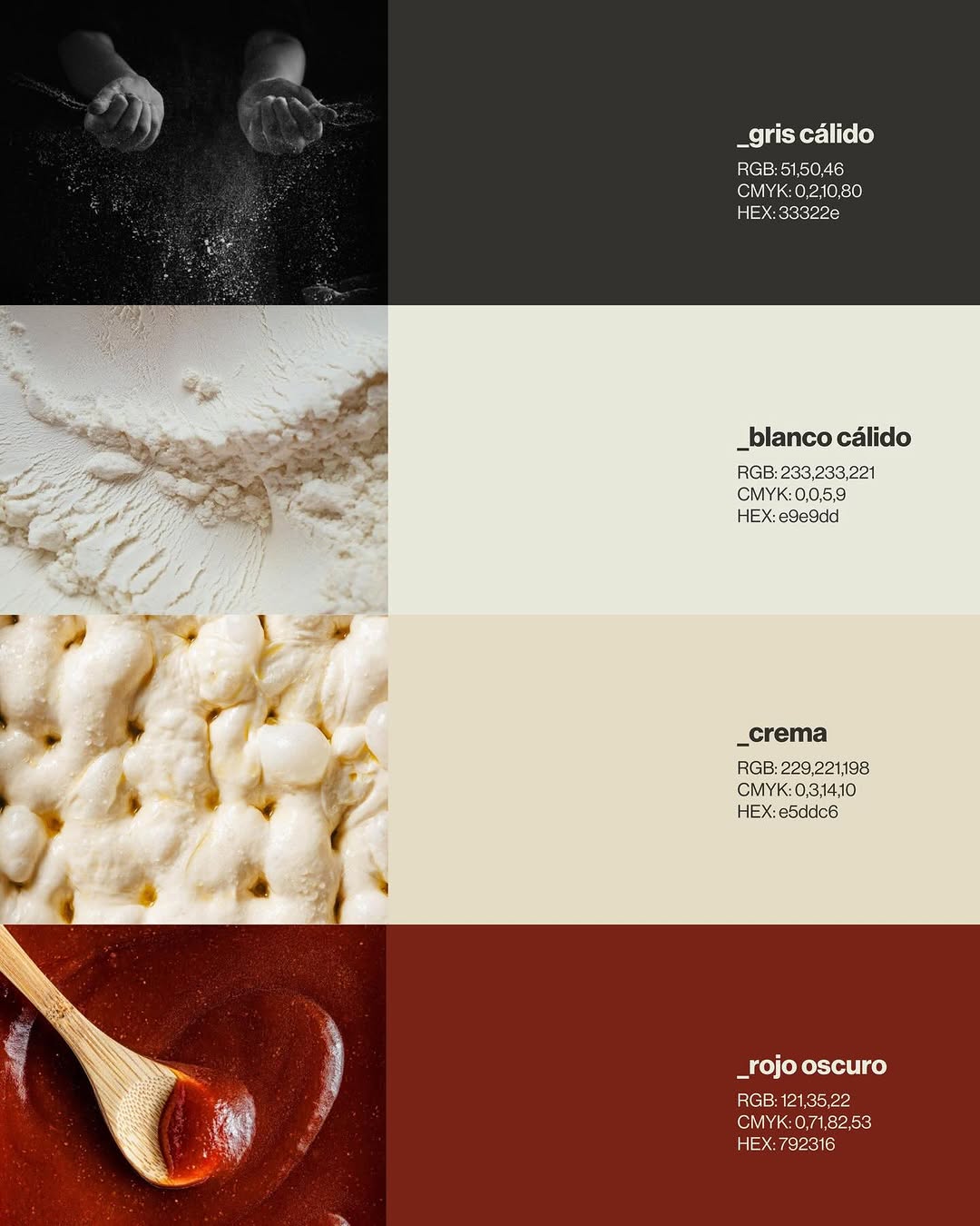
Logo / Identidad / Colores / Tipografías / Texturas / Patterns
Prossimamente en Chicago 113, Esq Av. del Parque, Nápoles📍
21. Mai 2026spotted via @ten.10.design
Brand crush
[ Naming + Branding Project ] NOLI — CDMX (Mexico)
Logo / Identidad / Colores / Tipografías / Texturas / Patterns
Prossimamente en Chicago 113, Esq Av. del Parque, Nápoles📍
More moments worth a look.

The power here is stark contrast and negative space. Dropping a crisp, uncrowded logo onto a flood of solid, vibrant color creates an instant visual anchor without relying on complex graphics.

We created an identity that feels structured, editorial, and quietly authoritative. Accessible enough to guide, but solid enough to lead. Inspired by institutional systems and publishing, the visual language leans on typography, grids, and restraint. The brand behaves like a framework, not decoration. If your brand feels fragmented, it’s time to organize it. → Apply through the link in bio.
Stop and brand. A wordmark like uncocostudio's — soft serifs, generous spacing, one quiet colour — does the heavy lifting before a single customer walks in. Identity by @uncocostudio. We've been thinking about it since. #sense2lovesbranding #promotionalproductsaustralia #brandedmerchaustralia #corporategiftsaustralia #australianbrandidentity #brandcrushoftheweek #stopandbrand #storiesmakebrands
Ask Findie for a quick conversation, or hand the brief to Susan and the team. Either works.